Tuesday, August 29, 2006

New York/Amsterdam

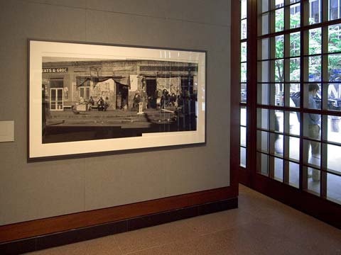
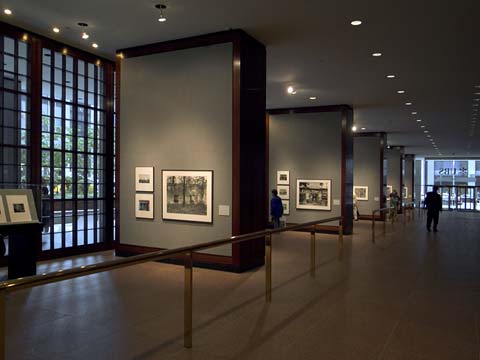
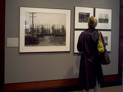
I dashed up to the Walker Evans show at the UBS gallery in Midtown just before heading back to Amsterdam. I had just read a review by Michael Kimmelman in the New York Times and was extremely curious to see the new digitally made inkjet prints of familiar Evans images. I was a bit skeptical after reading the article, which was titled "Walker Evans, Or Is It?" The question being whether these new prints, which expand the possible tonal range and detail of the images, changes the intention of Evans' vision.


Walker Evans at the UBS Art Gallery

Once at the gallery, it didn't take me long to to come to the conclusion that these prints were the best representation of Evans' work I had ever seen. In the past, I had never given much thought to the quality of his prints, but just accepted them for what they were--a mixed bag made at different times by different people--especially those prints made from negatives kept at the Library of Congress. Certain kinds of photographic imagery seems to me bound to the specific method of presentation. But Walker Evans was not a printing maven like Ansel Adams, nor one to elevate the objectness of fine printing. His work was about the image, a thing that exists in another dimension--connected, of course, to the print--but ultimately residing elsewhere: in the moment of exposure, in the mind's eye of the photographer, in the historical and cultural distance of the things and people photographed.


Walker Evans at the UBS Art Gallery

The brochure accompanying the exhibit described the new prints as similar to old music played on modern instruments, and I think there is merit in that analogy. But I would liken it more to the remastering or remixing of recordings of music. It is possible to undermine the original by adding too much digital sheen, too much spatial definition, but it is also possible to enhance the appreciation of the performance by using technology previously unavailable. In the end, the remastered recording can stand side by side with the original, each offering different exeriences of the music. In the case of Walker Evans, the new prints are hung next to earlier prints made or supervised by Evans offering different interpretations of "the images."


Walker Evans at the UBS Art Gallery, photo-montage

Probably the most contentious of the prints in the exhibit is a montage of two pictures Evans made of a road-side scene depicting Black southerners sitting or standing in front of a row of stores. Clearly, Evans made the two photographs with the intention that they be shown next to one another, but actually stitching the two together he never did, and would not have been able to do. Photoshop makes it relatively easy to join overlapping images into one. One is asked to trust the instincts of John Hill and Sven Martson, the printers, who knew Evans before he died in 1975. On a personal note, I was lucky to have attended a slide lecture given by Walker Evans at MICA (the Marlyland Institute College of Art) while I was there in 1974.
Monday, August 21, 2006

New York/Suzanne Vega


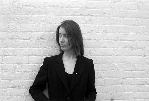
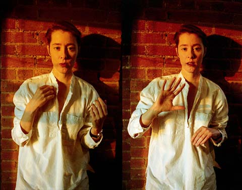
Suzanne Vega, New York, 1980 (35mm film)

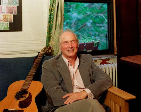
I moved to New York in 1977 primarily to study photography at Cooper Union, but I was also a serious songwriter--albeit a beginner--and I quickly found a group of like-minded writers who were meeting weekly to share their latest compositions. It was at one of those meetings at the Cornelia Street Café that I met folk songwriter Jack Hardy, and a couple of years later, Suzanne Vega. The three of us hung out together for several years egging each other on, flinging songs back and forth at each other like weapons, but ultimately believing passionately in one another.


Jack Hardy, New York, 2004 (4x5 film)

During that time I took a lot of photographs, but rarely were any of them of my musician friends. For me, the camera instantly distances and objectifies what is in front of me, and I didn't want to watch the scene dispassionately, I wanted to belong to it. I know that that is not necessarily the case for other photographers. Think of Nan Goldin, for instance, whose work is part and parcel of the scene she participates in. Suzanne and I talked a lot about looking at the world--I think she has always expressed a certain remove from things, but sharply observed, and with a warmth of spirit that enlivens what might otherwise be icy and disconnected. One of the songs she wrote back then was Tom's Diner, which she has described as having been written through my eyes.


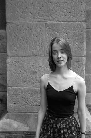
Suzanne Vega, New York, 1980 (35mm film)

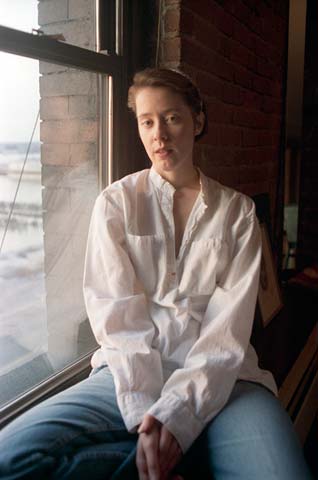
When Suzanne first began performing she needed a publicity photo for flyers and posters, and she asked me if I would take some pictures of her. So, I shot two rolls of black and white film. Cost was an issue. We walked around Greenwich Village looking for good locations and backgrounds--a white brick wall, somewhere, worked--and then the gray stones of Grace Church on Broadway and 11th Street. I don't think they were particularly good PR shots, but Suzanne trusted me, and something comes through in these pictures that is usually missing in the fancier, more self-conscious, photoshoots that followed. Ten years later Suzanne asked me to take some pictures while she was making her Days of Open Hand album. In these photos, taken at the height of her career, it is evident that she knew what to do in front of the camera. But like before we just walked around looking for good spots, chasing the sunlight in her loft in Lower Manhattan.


Suzanne Vega, New York, 1990 (35mm film)

I will be doing a small show of these photographs in Olomouc in the Czech Republic this October in conjunction with a film festival. Suzanne and documentary filmmaker Christopher Seufert, who is making a film about her, will be guests.


Suzanne Vega, New York, 1990 (35mm film)

Friday, August 18, 2006

New York/LES


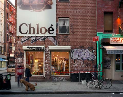
Ludlow Street (4x5 film)

For all the new enthusiasm for modern architecture evident around town, this is still a city full of dismal brick boxes with small catalogue-ordered windows. A few years ago this one went up on Ludlow and Stanton on the Lower East Side where I am now taking photographs. Gradually, this cheap malproportioned building became a part of the scene in this most sceneful part of New York. A small fashion business rented the storefront, an advertising banner draped the almost blind facade on Ludlow, and grafitti adorned the sides of this wall/building.

I took this picture one recent summer evening as the sun was going down. It was a Friday or Saturday, as I recall, and a red rope was already waiting for patrons of Pianos, a club just to the right of the picture. Red and green, lots of rectangles, ghosting figures, a dog, a bucket, bicycles, dresses, "Chloé."

Monday, August 14, 2006

New York/Hudson River Park

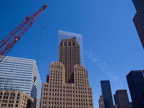
Since the heat wave of two or three weeks ago, the weather has been mostly beautiful in New York. On one particularly fine day I took a stroll with my family along the Hudson River Park. We walked from City Hall past the WTC site, the newly completed 7 WTC, and the Barclay-Vesey Building on West Street. The latter building is considered the first art deco skyscraper and was designed by Ralph Walker of McKenzie, Voorhees & Gmelin. Completed in 1926, it is a masterpiece of great formal strength, and at the same time, exhibits delicately carved stone work. The vaulted arcades at ground level are, perhaps, what most people know of the building. Despite the immensity of the World Trade Center and Battery Park City complexes nearby, the Barclay-Vesey remained a strong presence on the skyline.

When the WTC towers fell, much damage was done to surrounding buildings including the Barclay-Vesey. It has since been restored to its former glory. Rising next door is the new 7 WTC by David Childs of SOM with its crystalline curtain wall providing an almost transparent glass backdrop to Barclay-Vesey's brick and stone. I took the picture below with my digital camera just in front of the BPC cinemas where the Goldman Sachs headquarters is under construction. This view will be gone once that skyscraper is completed.


Barclay-Vesey Building and 7 WTC

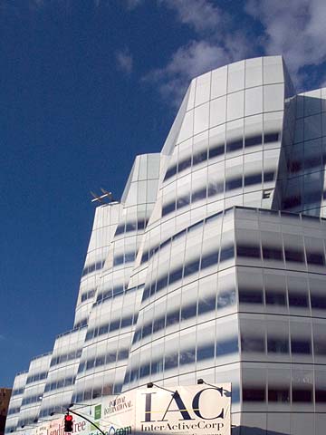
Further up the river in Chelsea I took a few snapshots of the IAC building designed by Frank Gehry. It is---unbelievably, at this late date--Gehry's first structure in New York, although many more are now in the pipeline. When the first glass panels of the curtain wall went up, opinions on the blogs and bulletin boards were mixed, to say the least. Some suggested that the smokey white glass was better suited to a suburban office park.


IAC building designed by Frank Gehry

I think the skin of this relatively restrained Gehry building is gorgeous against the pleated armature beneath, looking not unlike a majestic tall ship in full sail on the Hudson River. It will be even better once the street level scaffolding is gone and the glass touches the sidewalk.


IAC building designed by Frank Gehry

Hudson River Park is still a work-in-progress, but significant stretches of it are finished. On a mild day like this one thousands of people were walking and bicycling the promenade, or sunbathing on the grass. On our way uptown we stopped to rest, and I took this picture of my son Brendan and my wife Renée.


Brendan and Renée, Hudson River Park

Monday, August 07, 2006

New York/LES


Houston and Ludlow Streets

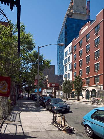
Returned to New York on Friday, and on Saturday got out with the view camera to hit a few spots on the Lower East Side. I had previously noted the view looking toward Katz's Deli on Houston and Ludlow. Three buildings are going up in close proximity, one occupying a former parking lot, and the other two infill entailing some demolition. There are some very tall structures going up in the neighborhood, undoubtedly using transferred air rights from adjacent properties. Katz's, of course, is one of the historical monuments of culinary culture on the Lower East Side. "Send a salami to your boy in the army."


Norfolk Street, Blue and the Switch Building

I walked from there down Norfolk Street to the condo development Blue at Delancey Street. I did a view looking south on Norfolk that included another new apartment building called the Switch Building because of its zig zag window treatment. I took a couple of more photos from the traffic island in Delancey Street showing the Bernard Tschumi tower and the surrounding architectural and commercial cacophany of the neighborhood.

Saturday, August 05, 2006

Williamstown/Williams College Museum


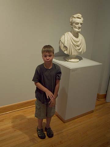
Abraham Lincoln by Sarah Fisher Ames, 1868

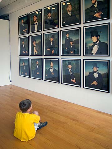
Although I liked Greta Pratt's Lincolns at MASS MoCA--like Elvis impersonators at an Elvis convention--I was happy to see Sarah Fisher Ames's bust of Lincoln from 1868. Ames's Lincoln, while idealized, is familiar, human, and there seems something wry and knowing about his expression. The artist clearly views Lincoln with a sympathetic eye and portrays Lincoln as a great man--but approachable, accessible. Although I appreciate the mutable cartoonish Lincolns of the impersonators (as seen by Pratt), and I understand the implied suggestion that Lincoln remains open to interpretation and historical revision, I was moved by this earnestly rendered portrait just a few miles down the road, and reminded at the same time of what was at stake in Lincoln's time. We find ourselves, today, in another moment when fundamental values hang in the balance. And while one looks for men and women of Lincoln's stature to pull us back from the brink, one also looks for artists to reclaim the moral high ground. Both kinds of leaders seem in short supply.


Urban Landscape by Zhan Whang

I spent a good deal of time looking at the three Jackson Pollock frieze paintings on display, one belonging to the museum, which has been recently restored. In this era of mega exhibitions, it is a pleasure to be asked to contemplate just three paintings. In a nearby gallery were Jacqueline Humphries' Seven Sisters, a new series of beautifully luminous paintings reminding one that painting is alive and well, though it may be ignored upriver at MASS MoCA. There was, however, installation art at Williams College Museum--Urban Lanscape by Zhan Whang--a depiction of the cityscape of Beijing rendered in pots and pans and other kitchen objects. It was spectacular at Williams, and would have looked even better in the factory galleries of MASS MoCA.

Thursday, August 03, 2006

North Adams/MASS MoCA


18 Lincolns, MASS MoCA by Greta Pratt
(no photos allowed in galleries)


The museum is an impressive adaptation of a factory complex along the Hoosic River containing large spaces with 19th century wood beams and columns. Large spaces dictate outsized art, or at least that's the way most curators approach things. Which means, generally, installation art. House of Oracles: A Huang Yong Ping Retrospective was the main show, a gigantic assemblage of assemblages touching on history, politics, and the aesthetics of art exhibitions. A mock dinosaur fossil bigger than any in the Museum of Natural History hovers over one gallery its tail poking through a door into another. The museum website points to an essay by Phillipe Vergne who writes that Huang's work has: " brought to my understanding of art as an aesthetic storm, a storm that is the image of the important shifts in aesthetic and theory that have fed the field of art history, its narratives and discourses, over the last twenty years, leaving it baffled." Putting aside the fact that a field of study does not have consciousness and therefore cannot be baffled, I saw lots of baffled elderly people shuffling through the exhibit.

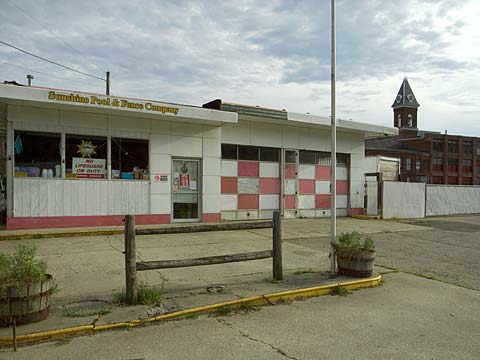
I was also not terribly amused by Carsten Hoeller's Amusement Park, which I assume is intended to slow down and decontextualize experience. The museum website states: "Originally trained and employed as a scientist, Hoeller now uses his audience as "subjects", positioning his work as giant experiments. But, with no data recorded, measurements taken, or objective results achieved, he allows visitors to experiment with themselves." The result of the experiment I ran on myself was boredom with the art in MASS MoCA and a yearning for the cool stuff outside like in this picture:


Sunshine Pool and Fence Company

Tuesday, August 01, 2006

New York/The Berkshires

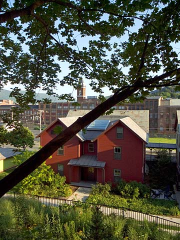
We left New York for a week in the Berkshires, the mountains in western Massachusetts. Drove up, via the Taconic Parkway, we are staying at The Porches, a hotel in North Adams across the street from MassMoca, the factory turned modern museum. The Porches is comprised of a row of former workers housing.


The Porches in North Adams, Mass.

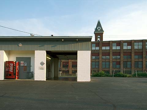
North Adams remains largely blue collar despite the decline of its industrial base. But clearly, cultural tourism, not to mention the proximity of natural beauty, has changed the focus of this small city of 14,000. Yesterday, we rented bikes and peddled the Ashuwillticook Trail, formerly a rail line linking the towns along the Hoosic River. It's about 11 miles--double that if you go both ways as we did. Today, we plan to visit MassMoca.


MassMoca and car wash across from The Porches