Wednesday, December 26, 2007

New York/New Museum


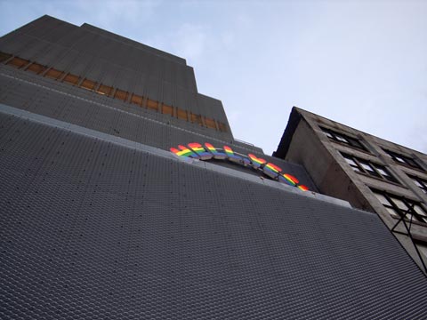
The Museum (Hell Yes! - Ugo Rondinone)

The installation encapsulates the philosophy of openness, fearlessness, and optimism that surrounds the New Museum’s reemergence in the contemporary art community, as well as its history as the home of socially committed contemporary art. -- The New Museum website

I finally got to the New Museum the other day braving the holiday crowd that has pressed into this out of whack wedding cake of a building since it opened a month ago. I've already written about the exterior architecture, which fits admirably into the polyglot of the Bowery. If there's ever a place where anything goes, this is it.

Inside, the building is less arresting, somewhat sober, a series of white containers for art. The offset setbacks of the exterior allow for unobtrusive skylights, which supplement fluorescent tube lighting. I've never cared for this kind of "European lighting"--you see it lots of galleries over there--but it works fine for the sculptural pieces in the opening exhibition "Unmonumental." For most wall art I prefer spots.
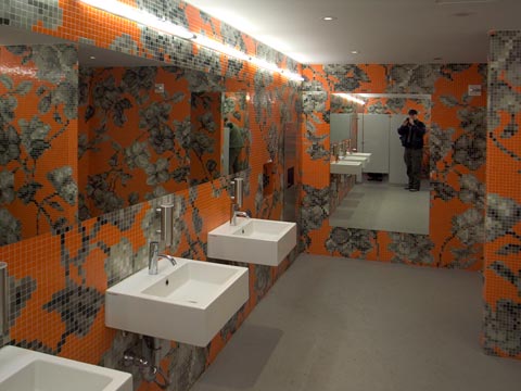

The New Museum
No photography in the galleries, so we'll settle for a restroom view.

The New Museum has none of the luxe quality of the Museum of Modern Art, and I have no problem with that. The architects' make only a few signature gestures, most notably the narrow stairs linking three floors of galleries. It's just wide enough for two people to pass going up and down, and it reminded me how the old Modern once featured a human scale staircase as an important element of circulation. (I think it's still there, actually, lost in the hustle and bustle and endless escalators.)
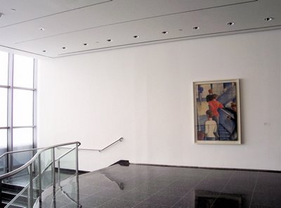

Museum of Modern Art, photo via CitySpecific

I was pleasantly surprised to see a rather accessible and generous opening exhibition at the New Museum. Surprised, because so much art these days is coded for the smug acknowledgment of the select few or panders to the titillation of the semi-sophisticated. Unmonumental is the apt title of the exhibit, which can be loosely described as assemblage art, three-dimensional constructions often made from disposable bric-a-brac. It's a sculpture show.
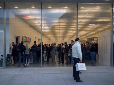

The New Museum holiday crowd

I won't go into the specific pieces--not as long as picture taking is forbidden in the galleries--but I found much of it freshly energetic, clever without being off putting, and just a lot of fun to rummage through. There were too many people in the museum for a leisurely visit, and we'll see if the crowds continue after the first of the year.
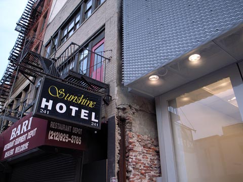

The Sunshine Hotel adjacent the New Museum
One of the last Bowery flophouses

I went when I did because they were screening a documentary about the Bowery, where the museum is located, and which forms the western periphery of my Lower East Side project. The film presented the history of the street from its days as the road to Peter Stuyvesant's farm to a last stop skid row. Except for a few hangers on in places like the Sunshine Hotel, there are no more Bowery bums.
Tuesday, December 25, 2007

New York/Hudson Street


Hudson Street

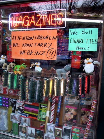
Webkinz--and cigarettes.

Thursday, December 20, 2007

New York/LES


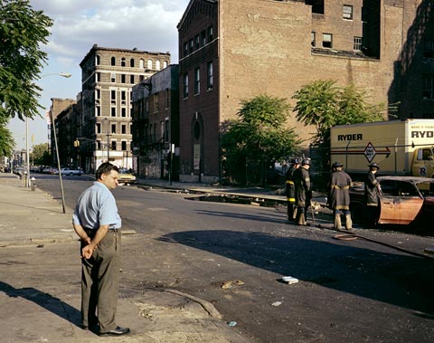
East 1st Street, The Bowery and Second Avenue, 1980 (4x5 film)

In the post below I ranted a little about the supposed death of photography (Is Photography Dead/Newsweek) caused, in part, by Photoshop, a program so amazing that one no longer needs the temporal world to make images. Anyway, back in 1980 when photography was, presumably, still alive I began making pictures of the Lower East Side in collaboration with Ed Fausty using a 4x5 view camera. You can click on the link at the top right to see the whole thing.

We were doing the project by the skin of our teeth financially, and rarely checked exposures with expensive Polaroids. So, some of the negatives are a little thin (underexposed), making them difficult to print. And some of them were not developed properly, and have problematic color shifts. The picture above was one of those, both thin and color shifted. Add to that the degradation of the film over the years, due to the instability of the materials from of that era, and you have a near impossible situation.

But thanks to Photoshop it is possible to coax the color back and largely correct the color imbalances--bring dead pictures back to life, as it were. It's not a pushbutton process, however, takes a lot of time, and requires a good deal of experience with the many different ways to select areas, colors, and densities. The end result, in this case, is an image never printed before, that comes alive in the present.

The Lower East Side project spans 28 years of time, and is about looking back, reinterpreting, and looking again in the present. In that sense the work is not primarily about static visual documents, but rather a process that takes into account the actions of time and change. Understanding the notion, that images of the "real world" are constantly acted upon by the shifting sands of culture, opinion, and history, is critical to working with these factoids called photographs. Nevertheless, one does not necessarily give up on the enterprise of "taking pictures" because their veracity can be questioned.

Peter Plagens in his Newsweek article refers at one point to "photography's tango with the truth." I think that's an apt description, and it encapsulates the power of photography not its weakness. As a photographer I may play the part of Joe Friday in search of hard evidence. "Just the facts, ma'am." But it's the tango with the truth that holds our interest and keeps the game alive.

Monday, December 17, 2007

New York/Death of Photography


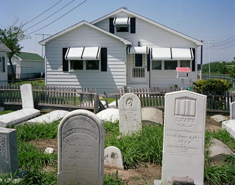
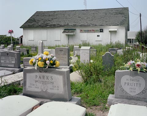
Tangier Island, Chesapeake Bay, Virginia, 1984 (4x5 film)

Is Photography Dead? Peter Plagens in a Newsweek article makes a mess of the recent explosion of photography in the museum/gallery scene and the concomitant use of Photoshop to create seamless fictional realities.


Here's the key paragraph from his article:

Yet wandering the galleries of these two shows (the Met and National Gallery), you can't help but wonder if the entire medium hasn't fractured itself beyond all recognition. Sculpture did the same thing a while back, so that now "sculpture" can indicate a hole in the ground as readily as a bronze statue. Digitalization has made much of art photography's vast variety possible. But it's also a major reason that, 25 years after the technology exploded what photography could do and be, the medium seems to have lost its soul. Film photography's artistic cachet was always that no matter how much darkroom fiddling someone added to a photograph, the picture was, at its core, a record of something real that occurred in front of the camera. A digital photograph, on the other hand, can be a Photoshop fairy tale, containing only a tiny trace of a small fragment of reality. By now, we've witnessed all the magical morphing and seen all the clever tricks that have turned so many photographers—formerly bearers of truth—into conjurers of fiction. It's hard to say "gee whiz" anymore.

First of all, there have always been photographers who used the medium to create alternate realities, or who sought to make photography more art-like by using different techniques, materials, or color palettes, and, of course, those who mixed media to create hybrid objects that were not easily classifiable. Indeed, it has long been understood that photography's relationship with reality, while rooted in it, is tenuous. Even a photographer like Cartier-Bresson considered himself, ultimately, a surrealist despite being the epitome of a "straight photographer." As the Richard Lacayo wrote in Time earlier this year:

We connect Cartier-Bresson to photojournalism because he founded the news photo agency Magnum. But he was trained first as a painter. And when he started to take pictures in the early 1930s he wasn't interested in gathering news. He was a newly hatched surrealist on the hunt for miracles, moments when the real world somehow gave you a fleeting glimpse of the uncanny.

I recall the John Szarkowski curated show at the Modern in 1978 (just after I arrived in New York) called Mirrors and Windows, which posited two main paths in photography, the one seeing out into the world through a frame, the other reflecting the inner world of the photographer. This dialectic made for a contentious exhibition--which side of the great divide do you live on? Obviously, there was and is no clear divide between inside and outside, although there is no doubt that photographers and artist have different intentions with regard to depicting the inner and outer world. Those intentions are still at the heart of the matter, and the introduction of Photoshop has not changed things one bit.

Robert Hughes, back then, wrote in Time about Mirrors and Windows:

The most striking thing illustrated by the show is how far behind photography—meaning the photographs Szarkowski designates as "serious"—has left its old role as witness to public events. ...Wars, elections, riots, disasters, communal ecstasies, the speeches of politicians and their deaths—all are eaten up by the omnivorous lens, as photography (through journalism) defines the terms of our fictitious intimacy with the world.

So in 1978 Hughes talked about photography and the "fictitious intimacy" with the world, and now almost 30 years later Plagens refers to photographers as former bearers of truth turned into "conjurers of fiction." Plagens goes on to suggest that the turning point in this move away from realism was the work of Cindy Sherman, specifically her movie stills series, which quoted a photographic genre expressive of verisimilitude as opposed to unmediated reality. As actual photographs, however, they are documents of a performance--her dressing up and posing in carefully chosen locales--and have nothing to do with a Photoshop created reality. While they were groundbreaking pictures conceptually, they were, otherwise, conventionally made.


Tangier Island, the Chesapeake Bay, Virginia, 1984 (4x5 film)

For a while it appeared that postmodernism, which Cindy Sherman is linked with, declared every creative endeavor dead on arrival. How could one write a conventional story, make a painting, or compose music as authentic expressions of observation or self-reflection once we knew that such attempts were exercises in futility like trying to nail jello to a wall?


Well, we stared down that abyss and moved on with a myriad of different strategies (fractured beyond all recognition) in spite of the eschatological pronouncements of the high priests of art criticism. I will have more to say about all this, perhaps, unless the now useless task of making photographs gets in the way. Stay tuned.

Sunday, December 16, 2007

New York/Houston Street


Houston Street

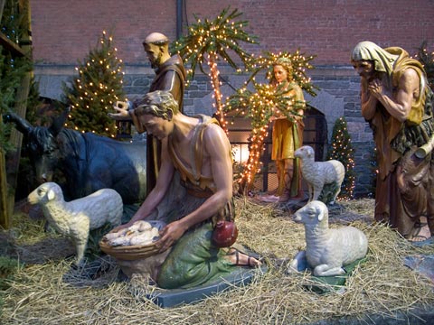
Manger scene in Soho.

Tuesday, December 11, 2007

New York/New Museum


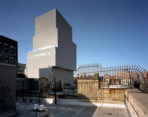
The New Museum (4x5 film)

Here is a wider view of my rooftop looking toward the New Museum made with the 4x5 camera. It was a crisp, but not uncomfortably cold morning. This is the back of the building, although, except for the transparent glass ground floor, there really isn't a front or back to the tower. But since it only takes up a small lot on the Bowery, it will tend to be viewed primarily from the street.

This is an oblique view that will work well in my Lower East Side series--a roofscape rather than a streetscape. Another icon of the rapidly changing neighborhood.

Saturday, December 08, 2007

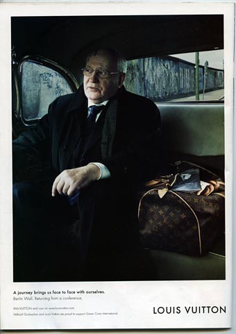
New York/Gorbachev


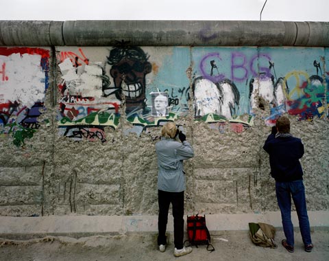
The Berlin Wall (click for closer view)

Gorbachev and the Berlin Wall 1989.


Photo by Annie Leibovitz

Gorbachev and the Berlin Wall 2007.

Friday, December 07, 2007

New York/LES


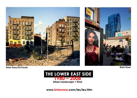
Today I launched my newly redesigned Lower East Side web pages. I'm planning to send out, shortly, the card above. As I worked on the new LES pictures, I realized that I have a surprisingly complete set of images of the Bowery taken in the past five years. This last remaining strip of gritty reality in Lower Manhattan is poised for rapid gentrification, the recent opening of the New Museum a vivid marker of the change. So, I am also putting together a Bowery web page.

Yesterday, I discovered that the popular blog MetaFilter featured my Lost Border website, and since then, I've gotten about 1,500 visits--it's usually 50.

Monday, December 03, 2007

New York/Eldridge Street Synagogue


Rivington Street

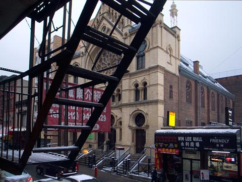
It snowed on Sunday and for much of the day the city looked quite magical. Brendan, my son, and I walked across town and down the Lower East Side to visit the opening of the newly renovated Eldridge Street Synagogue, which as I understand it, will be called Museum at Eldridge Street. The restoration looked beautiful, a good sized crowd was on hand, and a klezmer band played jauntily in the main sanctuary.


Eldridge Street

The synagogue is located at the southern end of Eldridge Street near the Manhattan Bridge, an area that is now the heart of Chinatown. The incongruity of the old world Moorish themed building surrounded by Chinese businesses is striking. But this is the kind of jarring cultural collision that makes the Lower East Side and New York in general so fascinating.


Eldridge Street


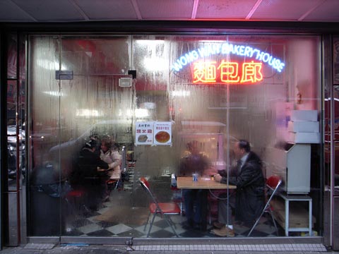
Canal Street


Canal Street


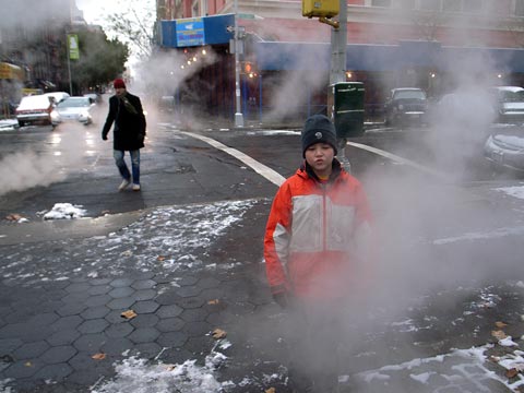
Brendan on Forsythe Street

Saturday, December 01, 2007

New York/New Museum


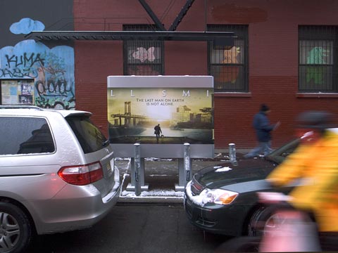
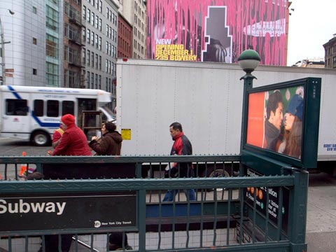
Calvin Klein ad morphs into New Museum ad on Houston Street

Well, I won't be going to the New Museum today as planned because they have already given out all the tickets to the 30 hour free admission marathon. The ultimate brilliance of the New Museum may be their ability to harness the full corporate/media juggernaut that runs this town. Will "new" art be mostly about the art establishment creating a new brand? Will the New Museum serve primarily to give museum imprimatur to artists already ensconced in the commercial galleries? For those of us toiling in the shadow of the museum--literally in my case--the museum may represent a shining, but unattainable Oz.


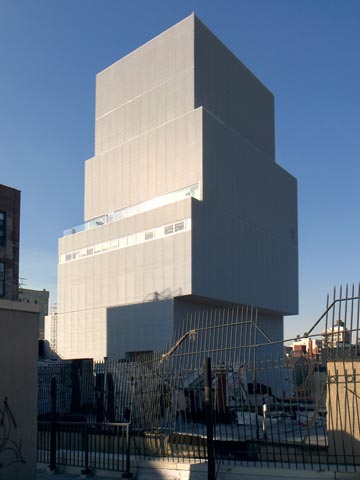
The New Museum from my rooftop

Yesterday morning I climbed out my window and up the fire escape to photograph the New Museum from the roof. It is perhaps the best way to view the building, its off kilter boxes emerging amid the confusion of the elevator sheds, skylights, and water towers that define the rooftop landscape of lower Manhattan.

The New Museum building, designed by Kazuyo Sejima and Ryue Nishizawa of the firm Sanaa, is, on the one hand, a pristine object standing aloof from the still very gritty Bowery. But viewed close up, the metal scrim, which glistens in the sun from a distance, is rather more utilitarian. As I wrote a while back in an earlier post, it has a provisional off-the-shelf feel unlike the richer materiality usually associated with museums. It is, after all, a institution dedicated to the here and now as opposed to the preservation of the past.


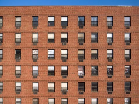
Thelma Burdick apartments

I took a number of pictures with the view camera, a few not including the New Museum. Running the whole block of Stanton between the Bowery and Chrystie is a low income housing project built during the '80s composed of an endless monotony of brick and windows. This, too, is part of the neighborhood in which the New Museum now calls home.