New York/LES

(Rose/Fausty)
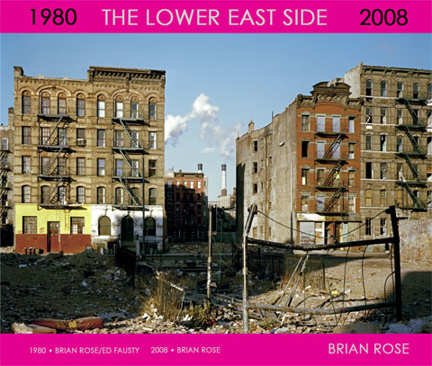
After working on the new incarnation of the Lower East Side project for a number of years--not as intensively as I'd like, but gradually building up a sizable body of work--I decided to put it all together in book form using Blurb, the online DIY book publisher. As I began the process, downloading the software, thinking about the design, etc., I discovered that Blurb was having a book contest. With a first prize of $25,000 and lots of attention for the winner and the runners up as well. Deadline fast approaching. So, without much ado, I threw myself into a four day 14 hour a day marathon and designed, sequenced, and wrote the text of a 200 page photo book simply titled The Lower East Side--with 1980 and 2008 on either side of the title.

Introductory text (Rose/Fausty)
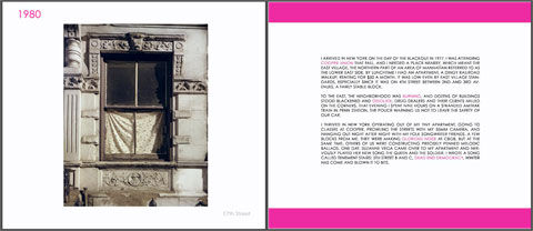
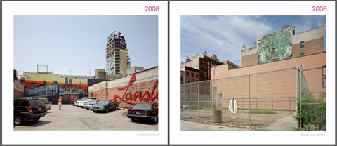
As you can see from the cover image above, I elected to use a rather brash magenta color as background, and it is used throughout the book as accent color. Although the photographs are all conventionally placed on white pages, I have pushed the graphic design forward a bit more than is typical for fine art books. The text, while readable, acts as part of the design, and the years of the photographs are clearly visible above the images, which is important, since the back and forth play between then and now is what the book is all about.

Typical double page (Rose)
Five years ago when I assembled a book dummy for The Lost Border, my Iron Curtain project, I worked with a graphic designer in Amsterdam who used magenta and deviated in various ways from the conservative design philosophy employed by most photo book publishers. Needless to say, when the proposal was finally accepted by a publisher, they shot down the design, and we went with a nice, but fairly tame, layout. Since this new Blurb book is not subject to anyone else's design sensibility, I have opted for the return of magenta, a non-neutral, but also non-natural color. Meaning that it does not tend to blend or pick up colors from the photographs. It remains a separate, even alien, element.
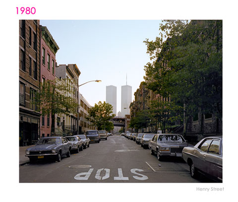
The important thing, however, is the content of the book. The first phase of the project was done in 1980 when fellow Cooper Union student Ed Fausty and I photographed the neighborhood with a 4x5 view camera. After that, we moved on to our own individual approaches to photography. I did various projects, most notably, documenting the Iron Curtain border and Berlin Wall. I lived in Amsterdam for 12 years, though keeping an apartment just off the Bowery. The following text taken from the book explains some of my motivation for returning to the project:
On September 11, 2001 I was in Amsterdam. The phone rang, and it was a friend from Berlin telling me in an urgent voice to turn on the TV. I then watched in horror as the attack on the World Trade Center unfolded and the Twin Towers collapsed. A week later I was back in New York on one of the first flights from overseas.
Although I made photographs of the impromptu memorial in Union Square Park, and took my view camera down to lower Manhattan mixing with crowds jostling for a glimpse of the WTC aftermath, I began thinking about a more serious response to events, one that would take a longer view of the impact on the city and beyond. Eventually I came to the conclusion I should return to where I had begun--the Lower East Side--the place where so many Americans traced their roots. The old neighborhood tucked beneath the bridges lying at the feet of the pinnacles of power would serve as a barometer of change and continuity.
Sometime in 2003 I restarted the Lower East Side project, working again with a 4x5 view camera, but on my own this time. From the beginning it was clear that this would not be a simple before/after take on the neighborhood. Before and after books, however fascinating, are usually one dimensional, and by definition subservient to the original set of photographs. While keeping an eye on the earlier photographs done with Ed Fausty, I wanted to rediscover the place with fresh eyes, with the perspective of time, change, and history.
What I have put together is a before/after book that looks forward as much as it looks back. I've mixed the photographs throughout with pairings and multi-page sequences of images based on numerous criteria--geography, composition, points-of view, similarities, contrasts, coincidences, religious and ethnic iconography, etc. What I like about it is that it's a book about the Lower East Side that does not get mired in "ye olde" neighborhood nostalgia. Nor is it a book about any one view of this often controversial place. Others have done that. This book is about the urban fabric we all inhabit, share and sometimes fight over.

(Rose/Fausty)
Unfortunately, however, it isn't a book yet except on my computer and in a couple of copies I'm having printed by Blurb. I've entered it into the contest--winners announced in early September--and I hope to show it around to publishers, galleries, and museums. At the moment there appears no venue for this project in lower Manhattan. No gallery or institution suitable, willing, or whatever. But stay tuned...
Update:
Here is the link to my book page on Blurb. Be sure to look at the preview feature of Blurb. You'll only see the first fifteen pages of the book, but it's pretty cool.

0 Comments:
Post a Comment
Links to this post:
Create a Link
<< Home