Friday, January 30, 2009
Sunday, January 25, 2009
New York/Eggleston/The Whitney
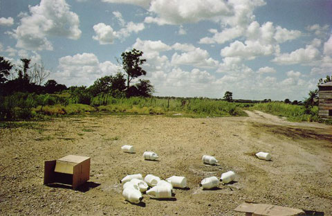
Photo by William Eggleston
Continuing my observations (from a few posts below) on the Eggleston show at the Whitney. The exhibition closes today, and I'll wrap things up with a few observations made while walking through the galleries.
I began shooting color in the mid to late '70s, and Eggleston was one of the few color photographers I knew about at the time. I had missed the famous Szarkowski exhibition at the Modern in 1976, but had seen the work published elsewhere a short time later. And I bought a copy of William Eggleston's Guide--one of the groundbreaking books in the history of photography.
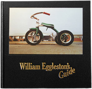
Initially, my interest in Eggleston lay more in his method and formal approach to subject. Eggleston probes with his camera, prodding here and there like a dentist. Does this hurt? What do you feel here? How about over here? He glances this way and that, up and down, sometimes level to the ground, sometimes tilted. His gaze seems all-inclusive, not hierarchical. Every scene, every object, every moment is in play.
In some ways his most famous images are outliers, least typical of his way of seeing. With such an even handed approach--democratic, as Eggleston says--the most iconic of his images shouldn't be any more important than any others. And in fact, they are not. The tricycle on the cover of the Guide, for instance, is sometimes represented as a child's view of the world, but it's actually taken from a lower worm's eye view. It's another visual experiment like pointing the camera into an oven or refrigerator. The tricycle, rather than intentionally elevated to a monumental status, merely looms large--and strange--from Eggleston's restlessly exploratory camera. Eggleston is not attempting grand visual statements, except perhaps incrementally. He's slicing and dicing, taking MRI's of America, each image a thin sliver of the body politic.
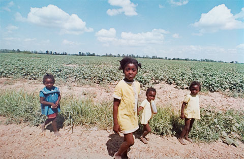
Photo by William Eggleston
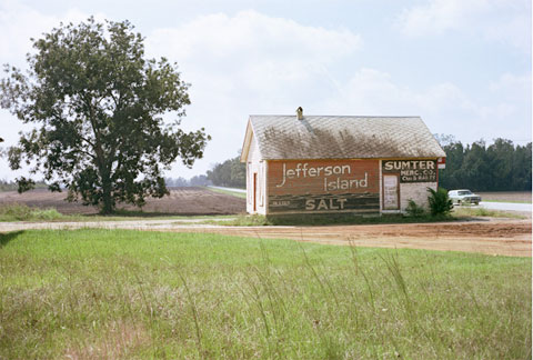
Photo by William Eggleston from Election Eve
Looking at the Democratic Camera at the Whitney, I find now that Eggleston's experimentation is, perhaps, subsumed into a larger cultural and regional perspective. The south plays a larger role in Eggleston's work than he, probably, would like to admit. His best work, as I see it, is more about atmosphere than formal composition. One of my favorite series is Election Eve, a seemingly random collection of photographs redolent of the peanut fields of Plains, George, the hometown of then president Jimmy Carter.
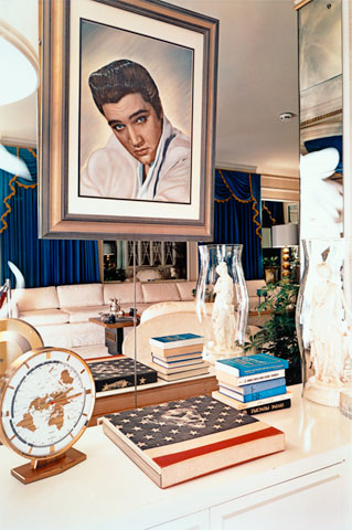
Photo by William Eggleston from Graceland
Eggleston also handles the garish décor of Graceland well, relishing the kitschy glam and dross of Elvis's home without critical disdain. On a text panel accompanying the Graceland photos, Eggleston is quoted as not being interested in Elvis. I doubt that he would admit to being truly interested in anything he photographs. But in the company of Elvis--southern royalty, as it were--he is right in his element.
It can be said that Eggleston's style is southern gothic, a latent sense of malevolence--a boy prostrate on a garage floor, a girl in a flowered dress sprawled on the grass, men with guns, women with big hair, slackers, drifters, marginal characters--Eggleston seems to relate--floating through a landscape littered with signage, suburban clutter, odd juxtapositions. It's been mentioned elsewhere the influence on David Lynch and other filmmakers, but he's, perhaps, better described in the company of Tennessee Williams or Faulkner minus the narrative.
No, Eggleston doesn't escape his southern upbringing, despite denials, or his patrician mien. Ultimately, he is an itinerent carny, performing brilliant visual feats--recognized far and wide--but still coming off a little creepy, smelling faintly of liquor, living without the obligations that tie most of us down.
Here's what it comes down to me. The slight-of-hand in Eggleston’s work is manifest as an incisive gaze rendered indifferently. This dichotomy—precision vs. spontaneity—is the essence of the Eggleston achievement. As a photographer, what I take away most from Eggleston is his cold-blooded equanimity in pursuing his glorified hobby. Everything is fair game for one’s attention, however transient that attention may be. Eggleston is quoted in the exhibition: “I had this notion of what I called a democratic way of looking around.”
What I understood immediately upon seeing Eggleston’s work back in the ‘70s was the idea of always moving. Snap, move, snap, move. It either happens or it doesn’t. There are no missed photographs, no regrets.
Friday, January 23, 2009
New York/Books
While checking my web stats I noticed several visitors coming by way of Stan Bantos's blog Reciprocity Failure. Stan, who is a talented photographer and writer about photography, recently compiled a list of his "top 30 photo books." I am honored to see that he has included my book The Lost Border as one of them.
Here's the list from Reciprocity Failure with Stan Bantos's comments:
1) In The American West -- Richard Avedon; one of portraiture's giants at his peak.
2) Ambiguous Ambassador- Tseng Kwong Chi; from humorous to majestic, all great photographs that happen to be self portraits.
3) Uncommon Places- Stephen Shore; the common made uncommon in color.
4) Madness- Claudio Edinger; beautiful images straight from hell.
5) Glory- Robert D'allessandro; the epitome of early seventies, wide angle, Tri-X documentary.
6) The Killing Fields; "art" by genocide...
7) The Inner City- Joseph Mills; street photography in dream time.
8) American Prospects- Joel Sternfeld; Americana redefined.
9) The Silence -- Gilles Peress; genocide and poetry in Africa.
10) Farewell To Bosnia-- Gilles Peress; genocide and poetry in Europe.
11) The Lost Border- Brian Rose; lyrical ghost imagery of bygone era.
12) Coney Island- Bruce Gilden; mid seventies NY at its grainy, idiosyncratic best.
13) Seydou Keita- Scalo (publ); the king of "outsider" portraiture, whether in his village in Africa or on opening night at the Gagosian in NYC on 10/23/97.
14) Cocaine True, Cocaine Blue- Eugene Richards; beauty in the depths of the human condition.
15) Inferno - James Nachtwey; high intensity, world wide drama crammed into 1 x 1 1/2.
16) Rich & Poor- Jim Goldberg; an intimate look into rich v poor. Guess who comes out looking worse...
17) Diane Arbus- Aperture (publ); the queen of portraiture.
18) William Eggleston's Guide- The Revolutionary Handbook.
19) The Last Resort- Martin Parr; stories within stories, live and in color.
20) Troubled Land- Paul Graham; tension and forboding in the land of beauty.
21) A Green And Pleasant Land- John Davies; landscapes past, present and forever.
22) Central Park -- Bruce Davidson; wonder and discovery in the manmade microcosm.
23) Sticks And Stones- Lee Friedlander: the swan song of swan songs.
24) Along the Ohio- Andrew Borowiec; middle America made familiar and magical.
25) The Black Triangle- Joseph Koudelka; a land laid waste in all its epic grandeur.
26) The Oxford Project- Peter Feldstein; the most simple of projects, the most brilliant of presentations.
27) Found in Brooklyn- Thomas Roma; neighborhood wonderland.
28) The Innocents- Taryn Simon; American tragedy as real as it gets.
29) At Dusk and By The Ground- by Boris Mihailov; two hard cover volumes of the most depressing panoramics imaginable sold in one package, haphazardly printed and toned into... true works of art.
30) The Americans -- Robert Frank; The New Testament.
Thursday, January 22, 2009
New York/Eggleston/The Whitney
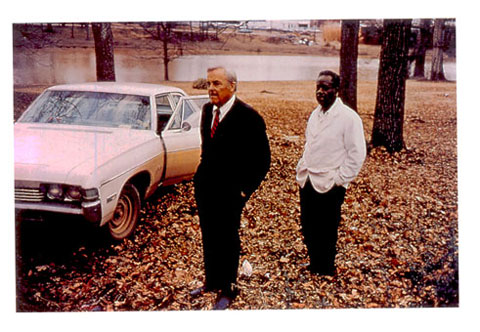
Photo by William Eggleston
Continuing my observations (from a few posts below) on the Eggleston show at the Whitney.
The exhibition at the Whitney is spacious, a whole floor of the museum. In my two recent visits the large holiday season crowds seemed involved in the work, not simply drifting through. A lot of people in the museum were obviously there to see the Calder exhibition upstairs. I was not, however, happy with the dimness of the gallery lighting, which reduced the vibrancy of the prints and gave everything a yellowish cast.
One of the reasons to go to the exhibit, as opposed to acquiring Eggleston's books, is to see the dye transfer prints made at the beginning of his career--but the lighting muddied the experience for me. I don't know if it was intentional--a concern about damaging the prints?
When I was at Cooper Union studying photography with Joel Meyerowitz I became aware of dye transfer prints. As I understood it at that time, dyes transfers were being used in advertising because of the saturated color and because it was possible to locally adjust color in ways not easily accomplished in so-called c-prints. Meyerowitz came from that world, doing commercial advertising, while shooting his early 35mm street photographs.
Shooting color slides, I was confronted with a dilemma. I could not afford dye transfers, could not make them myself, and therefore had to begin to learn how to make c-prints from internegatives. The quality of the lab-made internegs were mixed at best. And my first prints were not particularly good. Later, I gave up on slides and began shooting negatives, which translated better to prints. Getting there took some time.
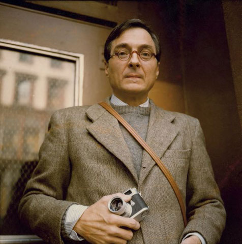
William Eggleston, photo by Maude Schuyler Clay
In realizing how costly dye transfer prints were, I also came face to face with a sobering reality: Eggleston was rich and could afford to shoot with abandon and print whatever he wanted using an expensive medium. This fact does not diminish Eggleston's accomplishment, but it led me to a somewhat different reading of his work.
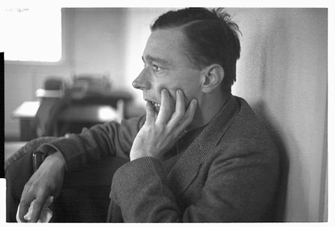
Walker Evans, photo by Edwin Locke
When one looks at Eggleston's pictures or those of Walker Evans, another photographer of patrician upbringing, some consideration must be given to the sense of privilege inherent in the eye of the photographer. Evans, of course, in some of his best known work, trained his view camera on the downtrodden of the south--objective, attentive to every visual detail--in the process ennobling his subjects, whether human or architectural. But there was a clear separation between himself and those he photographed.
Eggleston, unlike Evans, is not much interested in humanitarian concerns as a photographer, but his seemingly casual, aloof reading of the world around him, allows the viewer to see social complexity coldly--sometimes in the harsh glare of a strobe--without the need for unnecessary compassion. (Compassion without clarity invites mawkishness.) In different ways, both Evans and Eggleston exhibit a freedom in their work unbeholden to sponsors or clients, but proffered, perhaps, with a measure of noblesse oblige.
More to come...
Tuesday, January 20, 2009
New York/Inauguration Day
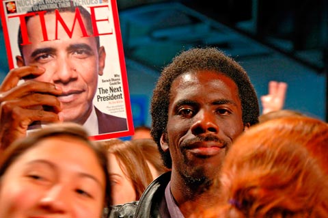
Photo by Rodger Kingston
A repeat from over a year ago, but an appropriate one. A terrific photograph by my friend Rodger Kingston.
Historic day.
Monday, January 19, 2009
New York/Eggleston/The Whitney
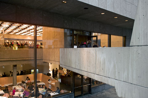
The Whitney Museum (digital) © Brian Rose
Neither the Guggenheim nor the Whitney allow photography in their galleries, which makes it difficult for me to review shows in the way I would like to. I've said it before, and will repeat--this does not help the museums or the artists being exhibited. It stifles free speech and hinders the discussion on blogs like this one. I do not buy the usual excuse about protecting copyright. All the images in the Eggleston exhibition, for instance, are readily available in book form, and snapshots taken in a gallery context in no way harm the rights held by the artist.
So, it is with some reluctance that I write about the Whitney William Eggleston show, ironically called Democratic Camera.
•••
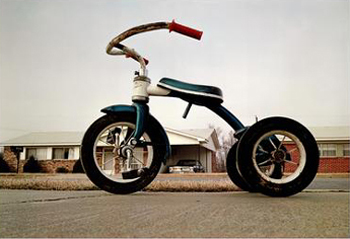
Photo by William Eggleston
I've been meaning to write about the Eggleston show for a while now--I've actually been to it twice--once with my son to also take in the Calder circus and early wire figures, and a second time for a more considered look. Before addressing the exhibit specifically, I'd like to talk about how I first became familiar with Eggleston back in the '70s when color photography was relatively new territory.
When I began began taking pictures, like most everyone, I worked in black and white. I learned to develop and print before going to art school, which was around 1975, and always had a home darkroom. I was interested in color, had shot some slide film, and had had a few drugstore prints made. But there was little support from my professors for pursuing color in a serious way. Color was still relegated to commercial photography.
I recall the one color class offered at the Maryland Institute (MICA) in Baltimore where I was at school. For a whole semester students seemed to do nothing but test prints and technical exercises. There was little emphasis on making photographs, so I avoided the class. At some point in 1976 or 1977 I came across Eggleston, Meyerowitz, and Shore in a magazine--just a handful of images--but a light went off in my head, and knew instantly that I would quit black and white photography and pursue color.
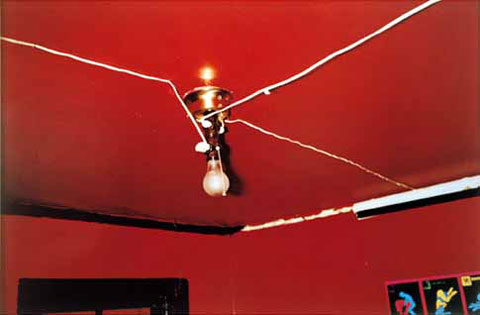
Photo by William Eggleston
In 1977 I went off to Cooper Union in New York where Joel Meyerowitz was teaching, and came into contact with other photographers who were shooting color. Although I did not see Eggleston's famous show at the Modern, curated by John Szarkowski, I did get a copy of Eggleston's Guide, which was based on the MoMA exhibition. Those photographs occupy the central galleries of the current Whitney Museum exhibition.
The Guide photos were imprinted in my brain--the vernacular subject matter, the ascerbic color, the utterly unsentimental tossed off quality of the pictures--what I perceived as Eggleston's almost disdainfully insouciant manner. It sat well with this 23 year old photographer.
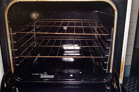
Photo by William Eggleston
Although I was aware of the themes and places in Eggleston's photographs, I was initially drawn to their formal qualities--how they encompassed the street photography styles of Winogrand and Friedlander--but with the added element of color seemed to rely less on the serendipitous collisions of things within the frame--and allowed for a "blander" less actively composed frame, that dared the viewer to question why? Why point the camera at this building, this street, this oven, this hound dog slurping from a puddle, this flash blinded red room, this monumental tricycle?
More to come...

Photo by William Eggleston
I've been meaning to write about the Eggleston show for a while now--I've actually been to it twice--once with my son to also take in the Calder circus and early wire figures, and a second time for a more considered look. Before addressing the exhibit specifically, I'd like to talk about how I first became familiar with Eggleston back in the '70s when color photography was relatively new territory.
When I began began taking pictures, like most everyone, I worked in black and white. I learned to develop and print before going to art school, which was around 1975, and always had a home darkroom. I was interested in color, had shot some slide film, and had had a few drugstore prints made. But there was little support from my professors for pursuing color in a serious way. Color was still relegated to commercial photography.
I recall the one color class offered at the Maryland Institute (MICA) in Baltimore where I was at school. For a whole semester students seemed to do nothing but test prints and technical exercises. There was little emphasis on making photographs, so I avoided the class. At some point in 1976 or 1977 I came across Eggleston, Meyerowitz, and Shore in a magazine--just a handful of images--but a light went off in my head, and knew instantly that I would quit black and white photography and pursue color.

Photo by William Eggleston
In 1977 I went off to Cooper Union in New York where Joel Meyerowitz was teaching, and came into contact with other photographers who were shooting color. Although I did not see Eggleston's famous show at the Modern, curated by John Szarkowski, I did get a copy of Eggleston's Guide, which was based on the MoMA exhibition. Those photographs occupy the central galleries of the current Whitney Museum exhibition.
The Guide photos were imprinted in my brain--the vernacular subject matter, the ascerbic color, the utterly unsentimental tossed off quality of the pictures--what I perceived as Eggleston's almost disdainfully insouciant manner. It sat well with this 23 year old photographer.

Photo by William Eggleston
Although I was aware of the themes and places in Eggleston's photographs, I was initially drawn to their formal qualities--how they encompassed the street photography styles of Winogrand and Friedlander--but with the added element of color seemed to rely less on the serendipitous collisions of things within the frame--and allowed for a "blander" less actively composed frame, that dared the viewer to question why? Why point the camera at this building, this street, this oven, this hound dog slurping from a puddle, this flash blinded red room, this monumental tricycle?
More to come...
Wednesday, January 14, 2009
New York/Czech Center
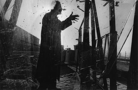
Photo by Antonin Kratochvil
Last night I went to the Czech Center to see my friend David Hrbek from the Czech Republic. He was leading a panel discussion--much as he does back home--with three distinguished Czech photographers: Antonin Kratochvil, Vladimír Birgus, and Jindřich Štreit. Kratochvil is the one of the three I had heard of, a photojournalist who was documented wars and the human condition all over the globe.
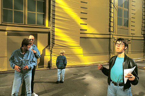
Photo by Vladimir Birgus
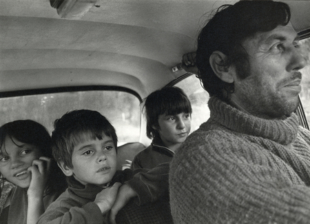
Photo by Jindřich Štreit
Although Kratochvil's photos exhibit the most panache in the strange way that gritty photojournalism can have a stylish aspect. Streit's more prosaic documentation of village life--particularly during the pre-Velvet Revolution days--have a humanist dimension that tugs more at the heart. Birgus's color street photography are skillfully poised compositions, sharply seen.
One tangent of the conversation had to do with prison experiences of the photographers. Kratchovil has been arrested or detained many times in his role as a photojournalist. But Streit told the story of his arrest by the Czech government during the communist years. His photographs of farm life were deemed anti-state, and according to the website Amber Online, he was sentenced to 10 months in prison for "defamation of the republic and the Head of State, based on an interpretation of his photographs. Even his camera was confiscated as an instrument of the crime. The case is probably unique in the history of photography."
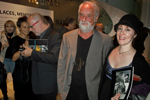
Left to right: Vladimir Birgus, Jindrich Streit, and Suzanne Vega
© Brian Rose
My friend Suzanne Vega was at the Czech Center as well. A couple of years ago, she and I had been invited by David Hrbek to take part in a film festival in the Czech Republic. Unfortunately, I didn't get a picture of David, but he did a terrific job moderating the discussion, and it was good to see him again. It was David's first visit to New York.
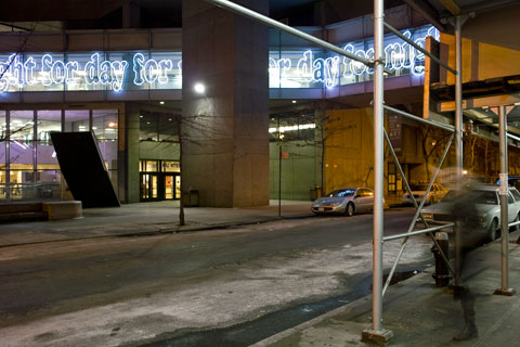
East 68th Street/Hunter College
© Brian Rose
On my way home via the 6 train at 68th Street. The sign says: Day for Night Day for Night...
Monday, January 12, 2009
Sunday, January 11, 2009
New York/Swastika
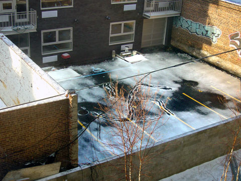
Williamsburg, Brooklyn, behind a building on Metropolitan Avenue (digital) © Brian Rose
We live in ugly times. I woke up this morning and looked out our window in Williamsburg, Brooklyn. A swastika had been drawn in the parking lot behind a newly completed, but unoccupied, apartment building. I know that this building, and the construction site next door, are owned by Hasidic Jews, who have a large presence in the neighborhood, especially on the south side of the Williamsburg Bridge.
The parking lot is locked, but easily accessible through the sloppily maintained construction fencing next door. But someone would have to know where they were going. The swastika was crudely drawn, but unmistakable.
Given the current situation in the Middle East, there is tension in the air--there were protesters at Union Square yesterday. But whatever one's opinion concerning Israel and the Palestinians, such expressions of hate and/or ignorance are an affront to us all.
Tuesday, January 06, 2009
New York/Guggenheim
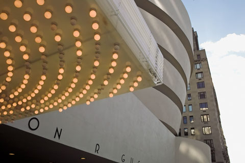
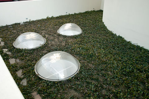
The Guggenheim Museum, Marquee by Philippe Parreno
© Brian Rose
I went to the Guggenheim and Whitney museums to see a couple of photo exhibits--Catharine Opie and Williams Eggleston. The Opie work was relatively unknown to me, and I wanted to see what or why she was given a large retrospective at the Guggenheim. Her career was launched by gender identity work, portraits of lesbians and transgender individuals, and self-portraits. This stuff seems dated to me at this point, which means I think it's work with a limited shelf life, now expired. The poses are wooden, the references to old master painting pretentious. But I give Opie credit for giving visibility to people who are at the margins of mainstream society.
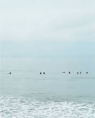
Opie exhibit at the Guggenheim
I liked the ice houses and surfers waiting for waves in one of the galleries--not so much the individual images, but the way they were lined up to form multi-panel panoramas. There's a lot of textual mumbo jumbo accompanying these beautiful pieces, however, and they would be better off without it.
Around the time that this series was completed she summarized her artistic project: “I concentrate on disturbing the devices that society imposes on variant communities to keep them ‘ghettoized’ by class, race, sexuality, and gender. It's important that my work be seductive as a visual language, as I want to keep the viewer engaged. This allows for multiple readings which challenge viewers to consider both people and space in their various complexities.”
What I like about the two series is the way in which the panoramas are comprised of individual images made at different times. The line of surfers never exisited in real time as seen across the panels, and there is a progression from fogginess on one side to clearer images on the other. Only a few surfers are shown riding the waves--most paddle about waiting for a wave.
The freeway flyovers and empty city street photographs do not connect with me. They suggest meaning that I do not think is sustained in the images.
We've somehow lost sight of what America was originally. Think about the power of Ellis Island, the melting pot, and how all that is disappearing in favor of white-bred America. . . . America's not about multiculturalism anymore. And that's what I mean, that cities still hold this utopian notion of what America once was.” To help bring home this sense of loss, starting with St. Louis, she once again portrayed her chosen cities bereft of their populations.
I don't agree with the statement about white-bred America. We just elected a black president, and we are gradually becoming less white, less homogeneous.
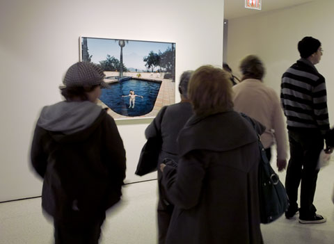
Opie exhibit at the Guggenheim, (digital) © Brian Rose
The domestic series--large scale images of lesbians in family/home situations--is not as compelling as the intention implied. There's supposed to be a tension between the ordinariness of the activities in the pictures and the extra-ordinariness of the couples and families depicted. OK, I get it. I do like the image of the pregnant woman floating in a pool--heaviness and weightlessness. But too much of Opie's work is about telling rather than allowing the viewer to discover.
There's a ton of laudatory opinion about Opie on the Internet, much of it from the star making machinery of the art world. Feel free to Google.
On to William Eggleston at the Whitney.
