Tuesday, June 30, 2009
Sunday, June 28, 2009
New York/Brooklyn Sky
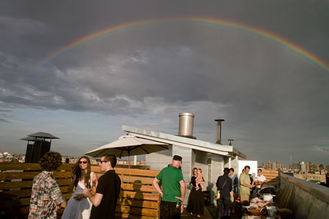
Roof party in Brooklyn -- © Brian Rose
Did another round of pick up basketball pictures at some courts in Chinatown. Early in the evening a fierce, but brief, thunderstorm passed through leaving the air fresh and cool. Roof party in Brooklyn was interrupted, but resumed under a brilliant rainbow.
This morning I got out with my view camera and did architectural photographs of our building--an assignment from the architect/developer. I wanted to do a photograph from the roof across the street, but assumed that would have to wait till I made arrangements with the owner. As I was shooting on the street, I spotted someone I thought might be the super--he was--and I ended up on the roof. Sometimes you get lucky.
Saturday, June 27, 2009
New York/The Bronx
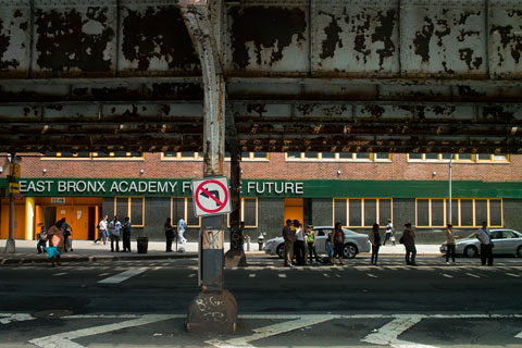
Southern Boulevard, the Bronx -- © Brian Rose
I went up to the Bronx yesterday to scout a building for a client. It's going to be tricky photographing it because it stands adjacent to an elevated subway line. The number 2 and 5 trains run along here, which in the '70s and '80s, was the scene of utter urban devastation. It's a pretty vibrant area today, though not without its gritty aspects.
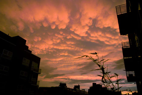
Red sky over Brooklyn -- © Brian Rose
If you were watching the Yankees-Mets game on TV last night, delayed an hour by dramatic, but quickly passing, thunderstorms, you saw some shots of an improbably vibrant orange sky over the ballpark. Believe it--I could see the same sky from my balcony in Williamsburg, Brooklyn.
Friday, June 26, 2009
Tuesday, June 23, 2009
Thursday, June 18, 2009
New York/Dutch Seen
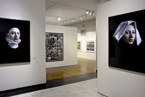
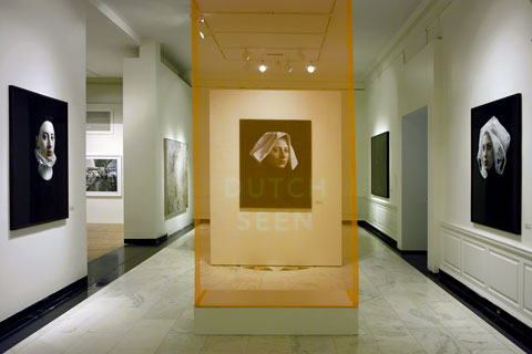
Dutch Seen, the Museum of the City of New York -- © Brian Rose
The more I've thought about the Dutch Seen exhibition at the Museum of the City of New York, the more I've come to the conclusion that the city--the ostensible subject of the exhibit--is largely invisible. Yes, sure, there's some street photography, some interiors of restaurants, and lots of multi-ethnic faces. But these are not the images that make the strongest impression.
Walking into the exhibition one is confronted first by Hendrik Kerstens' stunning portraits of his daughter Paula, each a 3/4 view, mimicking 17th century portraits by Vermeer and Rembrandt and others of the Dutch Golden Age. Paula, is presented as a New Yorker, wearing various bits of costume--a plastic bag, a napkin, a Yankee cap, beaver fur. The various headgear are at once immediately recognizable for what they are, but unmistakably evocative of the hats seen in period paintings.
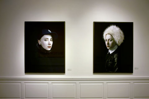
Portraits by Hendrik Kerstens -- © Brian Rose
Like the original women of Golden Age paintings, Paula is depicted as both idealized and specific, self-assured and intelligent--lost in thought, a mysterious cipher. In these photographs we are taken back to the early days of Dutch settlement in New Amsterdam, when to a significant extent, the character of the city was formed. That's the premise of Russell Shorto's book Island at the Center of the World. Shorto also contributes a short elegantly written introduction to the exhibition catalogue.
Paula is a grand conceit, richly ironic and humorous. She is a Dutch cosmopolitan in a savage landscape, glimpsed obliquely just beyond in the next gallery in the photographs of Misha de Ridder. De Ridder searched for vestiges of the world Henry Hudson found when he sailed into New York harbor. He photographed thick tangles of forest undergrowth, a fallen tree trunk, a sweep of beach at Sandy Hook.
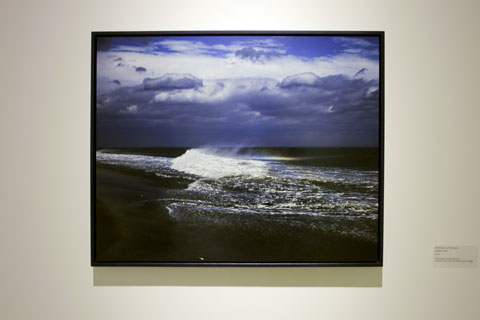
Photography by Misha de Ridder -- © Brian Rose
In his beach scene, a wave crashes on shore as a shaft of sunlight breaks through a dark sky, caught momentarily in the salt spray, shimmering, iridescent. It is an expression of the chaotic wildness that confronted the Dutch when they arrived, which they sought to tame and exploit, as the Dutch tend to do even today. It is also the one moment of pure serendipity in the show--a miraculous discovery, if you will--the kind of thing photography has always been about.
There is much more substantial photography to take in beyond Kerstens and de Ridder, but in a way, it all seems beside the point. I loved Charlotte Dumas' anthropomorphic portraits of New York shelter dogs, and I enjoyed the cutting glance of Danielle van Ark's photos of art gallery openings. And I was mystified--in a sort of positive way--by Erwin Olaf's black on black interiors of a fictional African American upper middle class home.
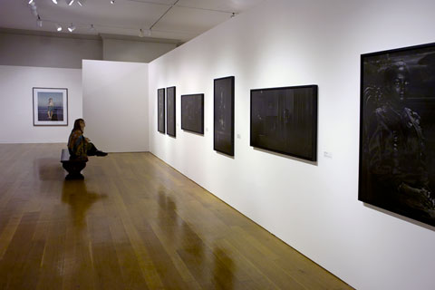
Photos by Erwin Olaf -- © Brian Rose
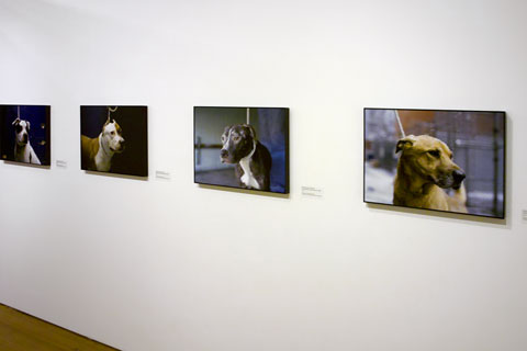
Photos by Charlotte Dumas --
The brilliant beach portraits of Rineke Dijkstra seem stranded here--they were, after all, made 10 or 15 years ago, and I can't help but think they were included because of some obligatory nod to her reputation as an icon of recent photographic history. Likewise, Inez van Lamsweerde and Vinoodh Matadin's transparently stylish celebrity portraits seem gratuitous.
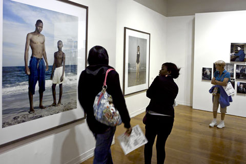
Photos by Rineke Dijkstra -- © Brian Rose
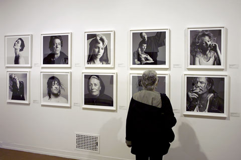
Photos by Inez Lamsweerde and Vinoodh Matadin -- © Brian Rose
Despite all the visual skill and conceptual high mindedness on display, there is a puzzling shortage of fresh discovery here--in an exhibition presumably about the Dutch rediscovering New York--at least nothing that approaches the epiphany of Misha de Ridders crashing wave, or the piercing eyes of Hendrik Kerstens' ridiculously sublime Paula.
Neither Kerstens nor de Ridder, of course, show even a glimpse of New York City.
Additional comments:
The layout and simple design of the exhibition is beautiful overall, and the newly refurbished galleries look great. I especially liked the orange title scrim hanging in front of one of Kerstens' prints. Different framing or mounting throughout the show helps give each photographer his/her own identity. And unlike so many museum shows I've been to recently, the photographs are well lit. The museum has never looked better.
Tuesday, June 16, 2009
Friday, June 12, 2009
New York/Bullets
Tenth Avenue/Chelsea -- © Brian Rose
The existence of numerous photographs showing American torture of detainees held in Afghanistan and Iraq is an established fact. The release of those photographs is being held up by the president and by others in government who believe that it might incite violence against American troops stationed in those places. Today in the Times Lindsey Graham, conservative Republican senator from South Carolina is quoted saying: “Every photo is a bullet for our enemy.”
In other words, the fact of torture is not what incites our enemy, but the image of torture. We can talk about the acts portrayed in those images--similar to those already released of Abu Ghraib--but we cannot see or show the facts.
They are bullets--bullets aimed at us.
Aimed, ultimately, at those who conceived the policy of torture, those who rationalized the legal/moral grounds for using torture, those who gave the orders to use torture, those who transferred the orders to use torture through the chain of command, those who then tortured detainees in the field, those who covered up and continue to cover up knowledge of torture, those who excused and continue to excuse the use of torture, and those who seek to prevent the truth in all its sordid aspects to see the light of day.
Photographs are bullets. No photography allowed.
Thursday, June 11, 2009
New York/Museum of the City of NY
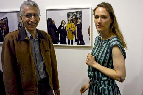
John Bartelstone and Danielle van Ark
© Brian Rose
Went to the opening of Dutch Seen: New York Rediscovered at the Museum of the City of New York. Large, lavish show funded by the Dutch government and others. Panel discussion moderated by Kathy Ryan of the New York Times Magazine. Hundreds piled in for the reception afterward. The discussion was not particularly edifying, though Misha de Ridder's explanation of how he found the locations for his photographs was interesting--maps and historical references to early Dutch settlement. Hendrik Kerstens could only manage to say that his work was about Paula, his daughter, which is superficially true, but not true in any larger sense. I'll write something about the exhibition once I've had a chance to go back for a longer look.
I ran into John Bartelstone, and Danielle van Ark, who is one of the photographers in the show. John is coming out with a book of his photographs of the Brooklyn Navy Yard, the former shipyard, now an incubator of all kinds of businesses and creative ventures. I photographed them in front of one of Danielle's photos of gallery openings. Seemed appropriate.
And a couple of images snapped on the way to the museum, which is located on the edge of Harlem on Fifth Avenue:
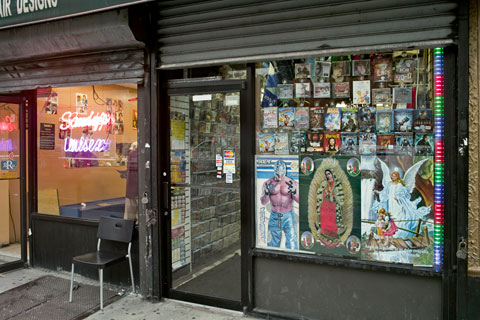
Lexington Avenue and 104th Street
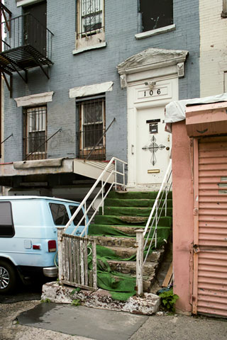
East 104th Street
Wednesday, June 10, 2009
New York/The High Line
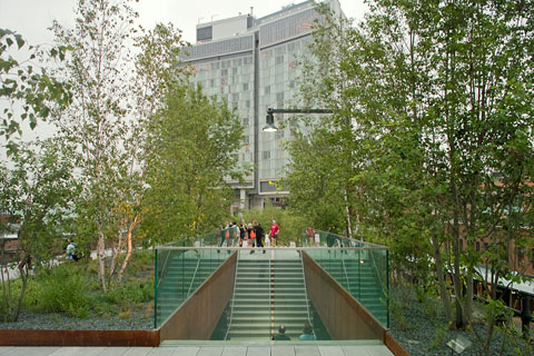
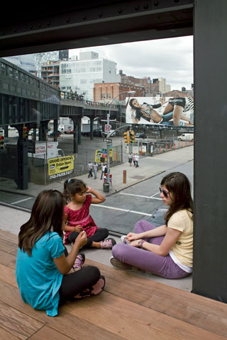
The High Line at Gansevoort Street
The High Line opened to the public on Tuesday. I went up late in the day, showers threatening, but it stayed dry as dusk approached. There were hundreds of people walking the former rail viaduct, but it was not uncomfortably crowded. That could change if the weather is good this coming weekend.
First impression--the High Line does not disappoint. The designers (James Corner Field Operations with Diller Scofidio & Renfro) have struck a balance between preserving this vestige of New York's industrial past and creating a new, urban dreamscape. The plantings evoke the wild opportunistic growth that emerged from the thin layer of detritus that accumulated over years of neglect--seen in Joel Sternfeld's beautiful photographs--but they are more diverse.
There are two experiential aspects of the High Line--the promenade itself with its greenery, structures, and event spaces, and the view of the city seen from above street level, the traffic and pedestrians flowing beneath. The photographs I managed to take as daylight faded primarily describe the latter.
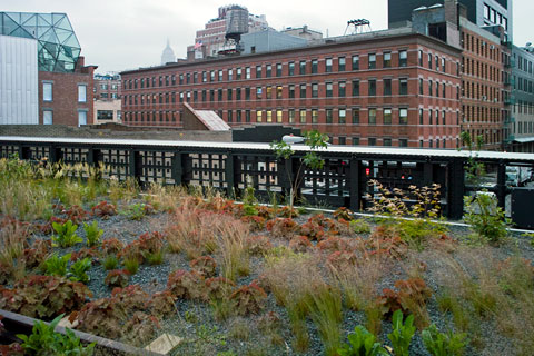
The High Line in the meatpacking district
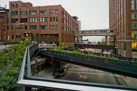
The High Line where it passes through the Chelsea Market
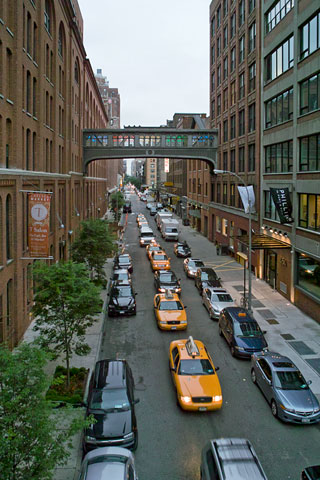
Traffic flowing beneath the High Line
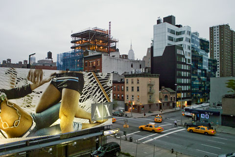
Tenth Avenue
Nicolai Ouroussoff in this morning's Times: " It is one of the most thoughtful, sensitively designed public spaces built in New York in years."
Friday, June 05, 2009
New York/Camilo José Vergara
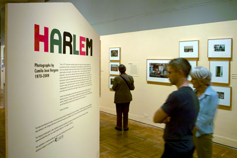
Vergara exhibition at the New York Historical Soceity -- © Brian Rose
A few thoughts on seeing Harlem, Photographs by Camilo José Vergara 1970-2009 at the New York Historical Society:
This is not a photography show in the traditional sense,” Vergara says during a stroll through the New-York Historical Society gallery. “I’m really interested in issues, what replaces what, what’s the thrust of things. Photographers don’t usually get at that—they want to show you one frozen image that you find amazing. For me, the more pictures the better. (Smithsonion Magazine)
The problem is the photographs are presented as if they were stand-alones--traditional c prints matted and framed with small neatly printed text panels. Vergara’s project would be greatly enhanced by a more immersive experience.
There was one low resolution video screen tucked off to the side in which successive images of different scenes ran in a loop. Otherwise, framed prints are stacked one above the other or in groups, the bright white mattes jumping off the warmed-toned walls and taking up too much space between images. I had to bend way over to see the lowest images.
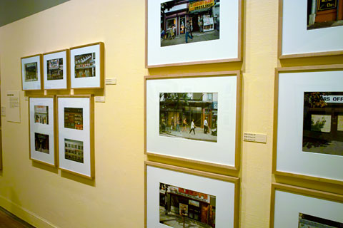
Vergara exhibition -- © Brian Rose
I’m not suggesting that Vergara’s work should be presented as a multimedia three-ring circus. But I don’t understand the traditional look of the NYHS exhibit. Vergara’s website, which contains the Harlem project along with his similar documentations of Camden, New Jersey and Richmond, California attempts to be interactive and less gallery-like, but the website is yet another of these tedious flash based sites--tiny text, tiny clickable squares on contextless maps.
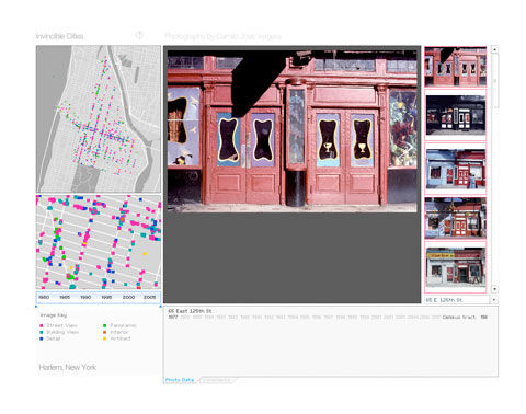
Invicible Cities, Camilo José Vergara website
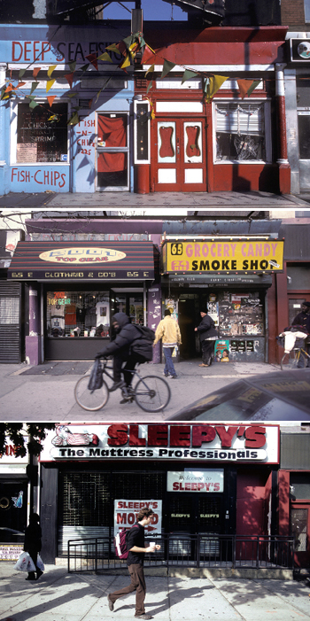
Harlem storefront, Camilo José Vergara
I think of my photographs as bricks which when placed next to each other give shape and meaning to a place. I see the images of neighborhoods arranged according to time and location, linking the hundreds of stories that are a place’s history. This is the way photographs can tell how Harlem evolved and what it gained and lost in the process.
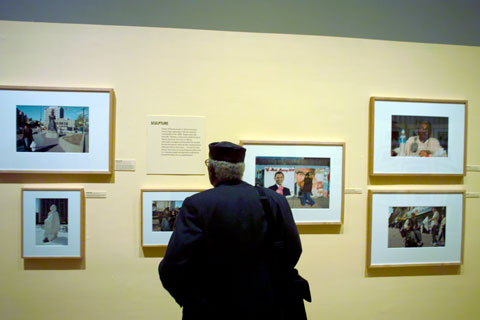
Vergara exhibition -- © Brian Rose
Vergara admits that he comes from the street/documentary photography aesthetic (Bresson, Levitt, Evans, etc.), but he insists that his work not be regarded as art photography, rather a sort of photographic sociology or anthroplogy. What I would like to see, however—regardless of where one places Vergara’s brand of photography—is a more rigorous approach to the medium. Most of the pictures have been made with small cameras despite his interest in architecture and landscape. The graininess undercuts the intention to convey information and detail, and many of the compositions of static subjects seem unnecessarily slap dash, made on the run.
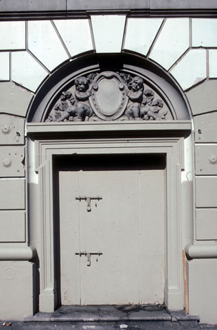
Harlem door, Camilo José Vergara
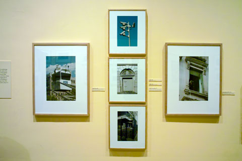
Vergara exhibition -- © Brian Rose
The image grouping above is meant to illustrate the encroachment of security and surveillance in the public realm. In this case, Harlem. Vergara gives us a close-up view of one of NYPDs mobile observation towers, a metal door with padlocks, a menacing dog in a window, a close-up of a pole festooned with video cameras, and a high gated turnstile similar to those seen in subway stations all over the city.
This is photography as show and tell.
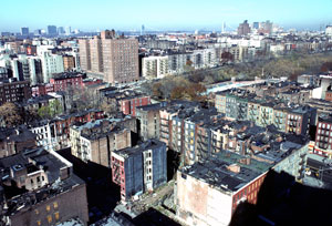
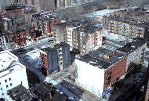
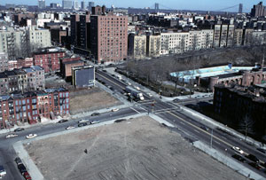
Harlem panorama, Camilo José Vegara
For me, the most interesting pictures are the panoramas taken over a number of years. Seeing the way in which blocks change--either losing buildings or gaining new ones--sometimes the changes are very subtle.
Wednesday, June 03, 2009
New York/Morning Musings
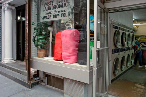
Sullivan Street
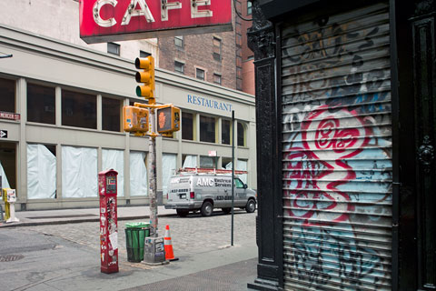
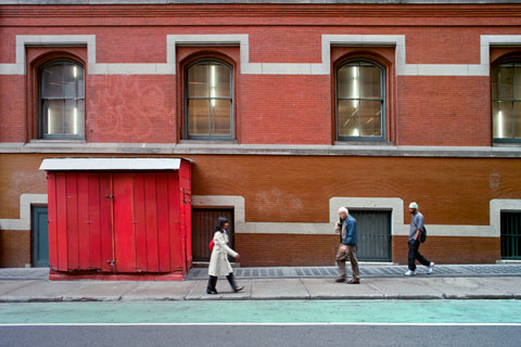
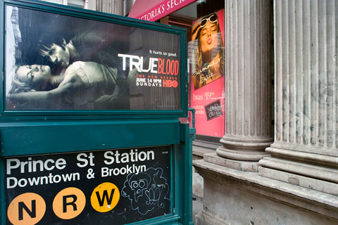
My morning ritual during the week consists of taking my son to school on the subway, walking 25 minutes across town through Soho, reading the paper at a cafe on Prince Street near the Bowery, and hitting my desk about 9:30am.
My practice of reading the New York Times, however, may have to end because the Times in its infinite wisdom has, in the midst of a deep recession, just raised the newsstand price of the daily paper from $1.50 to $2.00 (and the Sunday Times from $4 to $6).
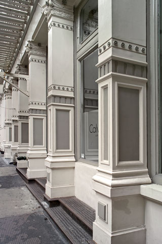
Prince Street
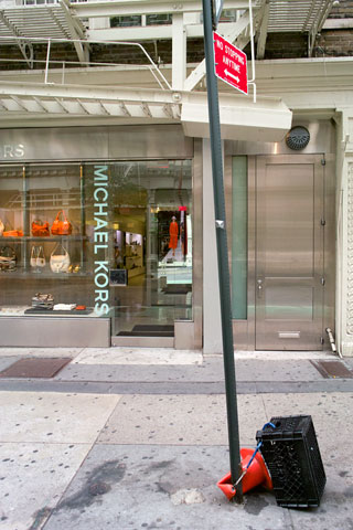
Prince Street
One used to see the Times read on the subways, but I haven't seen one in a long time. People clutch their iPods, cell phones, and other devices--and the ubiquitous free papers are handed out at the subway entrances and lie strewn about everywhere. A surprising number of people continue to read books on the train, gripping their paperbacks in one hand while holding onto a pole with the other. But the unique New Yorker's skill of folding the Times lengthwise making it manageable to read while standing on a swaying subway train has been lost.
Mercer Street
Prince Street
I've seen a number of Kindles, the new electronic reader from Amazon, and I expect to see more if and when the price of the hardware comes down. The newspaper can be read on these, and maybe this and other such devices will save the Times. But I wouldn't bet on it. The regional newspapers will die off first--they're already beginning to. As anyone reading this or any blog knows, there are now a multitude of different sources of news and information, but I don't see the Times, and the other big institutions acting nimbly in the face of rapid climate change. It's not just about the business model--it's content as well.
Prince Street
When I was 12 years old living in Williamsburg, Virginia, I used to come home each Sunday after church lugging a fat out-of-town newspaper--usually the Times--bought at the local drugstore. It was my portal to the world outside. For most of my life I have read the morning paper while sipping a cup of coffee. It is a simple pleasure, tactile and aromatic, one that I indulged in even during the leanest years. Until, perhaps, now.
Tuesday, June 02, 2009
Monday, June 01, 2009
New York/WTC imagery
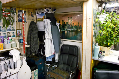
Astor Hair Stylist, Astor Place -- © Brian Rose
It's been more than 7 years since the World Trade Center attack, but images of the Twin Towers remain present in the city, if not ubiquitous. These are generally pictures of the towers before 9/11. Fortunately, at least for me, graphic images of the collapsing and burning buildings are rare.
