Wednesday, September 30, 2009
Tuesday, September 29, 2009
Sunday, September 27, 2009
New York/Nature as Artifice

Nature as Artifice, Aperture Gallery -- © Brian Rose
Not since they established the city of Nieuw Amsterdam in the 17th century have the Dutch been such a presence in the city as now. Everywhere one turns there is yet another event tied to the 400th anniversary of the arrival of Henry Hudson, an Englishman hired by the Dutch, to these shores. We have long known that many of our local names are derived from the Dutch—Brooklyn, Harlem, Tribeca—no that’s a joke, Tribeca is the Indian name for triangle below Canal.
But never have we been reminded so often and so well of our Dutch heritage. Had it not been for present day Dutch promotional savvy, we would probably have missed the whole 400th anniversary thing. Or we’d have been stuck with celebrating on our own terms, which certainly would not have involved major cultural events and exhibitions.
Were the United States to remind the English of our common heritage by unilaterally staging an official series of arts events in London, it would be regarded as an act of cultural imperialism, rightly so. But New Yorkers are pretty confident of their place in the grand scheme of things—center of the universe as we know it—so a little cultural hubris on the part of the Dutch is not necessarily unwelcome. The city has rolled out the red carpet, with the mayor pointing out, in this election year, that none of it has cost the city a red cent, much less $24 in beads and trinkets.
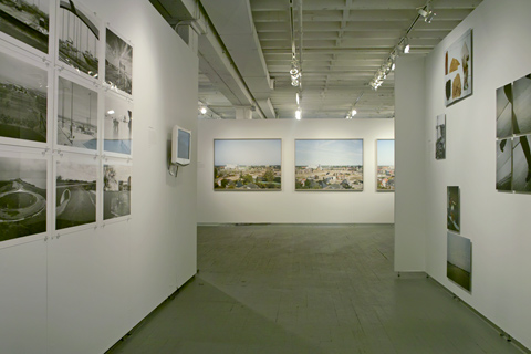
Nature as Artifice, Aperture Gallery -- © Brian Rose
Which brings me, belatedly, to the topic of this post—an exhibition at Aperture Gallery, Nature as Artifice: New Dutch Landscape in Photography and Video Art. This is the second major show this year featuring Dutch photographers. The first, at the Museum of the City of New York, focused on New York as seen by the Dutch. In this exhibit, the Dutch look at their own landscape, historically one of the most engineered patches of ground on earth.
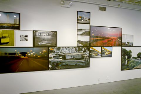
Snelweg, Theo Baart and Cary Markerink -- © Brian Rose
Having lived in the Netherlands for about 15 years, I was familiar with some of the photographers in the show. One wall of the gallery was devoted to a tour de force project called Snelweg (freeway), the work of Cary Markerink & Theo Baart. Snelweg presents the highway as both the connective tissue of suburbanization and as a place in itself. The pictures, made in various formats and sizes collaged together, looks great on the wall, but made for an even better book. Here’s a description by the photographers from the George Eastman House blog:
Since the Dutch prefer to look at “high culture” rather then reflect upon the “low culture” – the suburban landscape – it was difficult to find funding for our project. It forced us to take the lead. We subsequently became the producers, photographers, publishers and designers of the project. For the publication we had in mind we invited the American-born Dutch writer Tracy Metz who contributed an elaborate essay on the phenomena of the Dutch Highway. When designing the photo-book we choose a linear form. We had photographed in a mix of styles – using a variety of cameras and film – reflecting on the changes that had occurred in landscape-photography since the seventies. Every spread of the book was different; we used gatefolds, grids, full-bleed pages and included a typographical landscape as a double-gatefold, using the names of underpasses which in the Netherlands are called after the historical locations present before the highway was constructed there.
Although Snelweg depicts the freeway in the intensely used Dutch context, it’s really a universal theme, and applies to the motorway landscape of western Europe and the urbanized parts of the United States. It could have been the starting point for a different exhibition looking at connectivity and mobility as inhabited space not simply as the bare bones of infrastructure.
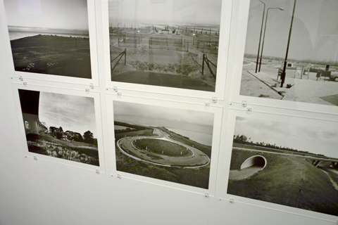
Jannes Linders photographs -- © Brian Rose
The rest of Nature as Artifice presents less complete slices of the Dutch landscape with some photographers well represented, others harder to get a handle on. Jannes Linders, one of my favorite Dutch photographers—largely unknown in the U.S.—is shown in a grid of large format black and white prints. These quiet, mostly emptied out vistas, deserve more wall space. They show a basic fact of the Dutch landscape, that while virtually every parcel of land is designated for use, much of the country retains its 17th century horizontal aspect punctuated by spires, windmills, and newer urban fixtures. What sets Linders apart is that he invests this often banal landscape with a poetic, though somber, quality that—from my experience—lies at the heart of Dutch society.
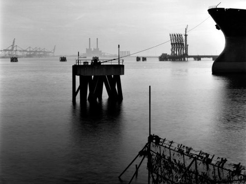
Photo by Jannes Linders
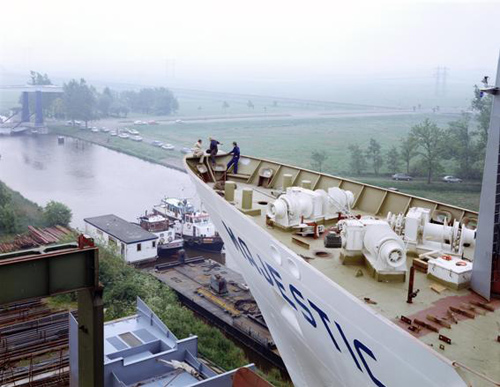
Photo by Hans Aarsman
As an outsider in the Netherlands I found the Dutch frequently inscrutable, insular. That’s how I feel about Hans Aarsman’s photographs. When I first arrived in the Netherlands his book of photos taken from the roof of an RV while traveling the country was something of a popular sensation for what was basically art photography. I never connected with the pictures, but obviously the Dutch recognized something essential about themselves in the mirror of his camera. In any case, I don’t think he is well served by showing poorly printed 4x5 contact prints to Americans unfamiliar with his photographs.
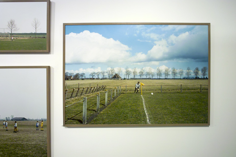
Hans van der Meer photographs -- © Brian Rose
Two other photographers I’d like to spotlight here are Wout Berger and Hans van der Meer. The latter has for years been photographing small time soccer fields in the Netherlands and all over Europe. While his pictures capture moments of play, they are equally about the surrounding landscapes, and express how integral the game is to Dutch society—and much of the world. I have always loved these pictures. Three, shown in this exhibition is not enough.
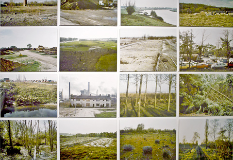
Poisoned Landscape by Wout Berger -- © Brian Rose
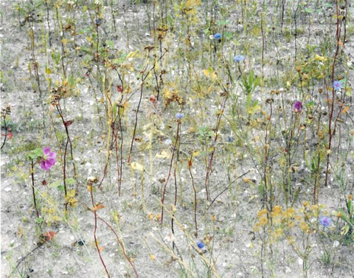
Photograph by Wout Berger
Wout Berger is another brilliant Dutch photographer perhaps not adequately shown in Nature as Artifice. His photographs of polluted wasteland around the Netherlands are interesting—despite murky looking prints—but his more recent work, often made just looking down at the ground a few feet in front of him, find the infinite in the finite. His book, Like Birds, which is on sale at Aperture Gallery, is beautiful.
What’s missing from this exhibition, speaking from a not entirely disinterested perspective (see my own pictures of the periphery of Amsterdam), are images of the new neighborhoods, the utopian architecture, the supreme expressions of the planners and architects whose visions of the future have been implemented in the Netherlands to an extent unique in the world. There are glimpses of it in Nature as Artifice, but just as the cityscape of New York was missing from Dutch Seen at the Museum of the City of New York, significant aspects of the Dutch landscape are largely absent in this, nevertheless, worthwhile show at Aperture.
Have this group photograph New York? Now that would have been interesting.
Saturday, September 26, 2009
Thursday, September 24, 2009
New York/Blurb Party
Blurb party in Tribeca
Last night I went to the Blurb party in New York. That's me at the beginning of the video above taken from Darius Himes's blog. Blurb as many of you probably know is an online service with tools for creating your own book, uploading it, and having it printed at very good quality at an affordable price. I've been using Blurb to create presentations of my work.
For the second year Blurb has sponsored a contest called Photography.Book.Now in which photo books are judged on content and design. Darius Himes, editor and book publishing maven, was the head of the contest jury. I decided, at the last minute, to submit my Berlin book dummy to the contest, which I am pleased to say won an honorable mention. Where things go with this book I don't know. It employs a number of photographs from my Lost Border book, but focuses specifically on Berlin, and 2/3 of the images have never been shown elsewhere.
You can preview the book on Blurb's website here.
The party was held in a space in Tribeca with beautiful views of the city. The winning books were liberally sprinkled about on tables and a continuous shelf running along the windows. After the awards ceremony most of us went to the roof terrace where there were more books. In the video I'm standing at a long table looking through a book and talking to the photographer who made it.
I didn't know a lot of people at the event, but chatted with a few I recognized--Vince Aletti, photo critic for the New Yorker, the grand prize winner Rafal Milach who did a wonderful book, Phil Block who runs the education department at ICP, and a number of photographers with their books whose names I cannot conjure up. It was an enjoyable evening.
Wednesday, September 23, 2009
Monday, September 21, 2009
New York/Princeton
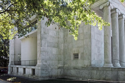
Whig Hall, Princeton University -- © Brian Rose
Charles Gwathmey, who died a short time ago, became the quintessential establishment architect. In the wake of less than stellar projects like the Sculpture for Living at Astor Place and the US mission to the United Nations, it is easy to forget that he, and his compatriots, the New York Five, once represented the architectural avant garde.
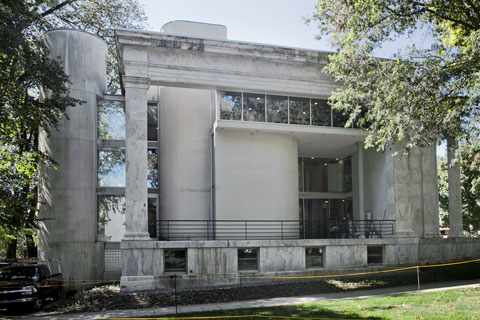
Whig Hall, Princeton University -- © Brian Rose
On Saturday I photographed one of Gwathmey's early projects, a modernist intervention into a late 19th century temple-like structure housing a debating club on the Princeton campus. A fire in 1969 left a gutted marble columned shell, and an opportunity for the young firm of Gwathmey-Siegel. One wall of the building was opened up and a deceptively simple composition of shapes arranged on a plan of nine squares was, seemingly, slid in. It was a magical demonstration of architectural sleight of hand.
My assignment was to photograph recent renovations and adaptations to the nearly forty year old interior. While there I made some quick snapshots of the exterior--virtually unchanged in the renovation. The original appearance of the interior spaces has been largely retained with blond wood elements inserted by the preservation architects Farewell Mills and Gatsch.
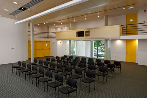
Whig Hall, renovated interior -- © Brian Rose
Gwathmey's design shows great restraint, in part necessitated by the requirement to maintain the esthetic unity of the original classical building. It gives testimony to the relationship between the precepts of classicism and modernism, something wholly unappreciated by the likes of Tom Wolfe who lambasted Gwathmey and his fellow "whites" in his essay From Bauhaus to Our House. After the success of Whig Hall and his brilliant houses on Long Island, Gwathmey chose to pursue an ambitious commercial career with the compromises and pitfalls inherent in such an undertaking.
But the integrity of these, often small, early projects, remains undiminished.
Thursday, September 17, 2009
New York/Museum of the City of NY
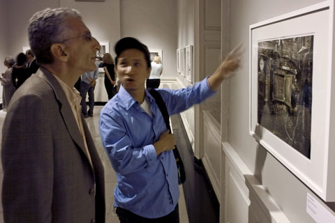
John Bartelstone and Ben Diep -- © Brian Rose
I've been to a couple of openings--one, a group show, at Aperture Gallery on Dutch landscape photography, and another, photographs of New York's waterfront by Len Jenshel and Diane Cook. Both exhibits are worth writing about, so stay tuned for some comment once I've had a chance to revisit the shows.
I ran into photographer John Bartelstone, and Ben Diep, one of the best color printers around at the Jenshel/Cook opening at the Museum of the City of New York. Ben, gesturing above, is trying to figure out whether these are analogue C-prints or digital C's from scans.
Monday, September 14, 2009
Friday, September 11, 2009
Thursday, September 10, 2009
New York/David Goldblatt
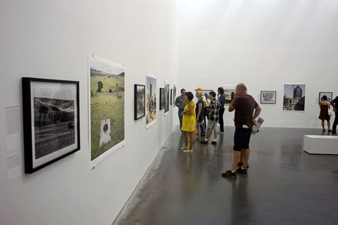
David Goldblatt exhibition at the New Museum -- © Brian Rose
After seeing the David Goldblatt show (Intersections Intersected) at the New Museum a couple of weeks ago, I struggled with a response. Despite the fact that his work is widely known, his photographs of apartheid era South Africa and its subsequent aftermath had never made a strong impression on me—probably my own lack of attention—or so I assumed. Nevertheless, I left the museum feeling ambivalent about Goldblatt’s admirably ambitious life’s work. I went back a few days ago with some friends who had just returned from a trip to South Africa, and gave the exhibition a second look.
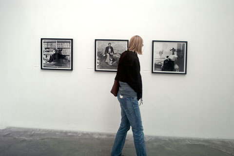
David Goldblatt black and white prints -- © Brian Rose
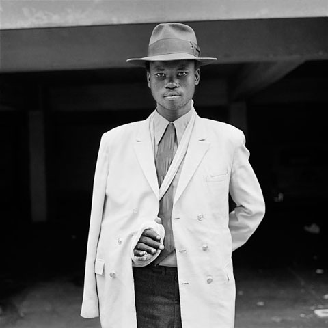
Photograph by David Goldblatt
As hard as the exhibition tries, I don’t find the attempt to connect the B&W and color work particularly fruitful. Like it or not, the jump to color represents a major break in Goldblatt’s way of seeing. The earlier work is often square format, engaged with people, and more journalistic—though always understated—the images have great intensity, richly printed. The color view camera work opens things up greatly, widens the view, pulls the photographer back, allows for smaller scale moments across a larger scale frame.
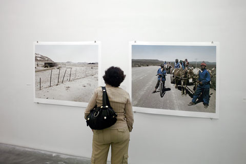
Goldblatt color prints -- © Brian Rose
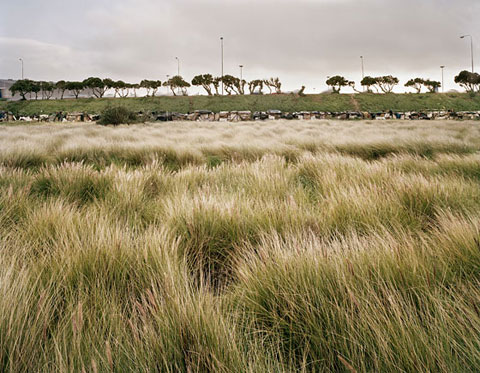
Photograph by David Goldblatt
(One of my favorites, it is a richly layered image--swaying grasses, a line of shacks, a highway with blurred cars, a line of trees against the sky.)
As a landscape photographer making images overlaid with cultural/political issues, I am sympathetic to Goldblatt’s concerns–I almost wrote mission—and that is where my problem with his work resides. Despite the inclusive taking-it-all-in appearance of the large color images, the offhandedness of the images is belied by a relentless intentionality. It is not that they are overtly polemical—but I have the sense that each image comes with implicit annotations and directions.
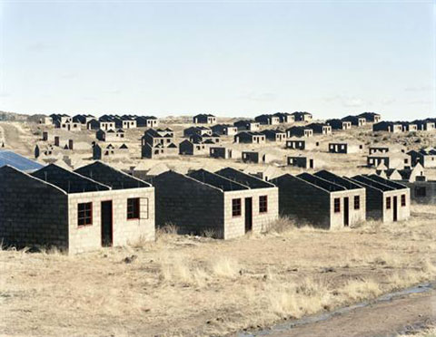
Photograph by David Goldblatt
I am distinctly in the minority in saying this. Most reviewers of Goldblatt’s color work say something close to the opposite--that the great merit of the photographs is the way in which they depict ordinary reality—quotidian—the word employed by New Museum curator Joseph Gergel. Most of the photography I admire fits the description of Goldblatt’s work—but… There is something else about that work that misses for me.
Text from an earlier exhibtion at Huis Marseilles in Amsterdam:
Until a few years ago Goldblatt’s ‘personal’ work was exclusively in black and white, for with colour he could not express his rage, revulsion and fear of the ideology of apartheid. Moreover, during that period he had found the technical expressive possibilities of colour photography to be limited: for example, colour transparency films had not enough latitude, colour negatives displayed colour casts, and he did not have sufficient control over prints made on PE paper. The beginning of a new political and social era after the abolition of apartheid occurred almost synchronously with far-reaching developments in digital printing techniques. At this point Goldblatt felt the need to expand his choice of subject and form of expression. A new generation of colour films and the remarkable control of contrast and colour saturation enabled by digital reproduction have made that possible for him.
Goldblatt shoots his photographs on colour film and then edits the negatives in the computer. Working together with his master printer Tony Meintjes, he only makes changes that could be done in a darkroom – he never uses the computer to alter the contents of an image. The prints are extremely sophisticated inkjet prints on aquarelle paper. He strives for a colour rendering which corresponds as closely as possible to his perception of colour in the reality of the harsh South African sunlight. High contrasts, unsaturated, neutral colours and at the same time a broad range of tone and hue give each print an unprecedented, pinpoint sharp graphic quality in which each detail is visible.
Those of us who began working in color at an early date came to the medium with few prejudices about the inherent meaning of color. I remember arguing once with another photographer who was struggling with the move to color, that blue skies were not too cheerful to me, they were simply blue. It never occurred to me that a rich colorful rendering of the world around me might lack seriousness or emotional weight.
The film and c-print material I began to use in 1978 produced beautiful results (though vintage prints have yellowed over the years), and I worked directly with negatives in the darkroom until a few years ago when it became possible to scan, Photoshop, and produce digital prints, as Goldblatt and most other color photographers do now. Photographers like Joel Meyerowitz, Joel Sternfeld, Stephen Shore, and Richard Mirsrach all printed much of the work they are best known for in the conventional darkroom.
Much of the language in the quote above attempts to give Goldblatt’s decision to move to color prints a unique credibility, even drama—the abolition of apartheid and synchronously far-reaching developments in digital photography…extremely sophisticated inkjet prints…unprecedented, pinpoint sharp graphic quality…his perception of colour in the reality of the harsh South African sunlight.
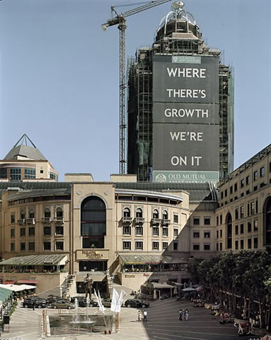
Photograph by David Goldblatt
As I looked longer at the color prints in the New Museum I realized that much of my problem with the work originated with decisions made in Photoshop—specifically the high contrast seen in most of the prints, and the attenuation of the color palette in the lightest and darkest areas of the prints. Shadows, for instance, in nature rarely appear without color. They tend to be bluish in warm daylight, but can contain and reflect the colors in them and around them. In most of Goldblatt’s prints, the shadows have been greatly desaturated.
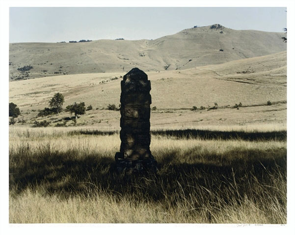
Photograph by David Goldblatt
The same goes for the highlights, particularly the grasses where a whitish/yellowish cast blinds the eye—which I believe was the intention—to express the South African light--but in fact, in my view, is an over-interpretation. In the end, I found the prints harsh and brittle, and sapped of life. Digitized. Whatever the justifications, this does a disservice to the images, and stands in the way, at least for me, of a fuller appreciation of Goldblatt’s achievement.
Go here for a different perspective.
Wednesday, September 09, 2009
Tuesday, September 08, 2009
Friday, September 04, 2009
New York/The Bowery
Below are 4x5 film versions of two previously posted images. The first shows the ongoing construction/destruction of the Bowery. The second shows the Cooper Square Hotel and Cooper Union building where the Bowery turns into Third Avenue above E4th Street.

The Bowery between Houston and Stanton Street (4x5 film) -- © Brian Rose
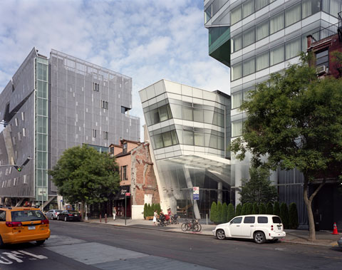
Third Avenue and Cooper Square (4x5 film) -- © Brian Rose

The Bowery between Houston and Stanton Street (4x5 film) -- © Brian Rose

Third Avenue and Cooper Square (4x5 film) -- © Brian Rose
Thursday, September 03, 2009
New York/Coney Island
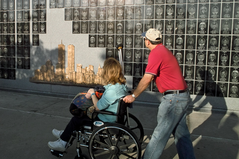
WTC memorial at KeySpan Park in Coney Island -- © Brian Rose
Got invited to a minor league baseball game--the Brooklyn Cyclones--who play at KeySpan Park located near the boardwalk, just beneath the landmarked parachute jump, with the Cyclone roller coaster visible beyond the scoreboard in left field.
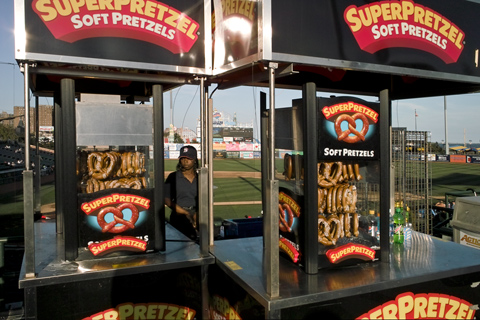
KeySpan Park, Coney Island -- © Brian Rose
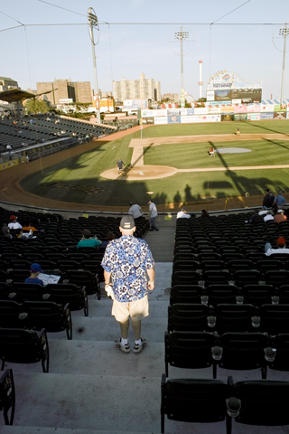
KeySpan Park, Coney Island -- © Brian Rose
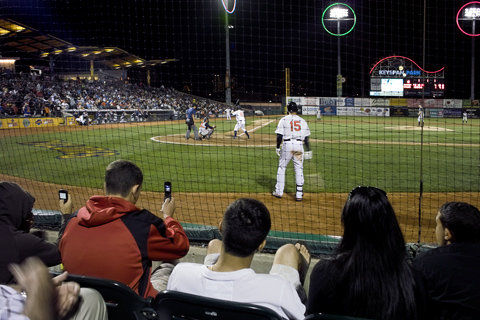
Carlos Beltran, #15, on deck -- © Brian Rose
Big crowd on hand as word had gotten out that Carlos Beltran, the injured Mets all star centerfielder, would be emerging from rehab to play with the Cyclones. He went 1 for 3 with a walk and single. Hit a line drive to the warning track that was caught, got picked off at first base (bad call by the ump), and struck out awkwardly in his last at bat. Read more here.
Tuesday, September 01, 2009
New York/Trenton
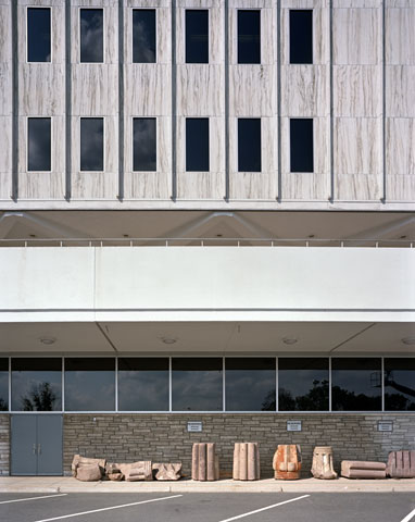
New Jersey State Museum, Trenton, New Jersey
(4x5 film) -- © Brian Rose
An outtake from my recent architectural shoot in Trenton. After completing a series of interiors, I wandered around the back of the museum to the loading dock and parking lot. A row of stone columns were lined up on against the building. The signs read "Reserved -- Museum Trustee."
