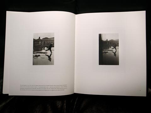
From Henri Cartier-Bresson’s Scrap Book, Thames & Hudson
An interesting print in the Cartier-Bresson exhibit at ICP shows an uncropped version of the famous photo (behind St. Lazare station) in which a man leaps across a pool of water, his foot a millimeter from touching the surface with his image mirrored in it. The ICP print allows one to see how the original image was partially obscured by a fence, a fault that Cartier-Bresson immediately “corrected” by cropping in along the left side and bottom, keeping the 35mm format intact.
Cartier-Bresson, perhaps, is the photographer who originated the idea of filling the frame as determined by the camera, in his case, a Leica 35mm rangefinder. Before him, most photographers thought primarily about the finished print, which might convey an image of any proportion, manipulated in any number of ways–still a legitmate way of thinking. But for Cartier-Bresson, the 35mm frame was the image, not something to be made later. The precise geometry of his pictures, the relationship between foreground and background, and the placement and attitude of people all were played out across the frame. He worked, generally, with one fixed focal length lens. No zoom. Either the image worked as is, or it did not.
Many photographers have followed Cartier-Bresson’s example, such as Robert Frank, Helen Levitt, Lee Friedlander, Garry Winogrand, and William Eggleston–the pantheon of what is known as street photography. This aesthetic has influenced those of us who use view cameras as well. I rarely crop the 4×5 frame, and try to make the image happen in the camera as much as possible. I know, however, that with such a large piece of film, there is more latitude available for cropping. For me, that means that when shooting in the field, I sometimes keep the edges loose, with the idea of pulling in slightly when scanning or making a print later. But I still walk around with two commandments in my head: fill the frame, and move in closer. I adhere pretty strictly to the former, but I have learned over the years the vitue of maintaining ones distance. But that’s a discussion for another time.
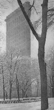
When I was a student I wrote a report on Alfred Stieglitz, who for a while captivated me. I was chiefly interested in his urban images, especially the views from out his gallery window on the skyline of New York. One famous image of his shows the Flatiron Building at 23rd and 5th Avenue in the snow, a y-shaped split in a tree intersecting the prow of the building. It’s an extreme vertical image focused on the moment of this intersection. It’s obvious that the image was cropped. No camera that Stieglitz used would have created this proportion. Stiegltitz’s final cropping has always been considered the definitive version of that image.

The Flatiron Building,
Alfred Stieglitz
While researching my paper, I traveled down to the National Gallery in Washington, D.C., and went through their extensive collection of Stieglitz prints. What I found, along with the usual narrowly vertical print, was an uncropped Flatiron image showing more of the pathway and benches of Madison Square Park and more sky around the building. I’ve never seen this print exhibited or published, and I do not know whether Stieglitz ever commented about the existence of the full frame version. To my eye–perhaps conditioned by Cartier-Bresson’s dictim of filling the frame, or Walker Evans’ example, which allowed for anecdotal details to register without necessarily focusing on them–I found the uncropped Flatiron image less willfully artful, and therefore, better than the Stieglitz final. At least that’s how I remember it. I wish I could show it here, but as far as I know the only existing image lies in a flat file in the photography department of the National Gallery.
Pingback: To crop or not to crop? | the little photo blog