Delancey Street and Ludlow (digital)
© Brian Rose
As an architectural photographer, it is my job, to make buildings look good, and to elevate the work of the architect who designed them. That does not mean that I have to like everything I photograph. I understand better than most, how decent designs get crushed by value engineering and cost cutting. Mediocre buildings are not always first and foremost the fault of architects. Developers, builders, engineers, planners, municipal agencies, nimby activists, all can contribute to the watering down of design, even to the point of creating a bad building.

Delancey Street and Ludlow (digital)
© Brian Rose
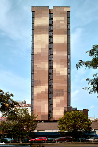
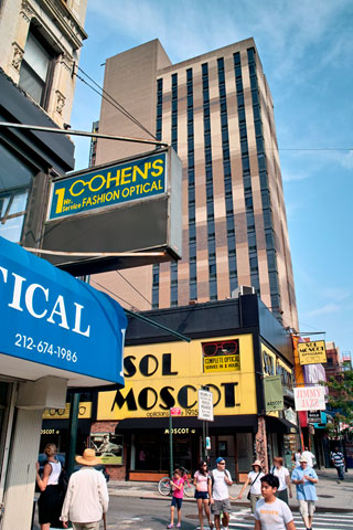
So, I have no idea what the hell went wrong here, but I know bad when I see it. This deadening brick tower evokes a 1960s government office building in the downtown of a small regional city. Windows are apparently an expensive amenity to be avoided in this bunker-like box. Narrow slits will do. The south facing facade, especially, is largely closed off to the sunlight and view of the lower Manhattan skyline.

Delancey Street and Orchard (digital)
© Brian Rose
And what to do with all the blank brick walls? I’ve seen stripes and banding, checkerboard patterns, colorful abstractions, but this is the first pixellated facade I’ve seen. Rendered in bland shades of café au lait.
And who will occupy this wonderful edifice? Why the students of SVA (the School of Visual Arts), one of New York’s premier art and design colleges. As a dormitory it will serve as an object lesson in bad design and the destruction of the urban fabric.
For the record, these are the culprits:
Developer – Charles Blaichman
Architect – Rawlings architects
Tenant – SVA
Commercial tenant – Bank of America (another branch bank!)

Orchard Street (digital)
© Brian Rose
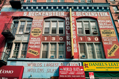
Just around the corner from the SVA bunker, a surviving piece of the old Lower East Side.