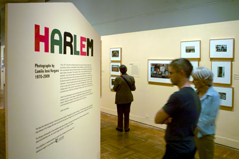
Vergara exhibition at the New York Historical Soceity — © Brian Rose
A few thoughts on seeing Harlem, Photographs by Camilo José Vergara 1970-2009 at the New York Historical Society:
This is not a photography show in the traditional sense,” Vergara says during a stroll through the New-York Historical Society gallery. “I’m really interested in issues, what replaces what, what’s the thrust of things. Photographers don’t usually get at that—they want to show you one frozen image that you find amazing. For me, the more pictures the better. (Smithsonion Magazine)
The problem is the photographs are presented as if they were stand-alones–traditional c prints matted and framed with small neatly printed text panels. Vergara’s project would be greatly enhanced by a more immersive experience.
There was one low resolution video screen tucked off to the side in which successive images of different scenes ran in a loop. Otherwise, framed prints are stacked one above the other or in groups, the bright white mattes jumping off the warmed-toned walls and taking up too much space between images. I had to bend way over to see the lowest images.
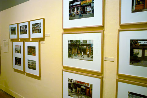
Vergara exhibition — © Brian Rose
I’m not suggesting that Vergara’s work should be presented as a multimedia three-ring circus. But I don’t understand the traditional look of the NYHS exhibit. Vergara’s website, which contains the Harlem project along with his similar documentations of Camden, New Jersey and Richmond, California attempts to be interactive and less gallery-like, but the website is yet another of these tedious flash based sites–tiny text, tiny clickable squares on contextless maps.
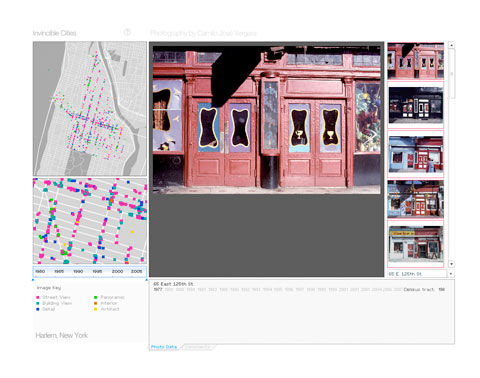
Invicible Cities, Camilo José Vergara website
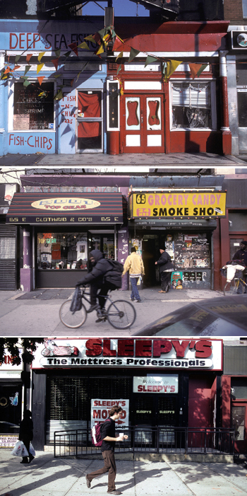
Harlem storefront, Camilo José Vergara
I think of my photographs as bricks which when placed next to each other give shape and meaning to a place. I see the images of neighborhoods arranged according to time and location, linking the hundreds of stories that are a place’s history. This is the way photographs can tell how Harlem evolved and what it gained and lost in the process.
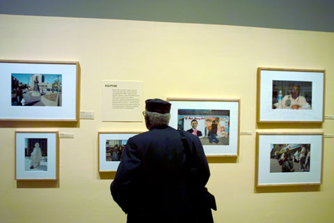
Vergara exhibition — © Brian Rose
Vergara admits that he comes from the street/documentary photography aesthetic (Bresson, Levitt, Evans, etc.), but he insists that his work not be regarded as art photography, rather a sort of photographic sociology or anthroplogy. What I would like to see, however—regardless of where one places Vergara’s brand of photography—is a more rigorous approach to the medium. Most of the pictures have been made with small cameras despite his interest in architecture and landscape. The graininess undercuts the intention to convey information and detail, and many of the compositions of static subjects seem unnecessarily slap dash, made on the run.
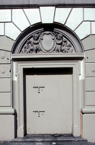
Harlem door, Camilo José Vergara
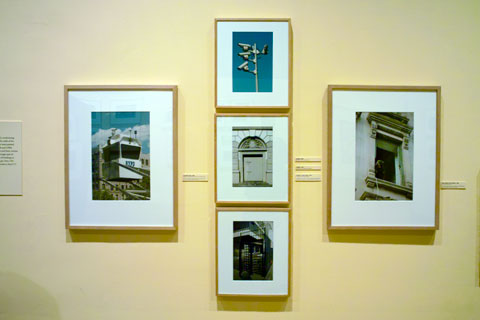
Vergara exhibition — © Brian Rose
The image grouping above is meant to illustrate the encroachment of security and surveillance in the public realm. In this case, Harlem. Vergara gives us a close-up view of one of NYPDs mobile observation towers, a metal door with padlocks, a menacing dog in a window, a close-up of a pole festooned with video cameras, and a high gated turnstile similar to those seen in subway stations all over the city.
This is photography as show and tell.
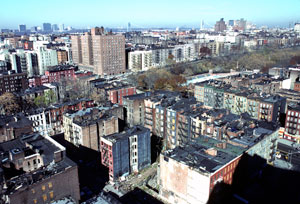
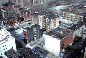
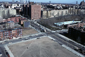
Harlem panorama, Camilo José Vegara
For me, the most interesting pictures are the panoramas taken over a number of years. Seeing the way in which blocks change–either losing buildings or gaining new ones–sometimes the changes are very subtle.