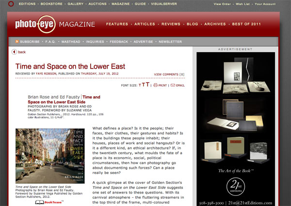
Review in Photo-Eye Magazine
After four days on the island of Texel on the coast of the Netherlands, I am now in Amsterdam. Day before yesterday we had a book party for my Dutch friends and Kickstarter backers. It took place in a beautiful house in the canal district near the Rijksmuseum, and we had at least 30 guests. The atmosphere was warm and convivial. Yesterday, we got a late start, but were able to enjoy some sterling weather (finally), and walked around the center of the city. I stopped in Architectura and Natura, one of my favorite bookstores in Amsterdam, and I am hoping to have Time and Space for sale there soon.
The review I have been waiting for just came in from Photo-Eye written by Faye Robson. Here are a few quotes:
With its carnival atmosphere – the fluttering streamers in the top third of the frame, multi-coloured buildings and cars, and the dynamically positioned boy who swings a baseball bat right into the centre of the image – the image seems to suggest a clarity of vision to match the clarity of composition.
Layering and multiplicity are watchwords for this collection; from the texts that pepper the book – ranging in subject and tone from the macro-historical to the anecdotal (the General Slocum disaster) – to the views across streets and round corners that lay bare the city grid, both its thriving and desolate spaces.
Despite its title, the book cannot even be read in a straightforwardly chronological manner. The photographs are divided fairly evenly between those taken in 1980, in collaboration with Ed Fausty, and images made in 2010 by Rose alone. However, the structure of the book thwarts attempts to compare and contrast the two sets of images either formally or with respect to the neighbourhood they document.
That Rose decided to use a view camera for this project reveals a great deal about his approach – these clear, sharp, detailed images present more visual information than the eye can take in. They are a view across time and space, beyond the merely human perspective. This complex and handsomely-presented project is a portrait, or map, of a place, which challenges our assumptions about urban street photography.
This is an in depth review–the first one to really dig into what the book is about, and I am very pleased with it. Read the whole thing here.
