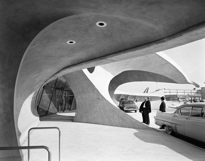
TWA Terminal, photograph by Ezra Stoller
A lot has been written in recent years about the pernicious effect of Photoshop on fashion photography and photojournalism. In fashion the discussion has focused on body types and the digital air brushing of unwanted (presumably unsightly) details. In photojournalism, controversy abounds, and the contest held by World Press Photo has instituted a code of ethics with specific restrictions on manipulation and captioning. Reuters recently announced that it was requiring all its photographers to submit jpegs instead of RAW image files because the latter, essentially digital negatives, offer greater opportunity to manipulate the images.
“As eyewitness accounts of events covered by dedicated and responsible journalists, Reuters Pictures must reflect reality. While we aim for photography of the highest aesthetic quality, our goal is not to artistically interpret the news.”
Mmm. Kind of calls into question the entire profession, if you ask me. I’m not sure what the difference is between highest aesthetic quality and artistically interpreting the news. Whatever the case, it is clear that we have a drastically changed photographic landscape where fine art photographers are encouraged to construct and manipulate images, while photojournalists are reprimanded for touching even a single pixel. Meanwhile, documentarists operate in a hybrid zone, often placing themselves squarely in the middle of the visual exploration of place or situation, sometimes manipulating reality to better express “truth.”
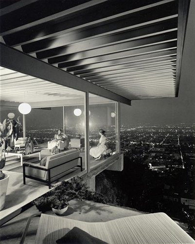
Stahl House, photograph by Julius Shulman
Which brings me to architectural photography, a small niche in the professional photography world, but overlapping with those who generally photograph the built environment — certainly my area of concern. Architectural photography has almost always been about idealization, certainly going back to Ezra Stoller and Julius Shulman whose black and white distillations of modern architecture defined the aesthetic. There was lots of staging of people and objects, and time of day and weather were not left to chance.
Staging, however, has been joined by digital manipulation, which is not just common, it has become de rigueur. Clients routinely instruct photographers to remove undesired objects, wires, appendages, background distractions, you name it. I had a client a few years ago who was unhappy with the quality of the stucco work on his building and he told me to “Photoshop the hell out of it” to make it look more like the rendering. The image became reality on steroids.
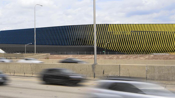

El Centro building, Chicago, Illinois
Air conditioning units edited out above, an undoctored photo below.
Blair Kamin, the esteemed architectural critic for the Chicago Tribune recently called into question the awarding of an architectural prize given to a building based, primarily, on the submission of photographs seen by the jury. It seems that large, visually distracting, air handling units on the roof had been removed from the pictures. The result was the depiction of a building that expressed the architects intentions, but not exactly the reality on the ground.
The fact is, when it comes to images, there is almost no architectural equivalent to photojournalism. Architects hire photographers, the images are manipulated as desired, and then the architects submit the pictures to magazines and contests, and show them to prospective clients. No one in this sequence of events ever suggests that there is a context to be considered outside this closed loop.
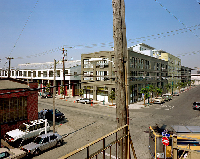 Elofts, David Baker Architects, Emeryville, California — © Brian Rose
Gritty industrial neighborhood.
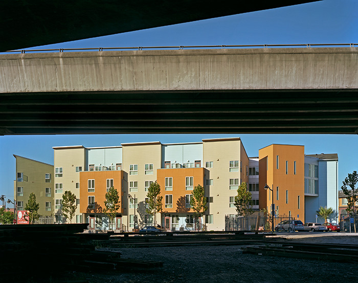
Crescent Cove, David Baker Architects, San Francisco, California — © Brian Rose
Elevated highway adjacent to the project.
Different architects have different perspectives, of course, and different aesthetic intentions. One client who I have worked for many times, David Baker, based in San Francisco, designs his buildings to integrate, or create a dialogue with, the urban fabric. Even if the architectural vocabulary takes on modernist forms that contrast with the surroundings, the tension thus produced is actively addressed. He has given me a free hand to find images of his projects that show that relationship, even when it is jarring or uncomfortable. Many architects, however, prefer to see their buildings purely as abstract art objects, and choose images that tend to edit out the real world. The architectural press generally goes along regardless of the degree of fiction put forward.
That’s not to say there isn’t a legitimate place for photographs that express the pure design elements of architecture. We’ve all seen — or even made ourselves — beautiful images that are reductive compositions, that express the geometry and formal elements of architecture, intentionally leaving out the extraneous details of the prosaic world beyond. That is a kind of reality, as well.
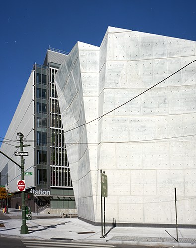
Salt Shed, New York, NY — © Brian Rose
Photoshop out the wires and foreground signs? Or not?
But I think things have gone too far, and for too long. Aside from a handful of newspaper critics, and a few independent writers, most of the architectural press is about commercial promotion. Digitally enhanced photographs and hyper-real computer renderings are an intrinsic part of that food chain. We all have to pay the bills. But as a photographer — and an artist concerned with the landscape as I find it — God (or is it the devil?) is in the details of a messy world.