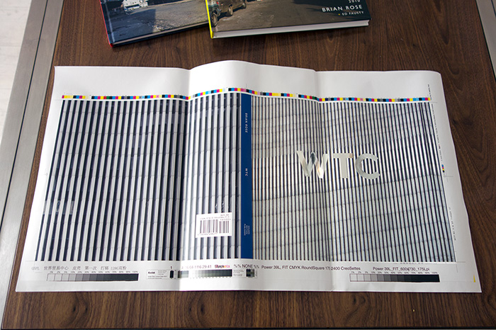
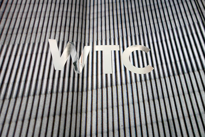
I’ve been showing a cover mockup for WTC that has dull gray lettering — looks good, but not inspiring. Yesterday, we got the cover proof with silver foil stamped onto a matte background. The result is, in my opinion, stunning. The letters WTC appear almost to float in air.

Cover proof — © Brian Rose
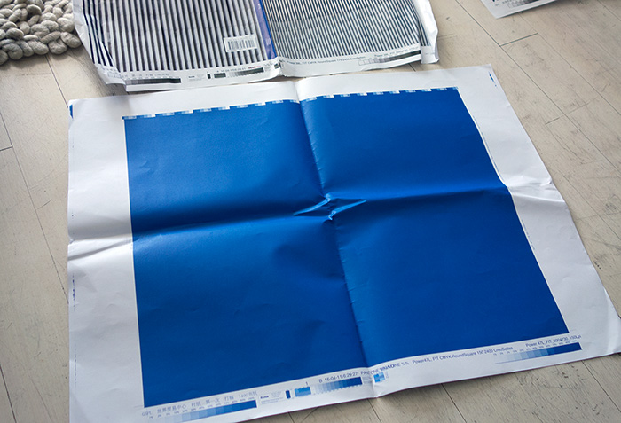
The rear cover will have another of the images from my WTC Frieze, comprised of close-ups of the steel piping of the Twin Towers’ skin. The spine of the book will be blue — a somewhat brighter blue than shown above — as will the endpapers inside the cover. The correct blue can be seen below.
The final cover design is something I’ve been playing with in recent years as the overall concept of the book came together. When I would talk to publishing people, they would almost always say, it looks nice, but of course, we’ll need a regular photograph on the cover. My artist and photography friends told me to stick to my guns.
Help make that decision the right one. Please support my Kickstarter campaign.

