Cooper Union/Zero Hour

studentshow
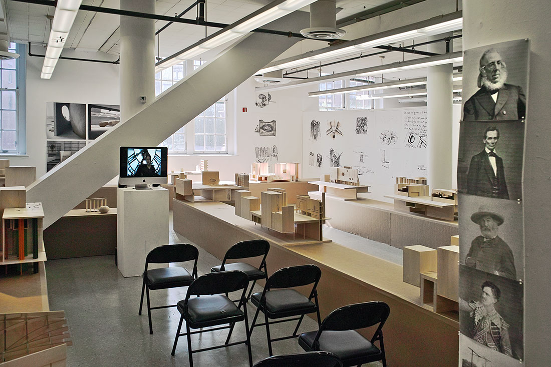
Recent student show in the architecture school — © Brian Rose
Portraits at right: Peter Cooper, Abraham Lincoln, Walt Whitman, Junius Brutus Booth (celebrated actor and father of John Wilkes Booth)

It is zero hour at Cooper Union.

Peter Cooper’s mission discarded:
Just two years ago, chairman of the board of trustees, Mark Epstein, announced that Cooper would cease being tuition free — for the first time in the school’s 156 year history — and Jamshed Bharucha, the recently installed president, was tasked with the “reinvention” of the school. The financial crisis that led to the imposition of tuition was caused by mismanagement, incompetency, and possible criminality, on the part of the board and the administration. The construction of the New Academic Building, among many other miscalculations, saddled the school with staggering debt. When questioned about the financial condition of the school, chairman of the board Epstein, showing stunningly poor leadership, blamed the alumni for not giving enough.

Students occupied the president’s office for weeks, only leaving when it was agreed that a working group would examine the school’s finances and propose a way to avoid tuition. The working group proposed a budget that called for sacrifice from everyone, and included greatly reducing Cooper’s bloated administrative costs. That proposal was rejected by the board of trustees, who seemingly did not understand the ramifications of their decision.

Death spiral:
The Cooper Union community, students, faculty, alumni, and others, remained steadfastly opposed to the reinvention of the school, which, aside from tuition, involved creating new revenue generating programs. A carefully researched lawsuit, enumerating past abuses, and accusing the board of violating the charter of the school, was brought to trial with a decision from the judge still pending. The alumni association was marginalized by President Bharucha, kicked out of its office on campus, denied access to its electronic mailing list, and for a time, not permitted to meet on campus.

The imposition of tuition immediately affected the school’s ability to attract the quality of students who had applied in the past. Admissions numbers plummeted. Prospective students began choosing other colleges over Cooper, some offering better financial incentives, and many offering far better amenities — factors that were not part of the equation before.

The administration and board lurched from one bad decision to another, at one point hiring the firm of Bo Dietl, a right wing blowhard, to take over the security of the campus, which included body guards for the increasingly paranoid president. Recently, the administration announced that it would begin charging for academic credits above a certain threshold — essentially a stealth increase in tuition. Confronted with protest, they withdrew the plan.

The Attorney General steps in:
Due to the lawsuit and the continued pressure put on by the Cooper community, the New York State Attorney General Eric Scheiderman began an investigation of Cooper Union, now teetering perilously on the brink. Members of the board of trustees began leaking misinformation to the press — most prominently, Daniel Libeskind and Francois de Menil — and the Murdoch-owned Wall Street Journal, in the process, further lowered its journalistic standards. In recent days, President Bharucha and his chief academic officer, Teresa Dahlberg have vanished from campus, and we now wait breathlessly for the next shoe to drop.

nabconstruction
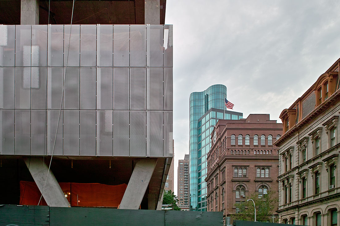
New Academic Building under construction and Foundation Building — © Brian Rose

What is at stake:
Thomas Jefferson wrote the epitaph for his gravestone with several brief phrases:

Author of the Declaration of American Independence
of the Statute of Virginia for religious freedom
& Father of the University of Virginia

Jefferson regarded the creation of his university one of his greatest achievements. It was, as he called it, an “academical village,” a place set apart where students and teachers would come together in the free pursuit of knowledge. Peter Cooper, a self-made inventor and entrepreneur, founded Cooper Union as his legacy, the gift of free education to the working class, the men and women who, in many cases, lived in the teaming slum neighborhood adjacent to the Foundation Building on the Bowery and the square now named after him. Unlike Jefferson’s rural village in the foothills of the Blue Ridge Mountains, Cooper’s institute was set in the heart of urban New York City.

Over the years, as the United States prospered and New York became one of the great cities of the world, Cooper Union became a more rarefied place, a free school open to all, but accepting only the highest qualified. Over the years, it has produced a notable share of the outstanding designers, builders, engineers, and artists in the city’s history.

The value of free:
Kevin Slavin, Cooper alumnus and MIT professor, has written eloquently about what free means in an educational context, a concept that those of us who attended Cooper Union understand intimately. Slavin writes:

“We went not because of the financial value of free — that is, zero tuition — but rather, because of the academic value of free. Free for everyone meant that the students who were there were beholden to nothing (nothing!) except their passion, talent, hard work, and brilliance. This unique, very particular sensibility — that, more than any other thing they could build, hire or install — this was the experience of the institution.”

Rebecca Mead writes in the New Yorker about Cooper “that It also grants a student the freedom to go in whatever direction her or his intellectual inclinations lead, without regard to the ultimate economic utility of the course of study. That learning should not necessarily be linked to future earning power is an ideal increasingly under siege in institutions of higher learning. Simply by embodying and demonstrating an alternative paradigm, Cooper Union benefitted even those who were not members of its student body.”

cooperbuttresses
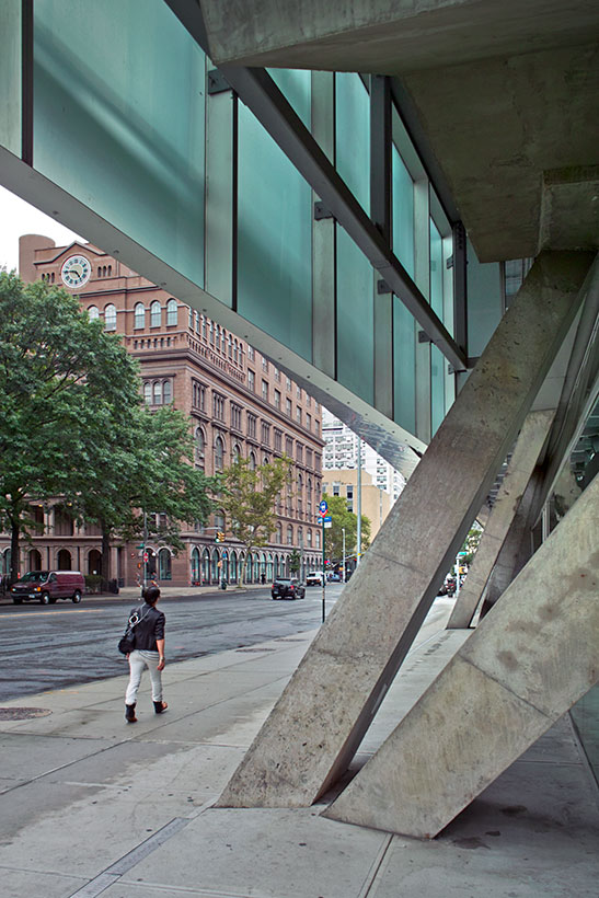
New Academic Building (foreground) and Foundation Buildiing — © Brian Rose

The end or a new beginning
Cooper Union’s future now hangs in the balance. The school’s current financial condition is grave and some doubt that it can survive as a tuition free institution, even were it to regroup and follow the working group’s plan. But it’s clear to me that it cannot survive with tuition. Cooper Union has no meaning, no purpose, beyond Peter Cooper’s vision of a school ” free as air and water.” It cannot compete with the juggernauts of American education, the Ivies, the well-endowed technical schools and art schools. Cooper’s survival depends on remaining what it was, free.

I am convinced, as of this writing, that an intervention by the Attorney General is the only way the school can be saved. It will require a reorganization of the school, a reaffirmation of the charter and founding ideals, and it will require some kind of grand bargain that will relieve the financial burden of debt that years of mismanagement have wrought. If that grand bargain cannot be reached — in this moment of New York City financial ascendency — I fear that Peter Cooper’s great educational gift will be squandered and his legacy forever dishonored.


New York/Paradise

Back from a week from the island of St. John in the U.S. Virgin Islands. We stayed in a so-called eco-tent overlooking Salt Pond Bay in the southeastern tip of the island. It was a reasonably comfortable structure, but we shared it at various times with a mouse, a lizard, a spider, a walking stick, biting bugs, and marauding birds. Under the hut, which sat on wooden stilts, hundreds of hermit crabs scrabbled about, their shells a constant crackling sound. Nature can be loud.

We were staying at the Concordia Eco-Resort, and traveled around the island to different beaches and snorkeling spots. I didn’t take many photographs, but snapped a few when we made pitstops between locations. As beautiful as St. John and nearby St. Thomas are — and there are many resorts and large houses — the majority of the population appears quite poor and lives in rather chaotic little compounds of makeshift buildings with chickens and, sometimes, goats running freely.

Paradise it is, but rough around the edges.

paradise001
St. John — © Brian Rose

paradise004
St. John — © Brian Rose

paradise005
St. John — © Brian Rose

paradise006
St. John — © Brian Rose

paradise003
St. Thomas — © Brian Rose


New York/East 4th Street

rose_harsley
Brian Rose and Alex Harsley — © Brendan Rose

A few days ago I went to Alex Harsley’s East 4th Street Photo Gallery to document his amazing space, a couple hundred square feet chock-a-block with prints running up and down the walls, even on the ceiling, attached to cords with clothespins. I brought along my son Brendan, who is 16 and needed to do a school photography assignment that involved making photos containing other photos.

Yes, that’s a 4×5 view camera, and yes, I’m wearing my dark cloth superhero cape as Alex salutes. I was there for 3 or 4 hours taking pictures — very slow going in such a tight space. I used my monorail camera so that I could use a wider lens. Most of the view camera images I’m doing these days are made with a field camera, a boxier, more compact camera with fewer movements, and a stiffer bellows, making it difficult to put a 65mm lens on it. But lightweight and portable. The camera above was previously my workhorse architectural camera. Few architectural photographers use view cameras any more, settling for the ease of digital SLRs, despite their limitations. Clients don’t know or care at this point. If you care, however, it’s an Arca Swiss camera with a Schneider 65mm lens on a Gitzo tripod and a Manfrotto ball head.

However, when I want highly detailed images to possibly print large, the view camera is still the way to go. I scan the negative at high resolution and make prints — like my last two exhibitions — up to 4×5 feet. The MIT mural shown in my earlier post was made from one of those 500 Mb scans. Anyway, I hope to have some images of Alex’s gallery to show in the near future.

I’ll be on vacation for a week to a place with limited internet and cell phone service, so don’t expect any posts till I return. Outta here.

New York/Love Saves the Day

lovesavesday
Love Saves the Day, Second Avenue and East 7th Street — © Brian Rose

Here in the East Village we are in shock over the explosion and fire that have leveled three historic tenement buildings on Second Avenue at East 7th Street. At present, there are missing people and numerous injured.

This is the downtown of the East Village, the heart of the culture and subculture that makes this place special, from high to low, the Beats, the Hippies, the Punks, and all who have chosen, or who have been chosen, to live in this crazy part of the world.

From 1966 to 2008 there was Love Saves the Day, a vintage clothing and bric-a-brac shop in the building now a heap of rubble. Above is a picture I took passing by not long before the shop closed.

Love Saves the Day.

New York/MIT Museum Interview

MITportrait
In front of Delancey Street photo, MIT Museum

The exhibition I am a part of at the MIT Museum (Photographing Places: The photographers of Places Journal, 1987-2009) includes interviews with the various photographers, which can be listened to through headphones at audio stations in the gallery. The interviews are broken up into short thematic bites.

My interview was done live over the internet with some editing done later. It’s fairly spontaneous commentary about my thinking and way of working. When I refer to “my book,” I’m talking about Time and Space on the Lower East Side, which is now sold out. And when I refer to “Cervin,” i’m talking about Cervin Robinson who was a consulting editor to the original Places magazine — an architectural photographer — and author of Architecture Transformed: A History of the Photography of Buildings from 1839 to the Present.

Here are the clips:
 
The Lower East Side project:


New York/WTC

1wtc003
Behind the Colgate clock, Jersey City, New Jersey (4×5 film) — © Brian Rose

As some of you know, I’ve been working on a book about the World Trade Center for some time. Just before the 10th anniversary of 9/11, I came to the realization that I had in my archive a remarkable series of pictures — made at different times in different formats — that focused on the Twin Towers as a presence ( and absence) on the New York skyline. It was too late to produce a book in conjunction with the anniversary, but I began putting together a dummy based on what I had. And at the same time I continued to make photographs that showed the emergence of the new Trade Center, specifically One WTC, now completed, which stands as tall as the former Twin Towers.

1wtc006
Old Fulton Street, Brooklyn (4×5 film) — © Brian Rose

None of my Twin Towers photographs were ever primarily about the buildings themselves, but rather they were urban landscapes that included the towers as architectural signposts. As the new tower of One WTC rose to fill the hole in the sky left by the destruction of 9/11, I chose to treat it the same way, as part of something, as opposed to an object all by itself. Nevertheless, I did not feel that I had one singular image (or a few) that adequately described the new tower as a prominent architectural expression.

So, when the weather broke earlier in the week, soaring into the 50s, I dashed out with my 4×5 view camera and spent a day stalking One WTC from various vantage points in Manhattan, Brooklyn, and Jersey City. Three days later, I’m still a bit sore from the exertion, but it was a great day, and I’m pleased with what I came up with.

There remain many unanswered questions about One WTC. Does it command the skyline as powerfully as the Twin Towers did? Does the design make the kind of iconic statement that many wanted from it? What does it mean to people across the political spectrum — some still insist on calling it “Freedom Tower.” And was it necessary to build it at all? My book will not settle any controversies about the new building, but ending the narrative with several strong images of the tower seemed a necessity in bringing the story around full circle.

1wtc011
Fulton Street (4×5 film) — © Brian Rose

There was a time during the 20th century when the skyline of lower Manhattan had an almost romantic storybook aspect. It was defined by a number of thin towers with spires like the neo-gothic Woolworth Building from 1913 and later, the Art Deco styled Cities Service Building. The first significant disruption to the stalagmite look of lower Manhattan was the Chase Manhattan Bank building, a modernist slab uncomfortably inserted among its svelte neighbors. The building itself, arguably, is one of the best early modernist office towers in Manhattan, but it began a trend of ever bulkier boxes that eventually obscured many of Manhattan’s most iconic skyscrapers.

Nevertheless, when the Twin Towers went up in 1974 they dominated the skyline in almost every direction. When I did my pictures of lower Manhattan in the early 80s they were ubiquitous, poking up and between other buildings, visible from a million different vantage points. It helped, of course, that there were two of them, and the vertical pin striping of the skin — the vulnerable exo-skeletons of the towers — seemed always to lead the eye upward.

One World Trade Center, despite its height, seems lost in the crowd much of the time. And while the Twin Towers often visually lined up with the erratic street grid of downtown Manhattan, the new tower seems rarely to do so. One exception, is Fulton Street where I photographed it juxtaposed with a richly articulated cast iron building from more than a hundred years ago. And as before with the Twin Towers, One WTC appears at its most commanding from across the Hudson in New Jersey.

1wtc014
Fulton Street (4×5 film) — © Brian Rose

The rebuilding of the World Trade Center is ongoing, and construction will dominate the area for years. But several WTC towers have been completed, and Santiago Calatrava’s winged transportation center is getting closer to taking flight. The memorial fountains and the 9/11 Museum, most of which is underground, will not be a part of my narrative, which is focused on the skyline of New York, its mythic nature, and its more workaday reality as seen from the ground — on the street — the democratic commons of New York.

1wtc017
One WTC entrance — © Brian Rose

There is no doubt, however, in the post-9/11 political climate, that the democratic commons is under assault. The Trade Center site crawls with police officers and other agents of what is now painfully called Homeland Security. And various private security guards hover about at the ready to correct the wayward tourist or local who finds him or herself caught in the blurring confusion between public and private property. These zones of ambiguity are multiplying around the city, not just at the World Trade Center.

The photograph above shows the entrance to One World Trade Center, a strangely beautiful, but chilling place — the glinting sunlight reflected onto the street, the regimented rows of steel bollards, the striping of the colored glass behind the revolving doors, the solitary black-suited sentinel awaiting anyone brave enough to step forward with the idea of entering this silent fortress.


MIT Museum/Cambridge, Massachusetts

places002
Exhibition entrance with wall-size print of Delancey Street 1980

A few weeks ago, an exhibition opened at the MIT Museum in Cambridge, Massachusetts called Photographing Places: The Photographs of Places Journal, 1997-2009. Places Journal was originally a print magazine dealing with issues relating to architecture and urbanism. Each issue featured an extended photo essay centered on a particular location. In 2004, just after I had begun re-photographing the Lower East Side I was asked to contribute to the magazine. I was approached by Cervin Robinson, the architectural photographer, who was a contributing editor to the magazine. Cervin is also the author of a Architecture Transformed: A History of the Photography of Buildings from 1839 to the Present. I knew Cervin from all the way back in 1980 when I first exhibited by photographs of the Lower East Side. Cervin was for me, and many other photographers, a mentor and great friend. I’ve written about Cervin here and here.

places004
Blow up of a Places Journal cover by Joel Sternfeld — © Brian Rose

I traveled up to Cambridge with my wife to attend a reception for the exhibition, which included four of my photographs, one of which was printed wall-size at the entryway to the show. The exhibition, curated by Gary Van Zante of the MIT Museum, features the work of about a 20 photographers whose images ran in the print version of Places. Places still exists, by the way, as a multi-dimensional website, and still presents photo essays focused on the built environment.

Almost a third of the photographers in the show were present at the reception, which was great. A couple of us had barely made it on time because of snow-delayed trains coming up from New York. I had very nice chats with Kate Milford, who was showing her photographs of downtown Brooklyn, and Lyle Gomes, who had photographed the landscape of the Presidio (former military base, now park) in San Francisco. I also spoke with Lisa Silvestri who has photographed post Katrina New Orleans. And best of all, the ageless Cervin Robinson was present.

Inside the door of the exhibition there is a blow-up of a cover of the former magazine with an image of the High Line by Joel Sternfeld in its former wild state. And two more images from that series are in the show.

places005
Lower East Side images — © Brian Rose

Above are my prints in the show — two from 1980 done by me and Edward Fausty working together, and two from 2004 when I had just begun re-photographing the Lower East Side. This is the work that eventually comprised Time and Space on the Lower East Side, my now sold-out book. It was in Places Journal before anywhere else.

places001
Brian Rose in front of Delancey Street 1980

Here I am standing in front of Delancey Street 1980 at the entrance to the exhibition. I knew that my image was going to be used big, but I didn’t realize it would be this big. Pretty cool! The next day my wife and I walked all the way from MIT to the Back Bay station in Boston through the frozen snow clogged streets. Spring is just around the corner.


New York/Blue Dress

Like practically everyone in the world attached to the internet, I’ve been perplexed by the conundrum of the blue and black (or white and gold) dress. No, I can’t solve the puzzle, nor explain things from a scientific perspective. However, the subjective nature of color is something I am acutely aware of — it can be baffling when you discover that an image you’ve worked on assiduously one day, looks wrong when you come back to it the next day. There is no doubt a psychological component to the perception of color.

original_dress
Original photograph

So, the dress. My son showed it to me first, and I saw it immediately as blue and black, which, it turns out, are the actual colors of the physical dress. However, my son and my wife both saw the dress as white and gold. We did not have a family meltdown, but the discussion was lively. Since then, I’ve read a number of articles explaining the phenomenon. But none of them, Wired and Scientific American included, are correct.

Process of elimination. Scientific American seems to think it has to do with all the different screens and devices with widely varied color balances. That’s pretty easy to shoot down when you have, as in our case, three family members all looking at the same screen and two seeing a different color dress. It’s not the screen.

Wired seems to think it has to do with color constancy and they provide a couple of examples of how the brain is fooled into seeing colors differently based on context. A simple example is shown below. The center blue squares appear different because of the lighter or darker blues surrounding them. The problem with this explanation is that almost everyone sees this phenomenon the same way — unlike the dress where people see two widely divergent color schemes. It’s not color constancy.

bluecontrast
Example of color constancy

Some people have written about the bright background fooling the eye in some way, so I cropped out the background and showed it to my white and gold family members. They still saw white and gold. It was not the background.


blue_blue_lg
Background fill using Photoshop sample of the blue of the dress

I then selected the blue of the dress in Photoshop and replaced the background with that blue. See above. Some experts have suggested that different people have different numbers of blue sensitive cones in their eyes and therefore are better able to distinguish blue. My wife and son now saw a white and gold dress against a blue background! It’s not the cones.

My son suggested that we print the images on paper and compare them with viewing on a backlit and luminous computer screen. I printed the original image and my blue background image, and my family still saw the dress as white and gold. Again, it has nothing to do with the screen.


blue_white_lg
Setting white point of the image to the blue of the dress

I then opened “curves” in Photoshop and designated the blue of the dress as the white point of the image. Presto! The dress became white and the black trim became gold. But the blue background also became close to white. My family was seeing a white and gold dress on a very blue background. Mmm. I had been thinking that it had to do with a different perception of color balance, but that should affect the blue throughout the image, not just the dress. It is not just white point and color balance.

Clearly, the white/gold phenomenon is occurring only with the dress itself. It’s a low contrast image, hazy, with muddied and mottled blacks and a relatively unsaturated blue color. There’s a warmish light hitting the dress, which further distorts the color relationships. And the blue and black of the dress are not solid RGB color like my Photoshop background. My son, however, says he sees a cooler. bluish light hitting the dress, while I see a warmer light coming from the right, particularly visible in the blacks. There’s obviously some kind of psychophysical aspect to what is going on.

That’s as far as I can go with it. As Republicans are fond of saying when challenged on the veracity of global warming, “I’m not a scientist.” I am convinced, however, that what we are seeing here is explainable, but perhaps falling into an area of visual perception not well understood. Certainly, the answers offered so far by the experts miss the mark.

Now enough about the damn dress!


New York/Central Park

centralpark_snow
The Great Lawn, Central Park — © Brian Rose

Frozen New York, 2 degrees fahrenheit this morning. Walked through the park in the afternoon. Almost no one around. Peaceful. Quiet.

The thin building at center left is 432 Park Avenue, the 15th tallest in the world. And tallest in New York if measured by roof height. One WTC’s spire is taller.

My slide talk at the library three days ago went well. Over a hundred people showed up despite several inches of snow earlier in the day. Sold some books, met some interesting people, had a great time.

New York/Library Talk

nypl-announcement

I will be doing a slide talk at the New York Public Library Mid-Manhattan branch on Tuesday, February 17 at 6:30pm. I’ve done two programs there before — one on my Lower East Side photos, and one on my World Trade Center pictures. It’s free, and everyone is invited. Hope to see you there.

Metamorphosis: Meatpacking District 1980 + 2013
with Brian Rose, Photographer

Mid-Manhattan Library
Tuesday, February 17, 2015, 6:30 p.m.
455 Fifth Avenue
New York, NY, 10016
(212) 340-0863


New York/Meatpacking District

victor-auto
Washington Street and W12th, 1985 — © Brian Rose

After finishing up my Meatpacking book, Metamorphosis, I somehow discovered the negative for the image above in another mystery box in my archive, too late for the book. It’s a view down Washington Street looking toward the Twin Towers and shows how the High Line used to go further south passing through Westbeth, the commercial complex repurposed as artists’ housing in 1970.

The building in the foreground with the Victor Auto Service sign is now the restaurant Barbuto, and the red house to the left contains Tortilla Flats, the Mexican restaurant. At some point after this photograph was taken, three blocks of the High Line were torn down between Gansevoort Street and W12th. The vacant lot under the High Line in the picture now contains an apartment building and garden entryway. See below.

wash12

It took a good while for me to get around to scanning and working up this image. These old negatives are difficult to color correct, and the image above represents probably six hours of careful coaxing in Photoshop. It’s mostly open shade, and strongly backlit, which makes it all the more problematic.

So, It didn’t make it to Metamorphosis, but it will be perfect for WTC, my next book, about the World Trade Center.

New York/Berlin

berlin_009
Lichtgrenze (border of light) in Mauerpark  — © Brian Rose

It has taken a while to scan my Berlin negatives from last November. I was there on the occasion of the 25th anniversary of the opening of the wall, November 9, 1989, to be exact. The first couple of days were dark and grey, typical for the season in that part of the world. And then I had two days of sun. The image above shows the installation of inflated balloons that formed the LIchtgrenze (border of light) that marked the trace of the former wall through the city. At night, LED lights mounted in the balloon bases, made them glow. During the day, they appeared like a string of pearls stretching across the cityscape.

I shot about 70 sheets of film in the four days leading up to the 25th anniversary, and scanned about 2/3 of them. I think there are about 15 images that are keepers. Working up the scans in Photoshop is time consuming. They are large files — about 500 MBs each — and the level of detail that I bring to coaxing the right look and feel out of the negatives is substantial. It’s relatively easy to color correct globally, but to get everything singing in an image can take hours. And something that looks great one day, can look drastically different the next. Such is the subjective nature of color.

These are the first of the 4×5 scans completed. You’ve seen some of these images before, but those were actually taken with my point and shoot, usually held on top of my view camera.

berlin_001
Footbridge with LIchtgrenze — © Brian Rose

berlin_004
Reichstag and other government buildings on the Spree — © Brian Rose

This was a carefully set up shot on a promenade along the Spree, the river that wanders through the center of Berlin. The domed building in the rear is the Reichstag. I felt that I needed something like this — a visual coda, a bit of photographic bravura, for my project that began almost 30 years ago.

berlin_006
Bernauer Strasse display — © Brian Rose

berlin_007
Berlin Wall exhibition in Arkade shopping mall at Potsdamer Platz — © Brian Rose

The anniversary of the fall of the Berlin wall was, of course, a moment both celebratory and reflective. Much damage was done by the division of the city and the Cold War division of Europe in general. People were killed attempting to escape the communist east. Life ambitions were curbed by repression. On the one hand, the reunification of the country meant that the democratic west with all its creative opportunities prevailed, but on the other hand, its crass excesses overwhelmed the more sober lifestyle of the east. And so here we are presented with the perfect dialectical complexity of contemporary Germany. An exhibition about the wall with fake artifacts, a kitschy reconstruction of a guard tower (a real one can be found 500 meters away), juxtaposed with riveting footage of the wall being built in 1961 and people making desperate dashes for freedom. All of it packaged and on display in the Arkade shopping mall in Potsdamer Platz.

berlin_015
Topography of Terror site and former Luftwaffe Headquarters — © Brian Rose

A few blocks away from the commercialism of Potsdamer Platz one finds the Topography of Terror — the exposed foundations of the Nazi Gestapo/SS headquarters, a preserved strip of the Berlin wall, and the former headquarters of the Nazi air force. The visual compression of history here is profound.

berlin_031
Wall remnant near the Nordbahnhof — © Brian Rose

There are only a few stretches of the inner wall that still exist — the easily recognized graffitied concrete slabs with the pipe along the top. People were eager to see it all hauled away after its opening in 1989. People now wish they had kept more of it. But there are many lengths of outer wall that can be found around the city especially along rail yards and abandoned industrial areas. Most people don’t even realize that these are remnants of the double walls that surrounded West Berlin.

Stay tuned for more photographs.

New York/Cooper Square

cooperbox
Cooper Square, New York — © Brian Rose

As Cooper Square gets a makeover, and Cooper Union “reinvents” itself — students entering the school now pay tuition for the first time since 1859 — Peter Cooper sits protected, for his own good we are told, in a box at the center of the square.

Some of us still hold out hope, that when Peter emerges from his plywood prison, his pioneering school will have returned to the mission he set out for it: tuition free, open to all, at the pinnacle of higher education in America.

That hope now rests primarily on a lawsuit brought against the Board of Trustees of Cooper Union accusing them of violating the school’s charter and squandering its resources. We wait — alumni and friends — with mounting anticipation for a positive decision from the judge of the New York State Supreme Court.

Please visit the website of the Committee to Save Cooper Union to learn more.


New York/Williamsburg

charlie
Bedford Avenue, Williamsburg, Brooklyn — © Brian Rose

JE SUIS CHARLIE.

Well, actually a more nuanced perspective. This is something I posted today on the blog Daily Kos as a reply to a diary writer who does not support the kind of provocative satire practiced by Charlie Hebdo. The full discussion is here.

Theo van Gogh

I am coming to the discussion rather late, but want to add some thoughts about another similar incident in the Netherlands, where I lived for 15 years. Some years ago, the columnist/TV personality Theo van Gogh was murdered by an Islamic extremist. Van Gogh was well known for his provocative statements about Islam and just about everything, and he collaborated with Ayan Hirsi Ali on a film that attacked Muslim persecution of women. But it was, in my view, a recklessly inflammatory film.

I considered Van Gogh an odious person, even though there was truth to some of what he had to say. He poured gasoline onto the fire, and didn’t seem to care about the consequences.

However, when he was attacked and stabbed to death in the street in Amsterdam, I was left with no choice in the end, but to side with those who defended Van Gogh’s right to live and to speak out. The attack on him was an attack on all of us. As is the case with the attacks in Paris.

So, while I sympathize with the points made in this diary — and I do not endorse many of the cartoons in question — I have to say, in the end, “Je suis Charlie.”

Sat Jan 10, 2015 at 09:56:43 AM PST


New York/Photo-Eye Review

photo_eye_review
Photo-Eye Review of Metamorphosis

It is hard to get real reviews of photo books or exhibitions. Most articles tend to be a rephrasing of press materials. And I’ve done lots of interviews for blogs and websites. I’m grateful for all of it, of course, but an actual critique — a thoughtfully considered assessment of one’s work — is particularly appreciated when it happens. So, I’m especially happy to receive such a review from Photo-Eye, the online photography book clearinghouse and shop.

Here are the closing lines of the review:

Meatpacking District joins those contemporary re-photography projects that share a calculated return to prior subject matter, to reexamine, reframe or tap into the power of comparison. Unlike some re-photography that addresses socio-political concerns, Rose assumes a rather neutral position in his written statement on the Meatpacking District’s metamorphosis; acknowledging both loss and renewal. Much re-photography is also tied to nostalgia. While Rose has no personal ties to the Meatpacking District per se, his return to New York after years abroad, and revisiting of past work and prior haunts, pushes back against his stated neutrality.

Color plays a striking role in the conceptual tone of this work. A gray winter’s day creates a past-tense palette in the 1985 work, whereas the temperate brightness of the 2013 helps to push us forward in time. The latter images defy a perceived patina of age, teetering on the line between vibrant and garish, new and unseasoned. The re-photography premise doesn’t always hold up individual images of varying strength and interest here, yet collectively these photographs offer much food for thought. The notion of absence informs a tour through this place’s industrial past
and adoption by a marginalized culture, thriving, yet hidden, then routed out and dying off, and its eventual rebirth as a sanitized, spotlight destination of see and be seen.

—KAREN JENKINS

Read the whole review here.

New York/Meatpacking District

westside002
Tenth Avenue between 14th and 15th Streets — © Brian Rose

A recent 4×5 film photograph of the Meatpacking District with the High Line and new retail space below. The previous techie gas station, which was also tucked under the rail viaduct, was great, but unfortunately, I do not have a photo for comparison. I think this is supposed to be “moderne.” But who knows.