New York/Meatpacking District

metamorphosis-cover_700pxMetamorphosis, Meatpacking District 1985+2013 — © Brian Rose

As I wrote earlier, my book about the Meatpacking District is well underway. Above is the cover featuring a photograph of Washington Street from 1985. It is, in many ways, a companion to Time and Space on the Lower East Side. Metamorphosis will be the same size with similar binding and layout, though we have pushed the graphic design a little bit more on this one.

Time and Space was a complex look at a large neighborhood with many interwoven visual and thematic threads. Metamorphosis is a tighter concept — 18 before/after views and 14 new images of this relatively compact neighborhood, all made with a 4×5 view camera. As before, I shot color film, and have scanned and color corrected the images in Photoshop.

The whole project (aside from the pictures made in 1985) was done in a very short time frame — less than six months — giving the book an immediacy that I think is rare. There is no way something like this could be done with most established publishers, who normally need long lead times and require much collaborative deliberation. Publishers often promote this aspect of book making, and I think overvalue their role in what often should be an artist/photographer’s unmediated statement. It depends, of course, on the circumstances, and many fine photo books have been made with only modest input from the photographer.

That’s not to say that this book was done without collaboration. I worked with Bill Diodato, photographer and publisher, and a small team of technical/design mavens. It has been a fruitful partnership.

As with Time and Space on the Lower East Side I will need to do a Kickstarter campaign to help cover the cost of printing. The economics of doing photo books like this are difficult. The barriers to success, from production to distribution, are high. But this will be my fifth book, and I have a good deal of experience at this point, and know how to make it all work.

Stay tuned for the next step.


New York/Colorful Past

There’s been lots of discussion about whether Inside Llewyn Davis by the Coen brothers is an Oscar-worthy masterpiece or a dismal failure. Whatever the case, I’d like to briefly touch on the look of the film. The story takes place in 1961 Greenwich Village and the main character wanders the streets and cafes of the area, familiar terrain to those of us who were a part of the folk scene in New York. My participation came much later, the late ’70s and early ’80s, but even today, the look and feel of the place has changed very little.

INSIDE-LLEWELYN-DAVISA scene from Inside Llewyn Davis, East 2nd Street

To my eye, the neighborhood is a richly colorful landscape, in parts beautiful, in other parts tawdry. McDougal and Bleecker Streets where the folk scene was centered remains a tourist district with mediocre restaurants and cheap gift shops. But there’s also Porto Rico coffee, Caffe Dante, and Mamoun’s falafel, places that have survived decades. Even Ben’s Pizza is still there in all its fluorescent and formica glory. Caffe Dante was where I used to hang out with Suzanne Vega and Jack Hardy plotting to shake up the world with our songs. It’s still great for atmosphere, but the coffee at Third Rail a couple of blocks away is on a different level. But I digress.

People have criticized Inside Llewyn Davis for portraying the folk scene as a ghostly shadow of its true self. Suzanne Vega called the movie “brown and sad.” The movie, indeed, is visually muted and dark. The Coen’s obviously filtered the color giving it that old color look–like an Instagram filter.

bob-dylan-freewheelin

But the past is only Instagrammed in our minds Or in prints and slides that have faded and color shifted over the years. When Dave Van Ronk–who the movie is sort of, but not really about–and Bob Dylan inhabited the neighborhood in the early ’60s the look of the place was undoubtedly as brightly hued as it is today.  My guess is that the Coens and their art director were inspired in part by the iconic photograph on the cover of The Freewheelin’ Bob Dylan where he and Suzy Rotolo walked down the center of Jones Street on a snowy thinly lit day.

One can argue that the Coens wanted to remove their movie from the present and give it a dreamy long ago quality. But at this point, color filters are an overused device. Moody, slanting light streaming through windows, has also become a cliche supposedly evoking the past. Think of Spielberg’s Lincoln.

In my book Time and Space on the Lower East I tried to make the point that the past and present are  not mutually exclusive realities. They are part of a continuum of experience. They are both here now in vivid color. And the sky on a sunny day is blue.

e4thEast 4th Street 1980 — © Brian Rose/Ed Fausty


New York/Color before Color

herzog-foot-of-main-1968-time-1
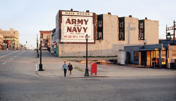
Foot of Main — by Fred Herzog

A curious thing has happened in the telling of the history of color photography. In recent years, it was discovered that two photographers, Fred Herzog of Vancouver and Saul Leiter of New York, had worked in color long before the familiar names associated with the development of the medium. And their color work was not just a casual sideline to black and white. Both produced extensive bodies of work made over years of time. While I prefer Herzog’s clear topographic style to Leiter’s aqueous street photos, they both did terrific stuff. Why are we only hearing about them now?

saul-leiter-window-1957-snowTwo photographs by Saul Leiter

When I decided to pursue color in the mid-70s, there was no Fred Herzog or Saul Leiter to be found. I was primarily aware of Stephen Shore and William Eggleston–and Joel Meyerowitz who I studied with at Cooper Union. As it turns out, Herzog and Leiter had been shooting color slides for decades, showing them to friends and colleagues, but outside of their immediate circles, they were almost unknown. Herzog was documenting Vancouver, British Columbia, a dynamic, growing city, but until relatively recent times, a provincial town far removed from the East Coast art centers. Leiter was known more for his fashion photography, and as he said, to explain his relatively low profile: “In order to build a career and to be successful, one has to be determined. One has to be ambitious. I much prefer to drink coffee, listen to music and to paint when I feel like it.”

There are many reasons why it took so long for color to arrive to the museums and galleries, but the key thing to understand is that before the 1970s, color printing was problematic. Chromagenic prints (C-prints) were invented by Kodak and brought to the market in 1942. Well into the 70s this material was mostly associated with family snapshots, and as anyone who has looked at old color prints knows, the color faded and the paper yellowed. It was possible to have enlargements made–you could have your local photo finisher make an 8×10 print. But you had no control over the final outcome. For these reasons, early C-prints were not suitable for fine art purposes.

Magazines like National Geographic and Life began to use color in 60s, but they worked directly from slides or large format transparency material. which were made into separations for offset printing. That was the norm for magazines right into the 1980s. When I began photographing architecture around 1982, all my clients still wanted 4×5 transparencies, luminous sheets of film handled like irreplaceable jewels. The impetus for color printing–the kind that went on the walls of galleries came from elsewhere.

To a degree, fine art color printing was born out of the advertising industry. Photographers were shooting color transparencies and the ad agencies had dye transfer prints made, an additive process that involved making color separations and sandwiching them together–much too complicated to get into here–but a method of color printing that provided a great deal of control over the final result, often an intentionally unnatural result for ad purposes. It was a time consuming and expensive process, but worth it to the ad agencies.

At some point, photographers realized that dye transfers were a stable archival material that could be used to make beautiful fine art prints. Joel Meyerowitz, who worked in advertising, made dyes of his early 35mm street photography, and William Eggleston’s prints shown at the Museum of Modern Art in 1976 were dye transfers. Helen Levitt’s color prints were made by Tartaro Color, the leading dye lab in the city. Most of us could not afford to make dye transfers, though I remember one of my fellow students at Cooper Union, whose father worked in the industry, had his slides printed as dye transfers. I was jealous. Eventually, with improvements to C-printing and the advent of ink jet printers, the medium of color photography rapidly expanded in the 1980s.

Things had already begun to improve when I first started color printing in the darkroom at Cooper Union in 1977. I made 11×14 prints in drums, pouring the chemicals in and out by hand, often ending up with green chemical streaks on the paper, which meant starting over again. It was laborious work, but I managed to make about 25 prints for an exhibition in the hallway of the photography department. Since I was shooting 35mm slides–a positive film, and printing on reversal material–I had to have internegatives made from the slides. There were only a few labs in New York City that specialized in that kind of thing, but at least here it was possible. The prints I made back then look pretty bad today. In the early 80s I printed at a rental lab called My Own Color Lab, which gave individuals access to large scale processors used by commercial labs. For a number of years My Own was a Mecca for color photographers and free lance printers, and there I came into contact with people like Nan Goldin, Andreas Gursky, and Phillip Lorca DiCorcia.

516ef145eee9dphoto_high_8707
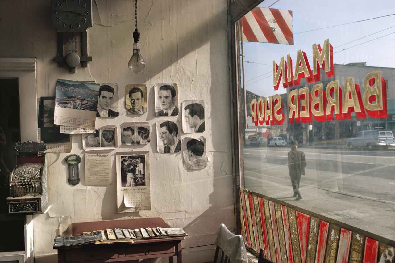
Main Barber — by Fred Herzog

But if you were Fred Herzog in Vancouver shooting Kodachrome in the 50s, 60s, and 70s there was really no way to make decent exhibition prints. You loaded the slides into a Kodak carrousel tray and projected them just like your neighbors showing their latest vacation snaps. The amazing thing is that Herzog kept at it for decades, all the while eschewing the pictorial cliches of the day, taking a hard look at a beautifully gritty place, a Canadian city both familiar and foreign, full of advertising signs, fin-tailed automobiles, and working class men and women. It’s a remarkable achievement, all done outside of the art world bubble, full of a freshness and sense of discovery so often lacking in the arch and self-conscious product presently displayed in our finest salons.

So, the narrative has changed. Leiter and Herzog were first–but their photographs, 35mm Kodachromes, were mostly unseen–until after the big wave of color photography had crashed ashore establishing a pantheon of art world stars. They eventually received the attention they deserved, but very late. Saul Leiter died last year at the age of 90, and Fred Herzog is now 83.
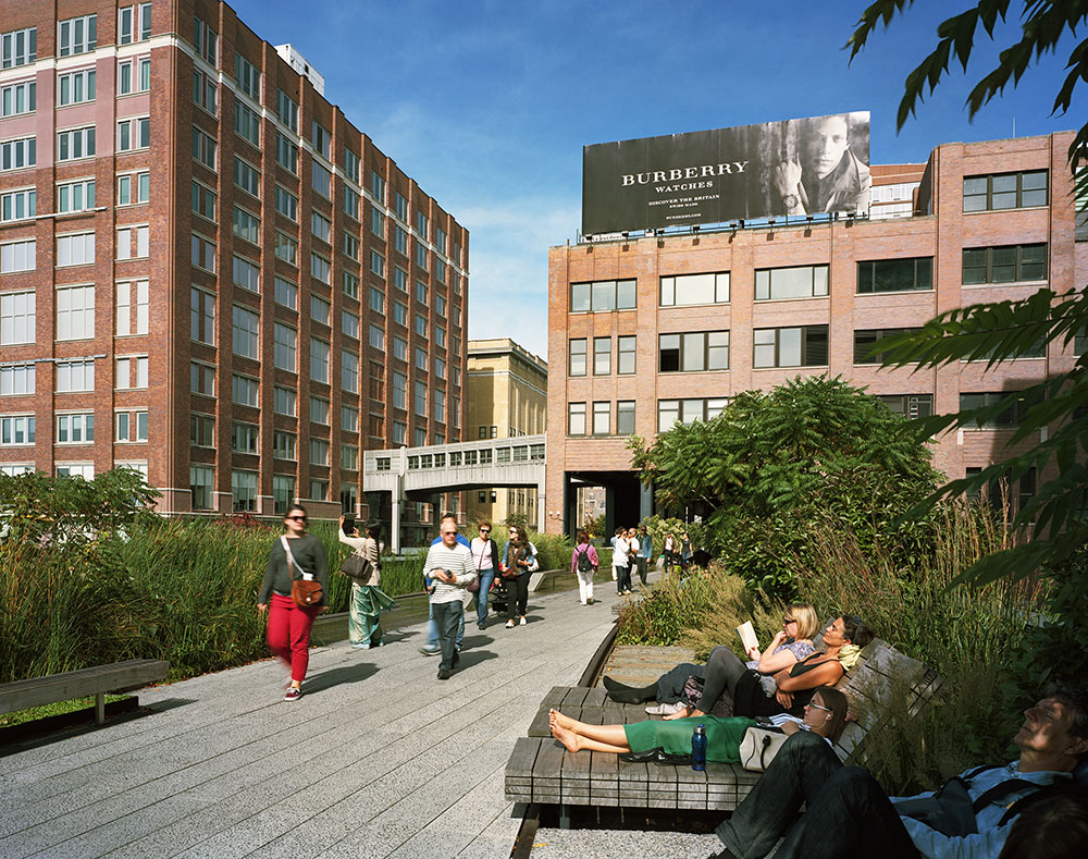
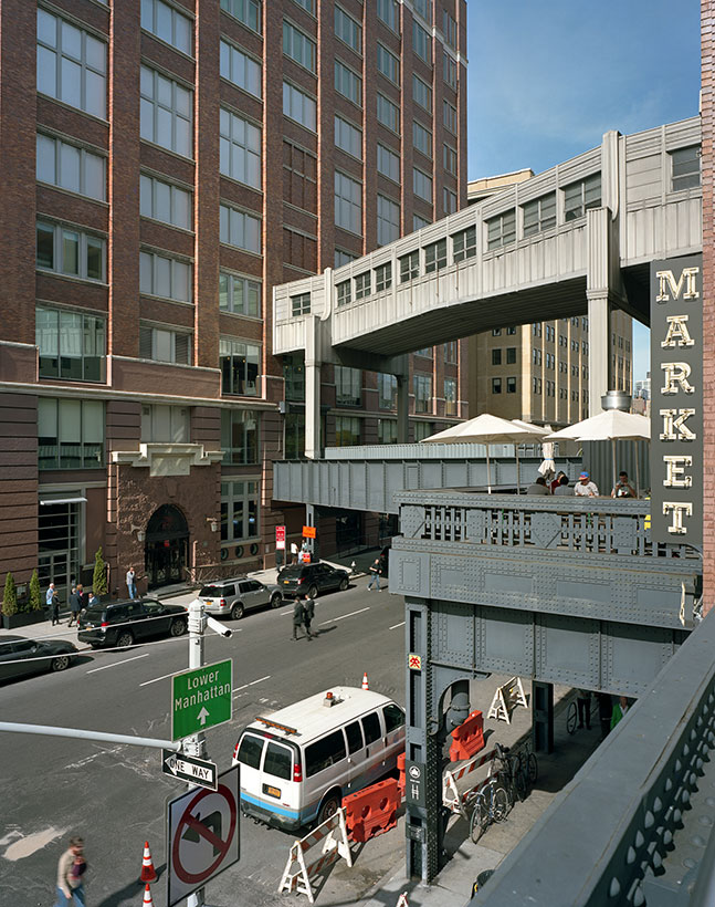
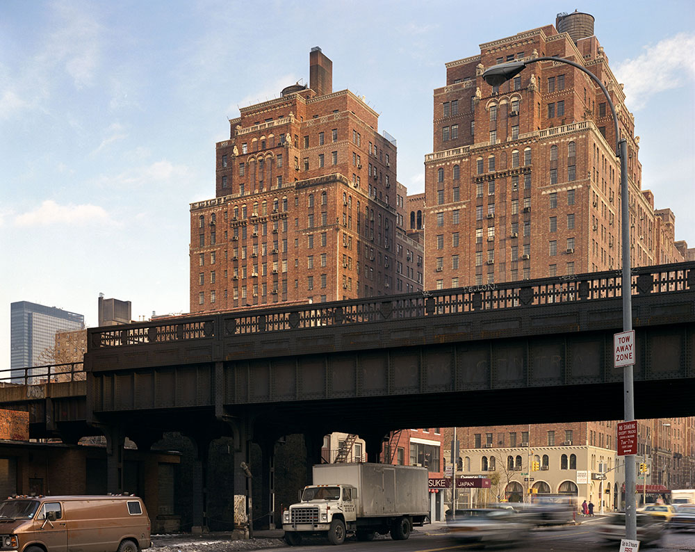
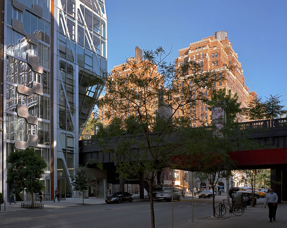
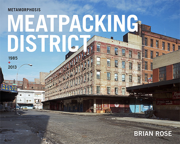


New York/Greenpoint

lou_reed_adManhattan Avenue, Greenpoint, Brooklyn (digital) — © Brian Rose

It’s the end of the year and I’m feeling somewhat wistful. A year of accomplishments — the success of Time and Space on the Lower East Side — my show at Dillon Gallery — the completion of Metamorphosis, my Meatpacking District book to be released this coming summer .  But also a year punctuated by moments of poignancy as is inevitable with the passage of time.

Earlier today I tested out my new camera, a Sigma DP1, a much improved refresh of the somewhat balky second generation of the camera. The former took incredible pictures in ideal light conditions — better than other point and shoots I’ve used. But it was a difficult camera to handle, even for me. Nevertheless, I’ve stuck with it because of its large image sensor size and stripped down design. The new version is better in almost every way, and now produces image files large enough to make decent size prints.

The picture above was made in Greenpoint, Brooklyn while waiting for my family to meet me at a nearby restaurant. I came across one of the ads seen around town with Lou Reed in headphones. I’ve been unsure how I felt about them coming so soon after his death. But the image of Reed is beautiful, and when I came across one of the posters caught in a stream of low winter light, I felt a pang of sadness for the loss of one of rock and roll’s greatest figures.

Yesterday evening I went to see “The Wolf of Wall Street,” Martin Scorsese’s latest. I’ve generally been a fan — from his rough and tumble Little Italy films to the magical “Hugo.” But I walked out of this one barely an hour into it. I’ve never been so beat down, so bored, so exhausted by a film. Bah humbug! Happy New Year!


New York/Time and Space

cover_release

Time and Space on the Lower East Side

As many of you know, Cooper Union, the esteemed tuition-free art/architecture/engineering college is in the midst of an existential crisis. The Board of Trustees has proposed charging tuition to solve the school’s financial problems. Alumni, students, and other friends of Cooper are fighting the change.

I have 100 copies of my book Time and Space on the Lower East Side left in the first (and only) edition. I am donating 50% of the sales to the Cooper Union annual fund between now and the end of the year. Just type in “Cooper” in the discount box, get the book for $60, and help this important institution at a critical time and get a copy of this collectible book.

22 books sold. $755 raised for Cooper. Keep it up!

New York/Books

purchase_29Purchase, New York (4×5 film) — © Brian Rose

My journal has been quiet lately for several reasons, the main one being that I’ve been working on two books. As mentioned in an earlier post, my book about the Meatpacking District is now in the works.The final design is complete, and I am now fine tuning the image files. The whole package goes to the printer no later than mid-January.

At at the same time as I was finishing up that book, I was also doing a commission, creating a book about an estate in Westchester County just north of New York City. The book includes views of the house, a beautiful late 18th century structure situated on a hill affording glimpses of the Long Island Sound. But most of the pictures deal with the surrounding landscape.

Although I am known primarily for my urban architecturally oriented projects, I have done lots of landscape work over the years. In an important sense, everything I do is landscape photography, the distinction between man made and man altered topography being mostly meaningless. That said, however, it was a nice break from the Meatpacking District to spend a couple of days in this park-like setting.

purchase_40Purchase, New York (4×5 film) — © Brian Rose

purchase_38Purchase, New York (4×5 film) — © Brian Rose

purchase_39Purchase, New York (4×5 film) — © Brian Rose


New York/Zwarte Piet

sinterklaas_en_zijn_knecht_0
Saint Nicholas and his Servant

Since it’s all over the media, and today in the New York Times, I will briefly enter the fray surrounding the Dutch cultural icon Zwarte Piet (Black Peter).

As many of you know, I am married to a Dutch woman and lived in the Netherlands for about 15 years. My son was born there. It is a small country brimming with creative energy and industrious people. It’s an extraordinary place in countless ways. But with all respect to my Dutch friends and loved ones, let me be blunt.

The problem of Zwarte Piet is not simply that the Dutch can’t understand why outsiders are so upset about the image of a black-faced white person playing the role of Sinterklaas’s servant. Zwarte Piet is, in fact, emblematic of a deeply racist strain within Dutch culture. The reason the Dutch are so upset about foreign criticism of their tradition is because Piet exposes what they pretend does not exist. Something that goes against what they believe about themselves.

When Barak Obama was elected President of the U.S., I believed that it was proof that American society was moving beyond its legacy of slavery and racial inequality–and in some ways that may be true. But the ugliness directed at him since–that he is Kenyan, Muslim, communist etc.–that he is somehow not a legitimate president–all of that exposes the racist undertow running beneath the surface of American society. So, I take care not to single out the Dutch for their Zwarte Piet self-deception.

zwarte-piet
Not all Dutch people are supporters of Zwarte Piet.

Seven years ago, a short time before I returned to New York with my family, I wrote the following in this journal. I was clearly in something of a funk, but I still stand by it.

It’s getting late in November and the days are growing short, the sun is low in the sky when it does show itself in this mostly dreary climate. It’s almost time for Sinterklaas to arrive on his steamboat from Spain accompanied by his Black Petes. The Dutch cling tenaciously to the iconography of Sinterklaas: the severe bearded man dressed in Catholic bishop’s attire, the black-faced afro-wigged Petes cavorting about. It’s a children’s thing, but it is promoted with what seems an almost manic enthusiasm by adults. To outsiders interlopers like me who cannot get past the racist imagery of Black Pete, the whole business is repellent–and in bad taste. It is cultural heritage as kitsch–not a uniquely Dutch phenomenon, of course–but especially egregious.

Not unique — but especially egregious.


New York/Meatpacking District

princelumberNinth Avenue and West 15th Street (4×5 film) — © Brian Rose

My Meatpacking book is now in production, and I’m working with the same publishing team as the last time led by Bill Diodato. It will have 50 images–about 40 of them before/afters (1985/2013) and the rest will be newly made images. The picture above is one of the new ones. Although the original set of photographs made in 1985 were not an attempt at comprehensively describing the neighborhood, they did in fact hit many of the key spots. The High Line, in its two incarnations as the abandoned rail viaduct and high concept park/promenade, will be a strong presence in the series.

The working title is:

Metamorphosis
Meatpacking District 1985/2013

I am hoping for external funding for the book, and hope to have some idea of that soon. I raised money on Kickstarter for Time and Space on the Lower East Side, and I may have to do it again for this book. Aside from the money, Kickstarter is a good way to generate interest for a project and build momentum. But doing it is a lot of work, and I’d be happy to avoid it this go round.


New York/Meatpacking District

apple
14th Street, Ninth Avenue, Hudson Street (4×5 film) — © Brian Rose

whitney
Washington Street, Whitney Museum construction (4×5 film) — © Brian Rose

Two temples of culture and commerce. The glowing Apple Store on 14th Street beckons on a relatively mild autumn evening, a green iPhone hovering  in the sky. To the south on Washington Street tucked behind the southern terminus of the High Line, the Whitney Museum rises. Open in 2015.

New York/Chelsea

Two sets of before/after images taken in Chelsea on 23rd Street. Both feature two of New York’s most imposing buildings. The Starrett-Lehigh Building on Eleventh Avenue, which was built in the early ’30s as a distribution and warehouse facility near the docks on the Hudson River. Trains could load and unload inside the building, and trucks could be lifted to any floor. Today, it is the home to businesses in the creative fields, and virtually everyone has at one time or another seen ads shot in the photography studios in the building. London Terrace was also built in the early 1930s as the largest apartment building in the world. It still houses thousands of residents, though it is now divided into separate co-op and rental complexes.

StarrettEleventh Avenue and 23rd Street, 1985 (4×5 film) — © Brian Rose

10and23Eleventh Avenue and 23rd Street, 2013 (4×5 film) — © Brian Rose

Throughout most the 20th century, the west side of Manhattan was dominated by the docks along the Hudson River. It was a bustling area employing thousands of longshoremen back when cargo was handled piece by piece. As shipping moved to containers, which could be lifted by crane and transported by train or truck, the vast Hudson River industry was transplanted to New Jersey with plentiful horizontal space, and easy access to mainland highways and rail lines. The west side went into steep decline.

The edginess I encountered in 1985 has mostly disappeared. In the top photograph the Terminal Hotel was a seedy place fed by the prostitution and drugs that haunted the area. It’s now a more cleaned up budget hotel that, needless to say, does not cater to the wealthy patrons of the nearby art galleries.

londonterrace198523rd Street between Eleventh and Tenth Avenues, 1985 (4×5 film) — © Brian Rose

longdonterrace23rd Street between Eleventh and Tenth Avenues, 2013 (4×5 film) — © Brian Rose

When London Terrace was first built, the residents on the west end of the building would have looked down on trains moving along the High Line rail viaduct that serviced the adjacent piers. It was an outpost of relative gentility bordering on the rough and tumble world of the harbor district. Later, they would have looked upon an abandoned High Line, and largely desolate streets.

Now, London Terrace stands at the center of the Chelsea gallery scene occupying the former warehouses. Initially, the developers and property owners wanted the HIgh Line torn down, and they generally opposed the creation of the High Line park, which has become an international tourist destination. They were shortsighted, as so often comes with the territory, and the High Line has become a profoundly valuable urban amenity. One wonders how long the Chelsea galleries will survive the upward arc of real estate values. One wonders, as well, when the gravy train runs out.


New York/Meatpacking District

I’ve been hard at work on my Meatpacking before/after series. Most of the direct then and now pictures are done, and I am continuing to do new views of the area as they present themselves. Many of the 1985 pictures were taken on bleak winter days with minimal sunlight. Lately, I’ve been stuck with crisp and pristine fall days, which sometimes work in my favor, sometimes not.

One shot I’ve been trying to replicate was taken on 10th Avenue where the High Line runs along the street and takes a jog to the west where it then runs mid-block. The original photo shows a rundown tenement with an impressively decrepit “liquors” sign. It was taken in open shade with weak sunlight coming up 10th Avenue from the south.

highlinecorner1985
10th Avenue and 17th Street, 1985 (4×5 film) — © Brian Rose


highlinecorner10th Avenue and 17th Street, 2013 (4×5 film) — © Brian Rose

Today, the basic infrastructure of the scene remains unchanged. The tenement remains, the High Line still hovers above the street, and the immense warehouse building looms behind. But everything else about the former situation has been altered. The unbroken brick facade of the warehouse has been punched with windows to accommodate offices, the tenement is no longer decorated with signage, and a boutique occupies the ground floor storefront. The High Line is, of course, no longer an abandoned rail viaduct, and at this spot, where it crosses 10th Avenue, a window cut into the steel overlooks the street. People are everywhere where few once ventured.

The weather finally worked for me at this location with the sun straining through light clouds. The liquor sign no longer dictated a vertical composition, so I took a wider view showing people peering through the window on 10th Avenue.


New York/Statue of Liberty

sol04
Inside the Statue of Liberty — © Brian Rose

“There must be some way out of here,” said the joker to the thief
“There’s too much confusion, I can’t get no relief
Businessmen, they drink my wine, plowmen dig my earth
None of them along the line know what any of it is worth”

– Bob Dylan


New York/Statue of Liberty

sol005
Inside the Statue of Liberty — © Brian Rose

New York State has reopened the Statue by paying the salaries of federal employees who have been furloughed by the Republican shutdown of the government.

Meanwhile the countdown to default and financial apocalypse continues.