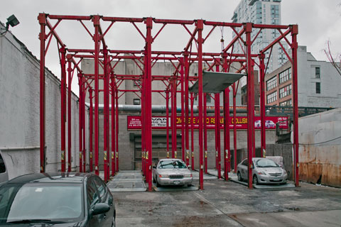
Tenth Avenue, Chelsea — © Brian Rose
Without comment.
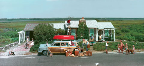
Kodak–I wrote with sadness a few weeks ago about the news that the company had filed for bankruptcy. Recently, the blogs have been featuring old Kodak Coloramas, the giant back-lit transparencies that were used to promote picture taking by the masses. Occasionally the images were impressive, but mostly they were kitschy, saccharine views of American life. We like them now–as parody–but even at the time they were unhip and projected an image of a company hopelessly out of step with a growing younger generation of amateur and erstwhile professional photographers. The writing was on the wall as early as the 1970s.
When I entered art school in 1977, Kodak was relevant to me primarily for their film, paper, and chemistry. By then, the Japanese had already cornered the serious camera market. Nikon, Canon, and a host of others were making beautifully designed SLRs and rangefinder 35mm cameras. My first camera was Nikkormat. Leica was still the premier street photographer’s camera, and although I couldn’t afford one, I did buy German-made lenses (Rodenstock and Schneider) when I got my first view camera. Kodak cameras were dumbed down gadgets for Mom and Dad who somehow always photographed you with a tree sticking out of your head.
Not that it mattered much–film was the core of Kodak’s business.
But even there, the company blew it spectacularly. Here’s how it went for me:
In the ’80s photographers began moving away from slide film, at that time dominated by Kodak, especially with their most famous brand Kodachrome. I began shooting negative film for making prints, and all my art projects were done that way. But my architectural clients wanted 4×5 transparencies, and the magazines, printed primarily in color, wanted the same.
In the mid or late 1980s 4×5 holders gave way to paper packets that did not require hand loading, which vanquished the dust problem that plagued sheet film. Fuji’s product had one sheet per packet and Kodak two. I typically shot six sheets of film for each image–two normals, and two at 1/2 stop under and over. The lab I used hated the 2-sheet Kodak packages because they had difficult time keeping track of the film, and I was strongly urged to use Fujifilm. Not only that, 2-sheet packs were more difficult to handle and more prone to accidents in the field, which would then spoil two images.
At some point I actually decided to track down someone at Kodak and explain to them how quickly they were losing New York professionals–a small number of people compared to the tens of thousands of wedding and portrait photographers around the world–but certainly their most prestigious and important group of customers. After being shunted from one department to another, I finally spoke to someone in Rochester involved in the manufacture of sheet film. He claimed that the 2-sheet packaging was what their customers wanted. He was friendly, but clearly did not understand the alarm I was raising. Way too late, a few years later, Kodak ditched the 2-sheet packaging.
One of the great challenges in shooting architectural interiors in those days was balancing different sources of light, and increasingly, fluorescent lighting was used in offices mixed with incandescents spots. Fluorescents, as you still see in older color pictures, came out an insipid green on film. Elaborate schemes involving multiple exposures, gelled fixtures, and filters, were used to achieve the desired natural look. As a result, architectural photographers comprised an elite priesthood performing small lighting miracles with their bag of tricks.
And then the final straw. I can’t pinpoint the year, but I believe it was in the early ’90s, Fujifilm introduced a negative film that came embedded with an extra layer designed to neutralize the green cast of fluorescents. This invention altered architectural photography immediately and permanently, and Kodak would have no answer for years. Virtually every interiors photographer abandoned Kodak for good.
From today’s Times:
Through the 1990s, Kodak spent some $4 billion developing the photo technology inside most of today’s cellphones and digital devices. But a reluctance to ease its heavy financial reliance on film allowed rivals like Canon and the Sony Corporation to rush into the fast-emerging digital arena. The immensely lucrative analog business Kodak worried about undermining was virtually erased in a decade by the filmless photography it had invented.
I just cringe reading this. They invented the technology of the future but utterly failed to create products that appealed to a new generation of customers. What an epic failure by one of America’s great companies.
Kodak considers home photo printers, high-speed commercial inkjet presses, workflow software and packaging to be the core of its future business. Since 2005, the company has poured hundreds of millions of dollars into new lines of inkjet printers. Once the digital camera business is phased out, Kodak said its consumer business would focus on printing.
Just in case anyone from Kodak is reading this, you’ve already lost this market to HP, Epson, and Canon. It’s over. The seeds of this failure go all the way back to those now beloved Coloramas. Kodak’s managers and marketers were lost in a rapidly vanishing American landscape–an imagineer’s Disneyland America–not the real world, not the changing world. Not the high tech world that Steve Jobs and other entrepreneurs here and abroad understood and so effectively exploited.
R.I.P. Kodak. (please keep making 4×5 negative film and c-print paper for me just a little longer)
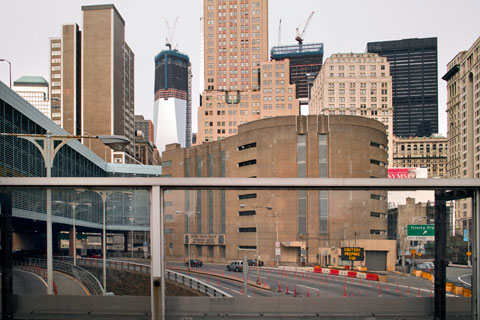
Brooklyn Battery Tunnel entrance — © Brian Rose
David Dunlop in the New York Times City Room column this morning writes about being stopped by MTA security guards while photographing a bus depot in Brooklyn:
The search for lost history leads to odd spots sometimes, like Second Avenue, between 126th and 127th Streets, once the site of William Randolph Hearst’s Cosmopolitan-International movie studio. It is now home to the 126th Street Bus Depot, and that’s what I was taking a picture of last week — from the sidewalk across the avenue — when a property protection agent with the Metropolitan Transportation Authority approached me.
You can’t take pictures of transit facilities, he told me, politely but firmly.
It reminds me of the time I was in East Berlin in 1987 before the Wall came down looking for surviving examples of early 20th century architecture to photograph. At one point, looking for a housing project clearly shown on my map, I found myself standing–with my 4×5 view camera–in front of an enormous complex of buildings with video cameras mounted on the facades–not a common sight in the ’80s. Suddenly, uniformed guards began shouting and approaching. I ducked downstairs into a nearby subway station and made a clean getaway. Later, I realized that I had accidentally stumbled upon the East German Stasi headquarters, the secret police. I was lucky to have escaped.
The truth is I had been photographing for days all over East Berlin using my big camera without being accosted by the many “people’s police” who seemed to be everywhere. Such indifference is not the case in New York City in 2012. Despite recent clarifications of the law and the specific rules regarding photography in public places, I am routinely told by private security guards, police officers, and uncredentialed busy bodies that photography is not permitted. It is, in fact, allowed–even in the subways and buses.
But things are not so simple. A few days ago I took my camera to Lower Manhattan and did a number of photographs relating to my ongoing documentation of the World Trade Center, specifically the rise of 1 WTC, which is replacing the Twin Towers. It was a good day. No one stopped me. In the photograph above I was standing on a pedestrian bridge crossing over the entrance to the Brooklyn Battery Tunnel. I suspect that I was in an area under the jurisdiction of the Port Authority of New York and New Jersey, a public/private authority with its own set of rules. They have stopped me in the past when I made photographs near the Holland Tunnel entrance.

Greenwich Street — © Brian Rose
In the picture above I was standing in a small public plaza adjacent to the tunnel entrance decorated with planters that were probably intended originally for security purposes. The city is littered with such barriers–mostly ugly and obviously ineffective. My guess is that the plaza is under the jurisdiction of the New York City Department of Parks and Recreation, which has its own rules governing photography and the use of tripods.
And in the photograph above I was standing in the Irish Hunger Memorial in Battery Park City under the jurisdiction of the Battery Park City Authority which has its own rules regarding photography and tripods. Another photograph I tried to do recently was from the steps leading up to the Borough of Manhattan Community College which has jurisdiction over its open plaza–I was stopped by a friendly security guard–and another I made was from the Hudson River Park, which is under the jurisdiction of yet another public/private organization. I have no idea what their rules are. Additionally, there are dozens of public plazas that are actually privately owned, the result of crazy zoning deals that award developers with extra floor space in exchange for creating a public amenity. These spaces, like the recently occupied Zuccotti Park, exist in an ever growing twilight zone of public access under private control.
Most of the organizations that have jurisdiction over these spaces are benign in their intentions, but the result, nevertheless, is that they have ultimate control over our public commons and our city. Are we fast becoming a police state?
Update: George Will, of all people, defends photographers’ rights here in the Washington Post.
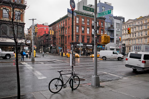
Rainy morning, the Bowery and Bleecker Street — © Brian Rose
A few more thoughts about Kickstarter prompted by two recent articles, one in the New York Times by David Pogue, who writes a popular tech column, and the other by Jörg Colberg in his blog Conscientious. Kickstarter, for those of you who haven’t heard, is an internet fundraising platform for creative projects. It’s only been around for two years, but has become–at least in my circle–ubiquitous. Everyone says to everyone, oh you should raise the money on Kickstarter. As if it’s a sure fire way to fund your dreams. It could, indeed, be just the ticket. But based on my successful experience with it, I’d say don’t do it unless you are really serious about your project, your prospects for funding, and your ability to follow through on that dream and the promise that is made implicitly with your backers.
Consider, for instance, that your core backers–at least to get started–are your family, friends and colleagues. In the process of asking them for money you may discover that those with the means to support your project may, in fact, be extremely stingy. Some may strangely disappear into the woodwork, or become suddenly unavailable. Others will surprise. People who you thought were only casually interested in your work, some with very little money, will jump right in with a substantial donation. In running a Kickstarter campaign, you run the risk of damaging relationships with friends, or finding out things about your friends that you, maybe, would rather not know.
In the end, fortunately, I was able to extend my network further and many backers were people unknown to me, some who heard about the project from the publicity I was able to generate, and some who were part of the Kickstarter community–people who get pleasure sifting through the projects offered on Kickstarter’s website, supporting those that interest them. Ultimately, that is what this is about–building and tapping into a community of people who want to share in the creative process, who appreciate the simple notion that dropping a few bucks into the offering basket will sustain something worthwhile. Like church, the fulfillment is often more spiritual than tangible. In my case, however, my 85 backers were essentially pre-ordering my book, and as it has turned out, getting it for less than the final retail price.
David Pogue in the Times, seems to regard Kickstarter as another of those Internet phenomena that makes sense to a younger generation of early adopters while leaving the rest of us baffled. At least that’s the rhetorical device the savvy Mr. Pogue uses to frame the subject, knowing, of course, that most of his readers probably haven’t yet heard of Kickstarter. He focuses on a handful of tech products that raised hundreds of thousands of dollars above their original goals. Product concepts that took off virally, given the fact that backers do not get a financial piece of the action, seem stupefying, even crazy. For my book project, there was no runaway viral infection. It was more of a slow fever that occasionally spiked up. Much of the time I just sat hunched over my computer screen in a sweat, monitoring the trickle of donations, sending out emails, thanking backers, and generally being a nervous wreck.
Reading through the comments about the Times piece I am surprised at the number of negative responses. A lot of people have trouble with the idea that project backers aren’t investors in the traditional sense–and that the money comes with no strings attached. It seems like cheating. It is clear that Kickstarter breaks all the rules and shakes up the establishment. The gatekeepers who control the flow of money, who man the curatorial/institutional ramparts, can finally be circumvented. The democratization of the marketplace has always been the promise of the internet, often unrealized. Kickstarter harnesses that promise, at least on a modest scale.
Talk about modest. Despite Pogue’s touting projects that achieved megabucks on Kickstarter, I managed to scrape together $11,000, enough to partially fund my book Time and Space on the Lower East Side. As a freelance artist severely buffeted by the winds of the “great recession,” I have trouble landing commercial photography assignments, much less acquiring the money to pursue book projects costing tens of thousands of dollars. There are few grants available for artists in this country. We do not, apparently, as a society, believe that government should support individual artists. And most institutional support of the arts goes to other institutions like museums, symphonies, non profits that promote the arts but do little for struggling artists. Every year thousands of artists apply for NYFA (New York State) grants, and the relative handful who get selected receive significantly less than the $11,000 I made on Kickstarter. Every year hundreds of photographers apply for Guggenheim grants, and four or five get selected. Last year I applied for money from the Graham Foundation, a Chicago based organization that funds architecture related projects, mostly to academics. It was a long shot, but I applied for money to photograph the architecture and landscape of megachurches putting a good deal of effort into the application. Had I been selected–I was not–I would have received much less than $11,000. And what do you do once you’ve applied for one of these grants? You sit on your duff for months while committees of the wise decide how to divvy up a pittance.
I have always avoided saying this, but I will now. Applying for these grants is a waste of time. It’s time to walk away. Kickstarter, and other up and coming models, offer a much better way to raise money for individual artists. It isn’t perfect. Jörg Colberg of Concientious has problems with the all-or-nothing aspect of Kickstarter. He thinks there should be more flexibility in setting goals. His point is well taken, though I understand why Kickstarter does it. Additionally, Kickstarter is a business, and both they and Amazon, which handles the dolling out of money take significant chunks of the pie. But seriously, I am prouder of my recent Kickstarter achievement than the New York State grant I got way back in 1980 or the NEA photographic survey grant I got in 1982. Except for a few projects I’ve done which were initiated by non profits–projects I did not choose on my own–I have been shut out of by the grant giving institutions since then. With Kickstarter I was able to mobilize my resources, take control of the process, and work with others to realize my goal.
It’s time to make the grant gatekeepers irrelevant, if they aren’t already. It’s time to walk away.
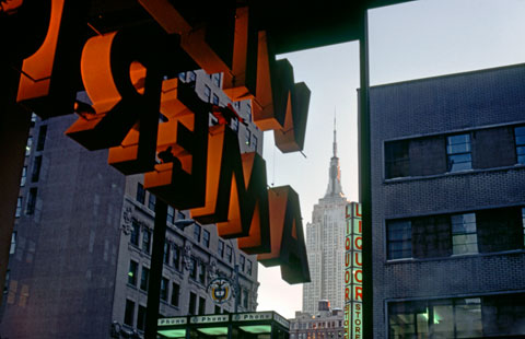
Kodak Gallery at 43rd Street and the Avenue of the Americas, 1978, (current location of ICP) — © Brian Rose
When I first began shooting color in the mid-70s, making prints was difficult. You couldn’t easily set up a home darkroom–color enlargers were expensive, and the chemicals were finicky compared to black and white. So, for several years I just shot slide film, mostly Kodachrome, which could be projected on a screen or looked at through a hand-held viewer. In my first color classes at Cooper Union taught by Joel Meyerowitz, all our discussions and critiques involved images that were projected. Meyerowitz, at that time, was exhibiting his work as dye transfer prints made directly from Kodachromes. They were beautiful, archival, required a custom lab, and were very expensive.
At some point I began teaching myself how to print color using an enlarger newly installed at school. There was no printing class. The chemicals were poured into a drum, which rotated on a mechanical base, and I could do prints up to 11×14 inches. To make prints from Kodachromes, I first had 4×5 internegatives made, with the end product being a so-called C print. The printing process was slow and labor intensive, and the results were sometimes less than perfect. But I made 25 prints one semester, and had an exhibition in the hall of the photo department. I also began shooting and printing from 35mm negative film, though I still liked working with the generous size of 4×5 internegatives. Looking back, that probably influenced my decision to shoot with the 4×5 view camera in doing the Lower East Side project with Ed Fausty. I liked printing from big sheets of film.
The one constant in all of this–film, paper, and chemistry–was Kodak. I had yellow boxes everywhere in my apartment until a few years later when green Fuji boxes began to infiltrate. I still have yellow Kodak boxes of film in my refrigerator and dozens of print boxes on the shelves in my studio. Although 90% of what I do now is digital, I will never entirely escape the yellow boxes.
Yesterday, not unexpectedly, Kodak filed for bankruptcy. Fujifilm continues on, a nimbler, smarter company, making some of the coolest digital cameras around. However, Kodak remains the only producer of negative sheet film, and although Chapter 11 does not mean it’s over for the company, my guess is that it will rapidly shrink, and eventually spin off different operations as separate companies. Where that leaves those of us still shooting film is anybody’s guess.
The photograph above was made in 1978 with my first camera, a 35mm Nikkormat, on Kodachrome. The Empire State Building was seen from below street level in the former Kodak gallery at 43rd Street and Sixth Avenue. The International Center of Photography now occupies that space. Kodak may soon exit the scene for good, but photography lives on, with or without yellow boxes.
No to SOPA! Protect artists’ rights, not corporate interests.
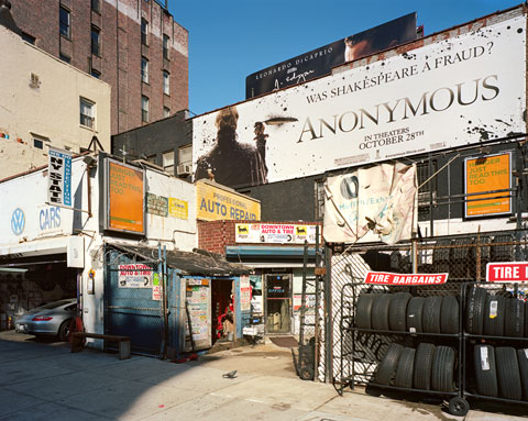
The Bowery and Great Jones Street (4×5 film) — © Brian Rose
While reading the New Yorker I came across a quote attributed to late choreographer Merce Cunningham. From Joan Acocela’s article:
…stories or even themes put the spectator in the position of someone standing on a street corner waiting for a friend who is late: you can’t see the cars or the buildings or the sky , he said, because “everything and everyone is not the person you await.”
Likewise with photographs. If you latch too much onto familiar visual narratives, other meanings, other connections, will not be made. This is true both for the image maker and the viewer.
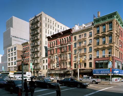
The Bowery and Rivington Street (4×5 film) — © Brian Rose
With that caution in mind, here are six recent images of the Bowery made with the 4×5 view camera. I did them in conjunction with a class I was teaching at ICP, and as part of my ongoing project to photograph the Bowery. The block above includes the New Museum on the left, the Bowery Mission and the Salvation Army building, the tall one in the middle. The latter are vestiges of the Bowery’s skid row past, though they and a couple other organizations still provide services for a more scattered homeless/street population. The gentrification of the Bowery, however, is proceeding rapidly.

The Bowery and Delancey Street (4×5 film) — © Brian Rose
Some of the roll-down window gates were recently decorated by artists. This one is by the notable graffiti artist Kenny Scharf.
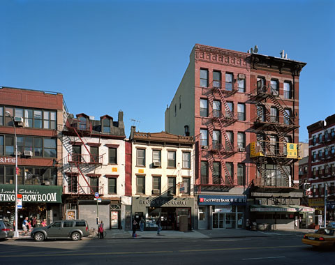
The Bowery and Grand Street (4×5 film) — © Brian Rose
The townhouse at left is from 1817 and is one of the few protected landmark buildings in New York to have its status rescinded. The owner wants to demolish and construct an office building. From the Villager:
(City Councilwoman) Chin noted that she has supported many landmark designations on the Bowery. “But in this instance, I have to look at the bigger picture and find a balance. There is an opportunity to help the community recover from [the World Trade Center attack], which it hasn’t done. I just hope that the advocates will see my point of view on this and that we will have the opportunity to continue to work to preserve the historic character of the Bowery. But on this building we will have to differ.” Chin said.
The reality, of course, is that the Bowery and lower Manhattan is a boomtown.
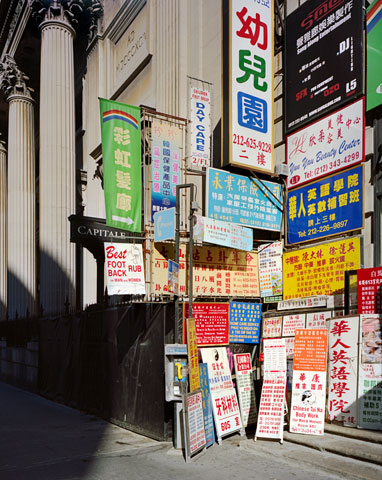
The Bowery and Grand Street (4×5 film) — © Brian Rose
It is true that the Bowery exhibits a ragtag collection of buildings from many different time periods. It does not present a unified urban landscape in the way that historic rows of townhouses dominate parts of Greenwich Village, or blocks of cast iron loft buildings define the streets of Soho. Nevertheless, there is much architecture worth saving, though sometimes one might have to peel away some of the layers to get to it.
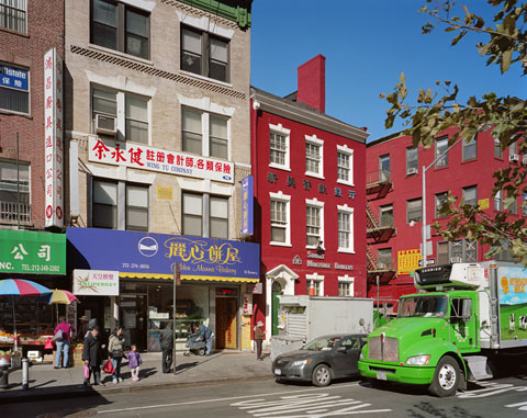
The Bowery and Pell Street (4×5 film) — © Brian Rose
Another similar sized townhouse from 1785–the Edward Mooney house–a well-maintained landmark containing a Chinatown bank.
ArtUp on ABC News, Channel 7
From last week:
Nice to see some publicity for FAB’s ArtUp program, which involves using construction scaffolds, containers, and other kinds of spaces and surfaces for public art. My WTC mural on the sidewalk shed on East 4th Street between the Bowery and Second Avenue is shown twice in the video, although I’m not mentioned by name. It will be up until January 27, so you still have a couple of weeks to see it.
Some updates on Time and Space on the Lower East Side. We are looking at a mid- to late March release of the book depending on how long it takes for the shipment from the printer in Germany to arrive by sea freight and to clear customs. I expect to have a small number of books sent to me before that, which I can then start using for promotional purposes. I am working on venues for a slide talk and book launch party, probably separate dates in March. I will post confirmed dates as soon as I have them.
The Blurb version of Time and Space will only exist for a couple more days. Once it’s down, it’s gone forever. So, if you’ve been thinking of purchasing one of these, this is your last chance. Up till now, I’ve made the entire book browsable using Blurb’s preview feature. But that will go, too. I may create a web presentation of the overall project as a resource, but the book will only be viewable as a 12 page sample.
Time and Space is now available for pre-orders here, or clock on the image above.