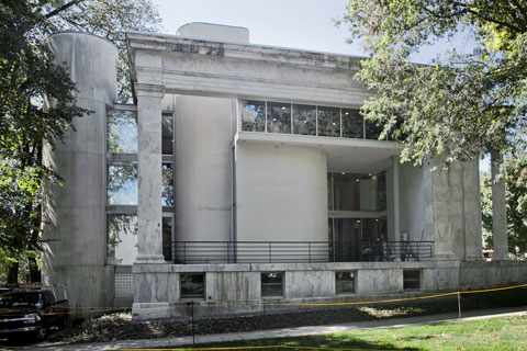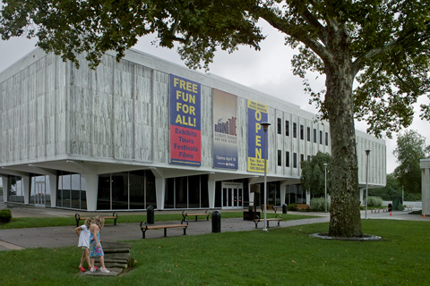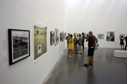
David Goldblatt exhibition at the New Museum — © Brian Rose
After seeing the David Goldblatt show (Intersections Intersected) at the New Museum a couple of weeks ago, I struggled with a response. Despite the fact that his work is widely known, his photographs of apartheid era South Africa and its subsequent aftermath had never made a strong impression on me—probably my own lack of attention—or so I assumed. Nevertheless, I left the museum feeling ambivalent about Goldblatt’s admirably ambitious life’s work. I went back a few days ago with some friends who had just returned from a trip to South Africa, and gave the exhibition a second look.
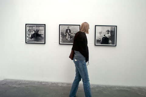
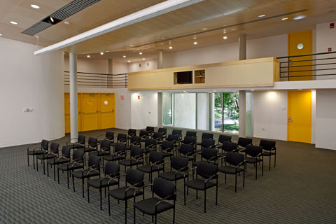
David Goldblatt black and white prints — © Brian Rose
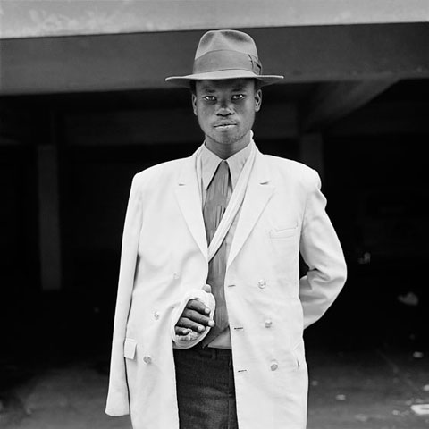
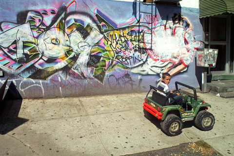
Photograph by David Goldblatt
As hard as the exhibition tries, I don’t find the attempt to connect the B&W and color work particularly fruitful. Like it or not, the jump to color represents a major break in Goldblatt’s way of seeing. The earlier work is often square format, engaged with people, and more journalistic—though always understated—the images have great intensity, richly printed. The color view camera work opens things up greatly, widens the view, pulls the photographer back, allows for smaller scale moments across a larger scale frame.
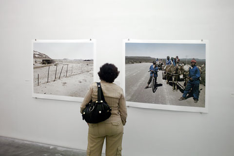
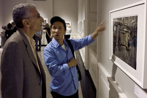
Goldblatt color prints — © Brian Rose
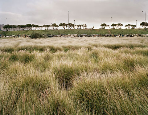
Photograph by David Goldblatt
(One of my favorites, it is a richly layered image–swaying grasses, a line of shacks, a highway with blurred cars, a line of trees against the sky.)
As a landscape photographer making images overlaid with cultural/political issues, I am sympathetic to Goldblatt’s concerns–I almost wrote mission—and that is where my problem with his work resides. Despite the inclusive taking-it-all-in appearance of the large color images, the offhandedness of the images is belied by a relentless intentionality. It is not that they are overtly polemical—but I have the sense that each image comes with implicit annotations and directions.
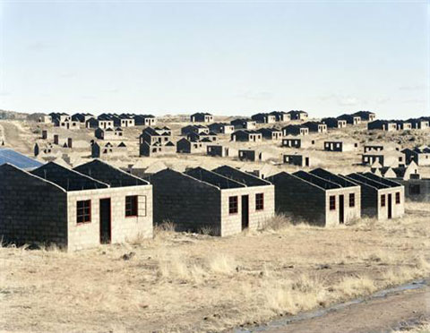
Photograph by David Goldblatt
I am distinctly in the minority in saying this. Most reviewers of Goldblatt’s color work say something close to the opposite–that the great merit of the photographs is the way in which they depict ordinary reality—quotidian—the word employed by New Museum curator Joseph Gergel. Most of the photography I admire fits the description of Goldblatt’s work—but… There is something else about that work that misses for me.
Text from an earlier exhibtion at Huis Marseilles in Amsterdam:
Until a few years ago Goldblatt’s ‘personal’ work was exclusively in black and white, for with colour he could not express his rage, revulsion and fear of the ideology of apartheid. Moreover, during that period he had found the technical expressive possibilities of colour photography to be limited: for example, colour transparency films had not enough latitude, colour negatives displayed colour casts, and he did not have sufficient control over prints made on PE paper. The beginning of a new political and social era after the abolition of apartheid occurred almost synchronously with far-reaching developments in digital printing techniques. At this point Goldblatt felt the need to expand his choice of subject and form of expression. A new generation of colour films and the remarkable control of contrast and colour saturation enabled by digital reproduction have made that possible for him.
Goldblatt shoots his photographs on colour film and then edits the negatives in the computer. Working together with his master printer Tony Meintjes, he only makes changes that could be done in a darkroom – he never uses the computer to alter the contents of an image. The prints are extremely sophisticated inkjet prints on aquarelle paper. He strives for a colour rendering which corresponds as closely as possible to his perception of colour in the reality of the harsh South African sunlight. High contrasts, unsaturated, neutral colours and at the same time a broad range of tone and hue give each print an unprecedented, pinpoint sharp graphic quality in which each detail is visible.
Those of us who began working in color at an early date came to the medium with few prejudices about the inherent meaning of color. I remember arguing once with another photographer who was struggling with the move to color, that blue skies were not too cheerful to me, they were simply blue. It never occurred to me that a rich colorful rendering of the world around me might lack seriousness or emotional weight.
The film and c-print material I began to use in 1978 produced beautiful results (though vintage prints have yellowed over the years), and I worked directly with negatives in the darkroom until a few years ago when it became possible to scan, Photoshop, and produce digital prints, as Goldblatt and most other color photographers do now. Photographers like Joel Meyerowitz, Joel Sternfeld, Stephen Shore, and Richard Mirsrach all printed much of the work they are best known for in the conventional darkroom.
Much of the language in the quote above attempts to give Goldblatt’s decision to move to color prints a unique credibility, even drama—the abolition of apartheid and synchronously far-reaching developments in digital photography…extremely sophisticated inkjet prints…unprecedented, pinpoint sharp graphic quality…his perception of colour in the reality of the harsh South African sunlight.
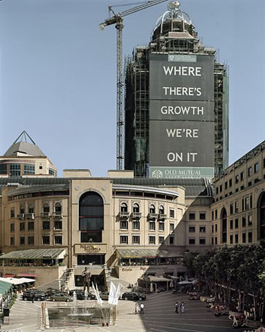
Photograph by David Goldblatt
As I looked longer at the color prints in the New Museum I realized that much of my problem with the work originated with decisions made in Photoshop—specifically the high contrast seen in most of the prints, and the attenuation of the color palette in the lightest and darkest areas of the prints. Shadows, for instance, in nature rarely appear without color. They tend to be bluish in warm daylight, but can contain and reflect the colors in them and around them. In most of Goldblatt’s prints, the shadows have been greatly desaturated.
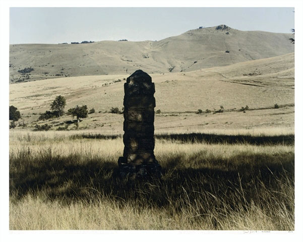
Photograph by David Goldblatt
The same goes for the highlights, particularly the grasses where a whitish/yellowish cast blinds the eye—which I believe was the intention—to express the South African light–but in fact, in my view, is an over-interpretation. In the end, I found the prints harsh and brittle, and sapped of life. Digitized. Whatever the justifications, this does a disservice to the images, and stands in the way, at least for me, of a fuller appreciation of Goldblatt’s achievement.
Go here for a different perspective.