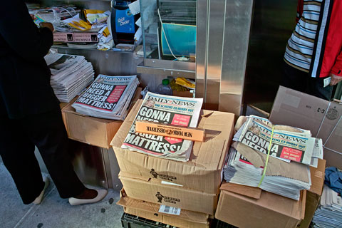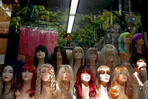
Astor Place (digital)
© Brian Rose
Without comment.
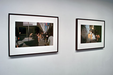
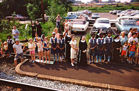
Paul Fusco, RFK funeral train, 1968
I was 14 years old in 1968, undoubtedly the most tumultuous year since World War II–at least in the western world. Although I was too young to be seriously engaged in what was going on, I was acutely aware of the epic events occurring–Vietnam, civil rights, the assassinations of Martin Luther King, Jr. and Robert F. Kennedy, and the violent end to Prague Spring in Czechoslovakia.
Two exhibits I visited recently in New York touch on events of 1968: Paul Fusco at Danziger Projects (show closed October 4) and Josef Koudelka at Aperture. Fusco photographed Robert Kennedy’s viewers of the funeral train as it made its way from New York to Washington, D.C.
I remember well watching the railroad cortege on television as it passed the thousands of people who lined the tracks. I also have a distinct memory of a brief bit of video shown once, in which a train coming from the opposite direction mowed down a number of people standing on the tracks adjacent to the funeral train.
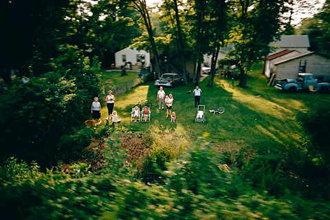
Paul Fusco, RFK funeral train, 1968
When I first saw the Fusco pictures, I was immediately swept back to the sorrow and apprehension of that time, to the fear and uncertainty that I have never been able to shake, a fear that rises to the surface today as a black man carrying the hope embodied in the Kennedy brothers nears the presidency, as earthshaking economic events rumble around us.
Fusco’s photographs were very simply made. On assignment from Look magazine, he rode the funeral train and did what he could from a fixed vantage point. He aimed his camera at the crowds and small knots of people standing at relaxed attention, some waving, some saluting, troubled, saddened faces, staring, transfixed, as the rail coaches slid by.
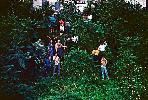
Paul Fusco, RFK funeral train, 1968
Fusco made his photos on 35mm Kodachrome, a vibrant slide film that stands up well over time unlike early color negative film, which tends to shift color and fade. As a result, these images from 40 years ago seem fresh and immediate, which makes them emotionally all the more jarring. The people depicted came “as-they-were” in a colorful array of flowered prints and decidedly unfunereal stripes and plaids. It was June and people came in shorts, bathing suits, sandals and bare feet. And although it was 1968, one sees scant evidence of the psychedelic trappings that so dominate our collective memory of the era.
The train passed through rural areas, small cities like Trenton, and big ones like Philadelphia and Baltimore where the faces are mostly black, people standing in scruffy backyards and vacant areas along the tracks. Some of these neighborhoods were in the midst of violent upheaval as racial frustrations boiled over after the murder of Martin Luther King. Fusco’s pictures, while freezing the momentary unity of grief, also reveal the racially segregated nature of a society coming apart at the seams.
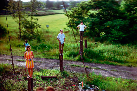
Paul Fusco, RFK funeral train, 1968
Because the train remained in motion, most of Fusco’s photographs were necessarily made on the fly. They are fleeting glimpses, poignant, abbreviated moments of individual solitude among crowds. Fusco focused on the motionless people, rotating his head and camera slightly to stay fixed on his subjects, as the train moved horizontally. The blurring of the surrounding landscape further isolates the figures and creates a model-like hyper-reality, akin to recent narrow focus imagery created in Photoshop.
The images have a posed quality as well, due to the fact that people had staked out viewing positions, sometimes awkwardly balancing on steep embankments or even standing on elevated objects. As the train went by they looked intently at the coaches and often their eyes met the gaze of the photographer. In Fusco’s photographs this relationship creates a strange and compelling phenomenon–they seem to look at us as we look at them. Do we recognize ourselves?
Paul Fusco’s photographs have been collected in a handsome book, RFK, published by Aperture. It tries to be both a tribute to Bobby Kennedy and an art photo book, which I think is a little forced. The book starts with pictures not taken from the train of the memorial service held in St. Patrick’s Cathedral and ends with the funeral in Washington. I would be happier without these bookends.
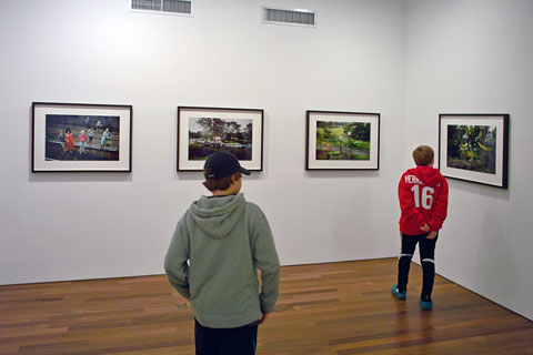
Paul Fusco at Danziger Projects • Brendan, my son, at left (digital)
The images as printed in the book, however, are nicer than the gallery prints, which are somewhat harsh and over saturated. The slightly more muted tones in the book seem more natural to me. Kodachrome is a punchy color material, but I don’t think prints have to mimic the straight slide film.
Next, a look at the Koudelka exhibit.
Without comment.
I’ve been busy lately, but have several posts coming up. Saturday I visited three exhibits in Chelsea: Joel Sternfeld, Josef Koudelka, and Paul Fusco. The latter two deal with tragic and tumultuous events in 1968. Sternfeld’s work is new and majestic. I’ll write soon about all of these.
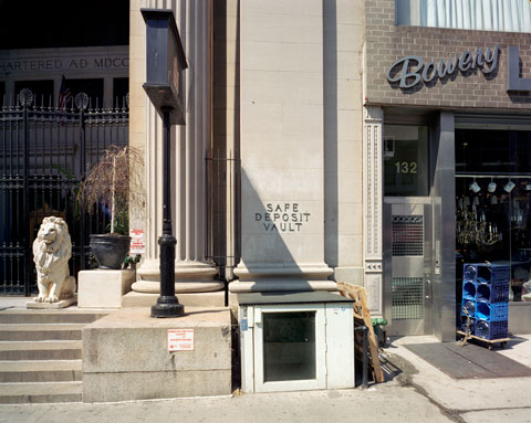
The Bowery (digital) • © Brian Rose
Walked through the Lower East Side and up the Bowery with Rodger Kingston, photographer and Walker Evans scholar. Took the snap above.
If you haven’t seen it, be sure to read Suzanne Vega’s blog post on the New York Times website about the origins and subsequent history of her song Tom’s Diner. I figure in the story.
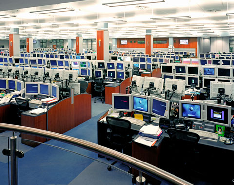
Morgan Stanley • London trading floor (4×5 film)
© Brian Rose
Goldman Sachs and Morgan Stanley, the last big independent investment banks on Wall Street, will transform themselves into bank holding companies subject to far greater regulation, the Federal Reserve said Sunday night, a move that fundamentally reshapes an era of high finance that defined the modern Gilded Age.
The New York Times
The World Trade Center • 1982 (4×5 film)
© Brian Rose
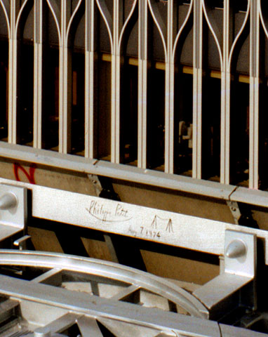
In 1974 when the WTC was just being completed, Philippe Petit, a French street performer strung a cable between the Twin Towers and proceeded to tightrope walk back and forth 6 or 8 times. Thousands watched in amazement from below. Eventually he surrendered to the waiting arms of the police. In the end, public sentiment ruled in his favor, and charges were dropped in exchange for a performance by Petit for children in Central Park. His breathtaking walk between the Twin Towers has become part of the folklore of New York, made all the more poignant by the horror of 9/11–seven years ago.
The World Trade Center • Phillipe Petit’s signature (4×5 film)
© Brian Rose
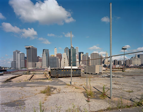
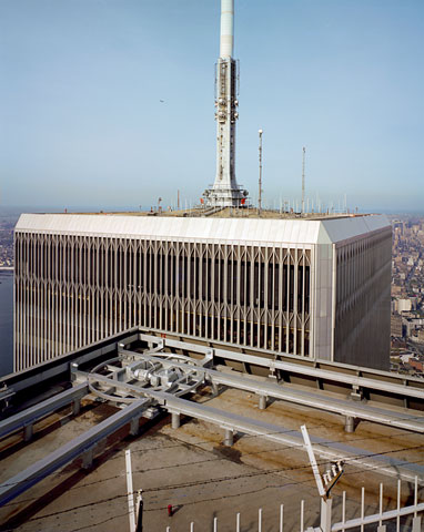
In the early ’80s I did a series of photographs of Lower Manhattan, funded by the National Endowment for the Arts, back when there was still NEA support for individual artists. Shortly after the destruction of the Trade Center, I sifted through my archive for photographs that included the WTC. They can be seen here. On of the pictures I came across was taken from the observation deck on Tower 2. I did a high resolution scan of the 4×5 negative and discovered something unseen in normal prints of the image, Philippe Petit’s scratched signature and tightrope icon.
In 1975 when I first went to art school (MICA in Baltimore) I was shooting exclusively in black and white. It was understood implicitly that fine art photographs were monochromatic–color was National Geographic and cigarette ads.
I’d been interested in color for a couple of years going back to a single roll of slide film that I ran through my camera. I had glossy 8x10s made of two of those images. But the color photography class at MICA in those days was mostly a tedious print making exercise that I avoided. In 1976 I started shooting 35mm slide film (mostly Kodachrome), was hooked, and never went back. I left Baltimore for New York, and ended up at Cooper Union where I studied with Joel Meyerowitz. By the end of 1979 I had begun my first major project, (in color) photographing the Lower East Side.
Joel Meyerowitz images from When Color was New (digital)
Julie Saul Gallery
Meyerowitz was one of 20 photographers in When Color was New, an exhibition that just came down at Julie Saul Gallery in Chelsea. The exhibit, although modest in scope, covered many of the key players in what was a fairly small circle of people exploring color as a serious photographic medium. Until that time, photography was mostly relegated to the “photo ghetto,” as we called it, galleries that generally showed smallish black and white prints, and tended to favor “concerned photography” or still lifes and landscapes rendered in luscious tonalities. Plenty of good stuff in there, don’t get me wrong, but none of it cutting edge in my estimation. Light Gallery, in New York, was a notable exception, showing the most innovative work of the 1970s including color when it emerged toward the end of the decade.
When Color was New covered the range of work done at the time including more conceptual work like John Pfahl’s as well as the multi-frame images of Jan Groover. Groover was a break out artist in the ’70s because her work was shown in a “real” gallery as opposed to a purely photographic house. What I like about these earlier constructed images by Pfahl and Groover is that you can see the artifice of the work unlike the many seamless Photoshop concoctions of the present.
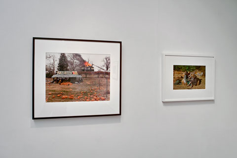
Joel Sternfeld and Mitch Epstein images (digital)
Julie Saul Gallery
The show included two Meyerowitz street photographs–pictures that I was familiar with in the late 70s–vividly preserved as dye transfer prints. Dye transfers were expensive to produce, but were inherently stable pigment based prints unlike C-prints. But C-prints were possible to do yourself–I printed at a rental lab–and much of the early color work was done that way. The vintage C-prints in the show were, generally, faded and yellowed, which I suppose is acceptable from a historical collecting point of view. But it is not the way to view these previously vibrant images. It is now possible to go back to the original negatives, scan them, and achieve results that make vintage C-prints look like ancient artifacts. Even familiar images like Joel Sternfeld’s picture of the Space Shuttle or Martin Parr’s hot dog eaters, were shown faded and color shifted. These are artists who are very much alive and kicking.
In no way to denigrate this enjoyable show, however, I think it’s time for a major survey exhibition on this important period of photography history. There are others, beyond the 20 photographers in the show who deserve inclusion–Len Jenshel and Jan Staller are two who come to mind–and I would hope my own work from that period might also find a spot.
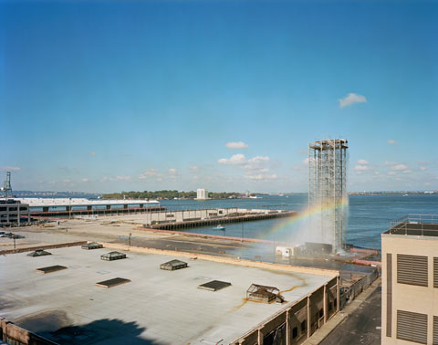
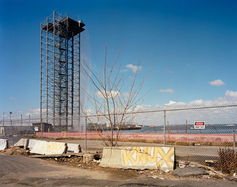
I’ve written already about the New York Waterfalls by Olafur Eliasson, which will be coming down soon after a summer of pumping water up and over their steel scaffolds. I’m not sure this was great success as public art, but it obviously was good for the city from a tourism point of view. The water quantity–or lack of it–has been discussed. There is now concern about damage being done to trees in Brooklyn because of the constant spray of salt water. It is true, if you stand on the Promenade high above the harbor on a windy day, there is a mist of water in the air from the nearest waterfall.
Waterfall, Brooklyn piers (4×5 film)
© Brian Rose
Waterfall, Brooklyn piers (4×5 film)
© Brian Rose
After spending a couple of days on the Brooklyn waterfront shooting for an assignment, seeing the Waterfalls mostly from behind, I’ve come to appreciate their erector set aspect, with the flow of water being a more ephemeral presence. Here are two photographs of the Brooklyn piers Waterfall–one from the Promenade, and one from the edge of the water, the scruffy area that will soon be transformed into a park.
Delancey Street and Ludlow (digital)
© Brian Rose
As an architectural photographer, it is my job, to make buildings look good, and to elevate the work of the architect who designed them. That does not mean that I have to like everything I photograph. I understand better than most, how decent designs get crushed by value engineering and cost cutting. Mediocre buildings are not always first and foremost the fault of architects. Developers, builders, engineers, planners, municipal agencies, nimby activists, all can contribute to the watering down of design, even to the point of creating a bad building.
Delancey Street and Ludlow (digital)
© Brian Rose
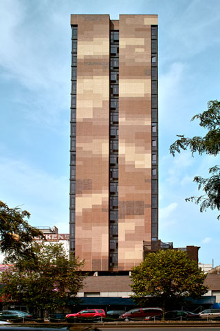
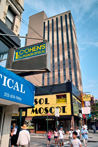
So, I have no idea what the hell went wrong here, but I know bad when I see it. This deadening brick tower evokes a 1960s government office building in the downtown of a small regional city. Windows are apparently an expensive amenity to be avoided in this bunker-like box. Narrow slits will do. The south facing facade, especially, is largely closed off to the sunlight and view of the lower Manhattan skyline.
Delancey Street and Orchard (digital)
© Brian Rose
And what to do with all the blank brick walls? I’ve seen stripes and banding, checkerboard patterns, colorful abstractions, but this is the first pixellated facade I’ve seen. Rendered in bland shades of café au lait.
And who will occupy this wonderful edifice? Why the students of SVA (the School of Visual Arts), one of New York’s premier art and design colleges. As a dormitory it will serve as an object lesson in bad design and the destruction of the urban fabric.
For the record, these are the culprits:
Developer – Charles Blaichman
Architect – Rawlings architects
Tenant – SVA
Commercial tenant – Bank of America (another branch bank!)
Orchard Street (digital)
© Brian Rose
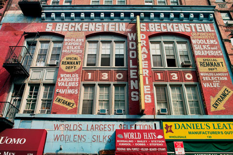
Just around the corner from the SVA bunker, a surviving piece of the old Lower East Side.
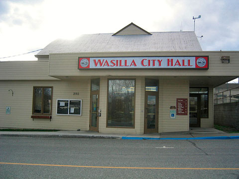
Wasilla, Alaska (from Flickr)
President Palin–America’s mayor/commander-in-chief.
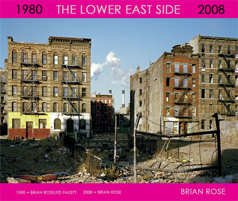
Cover of Lower East Side book proposal
© Brian Rose/Ed Fausty, 1980 (4×5 film)
As I posted recently I have created a book proposal for my Lower East Side project. I have barely begun showing the book dummy around, and it could take–who knows how long?–before something becomes of this. So, in the meantime, I have put the entire book online. This will replace the previous Lower East Side web pages. Almost all the images are still here, though it is now necessary to step through the sequence in order. You can, however, hop around using the links to the text pages at the bottom. Click the cover above or go here:
http://www.brianrose.com/lowereastside.htm
Comments are welcome.
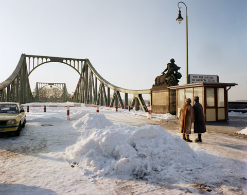
Glienicke Bridge, Berlin • The site of many Cold War spy exchanges. • 1987
© Brian Rose (4×5 film)
It’s hard to believe that it has been almost 19 years since the opening of the Berlin Wall and the subsequent collapse of the Soviet Union. My photographs of the former Iron Curtain, while increasingly distant history, seem more relevant than ever with the present cooling of relations between the western powers and Russia.
Today, I read in the Times, of the death of Wolfgang Vogel, one of the many shadowy figures of the Cold War–an East German lawyer trusted by both sides who arranged for the exchange of spies and dissidents across the border.
From the Times:
And in 1986, it was to Mr. Vogel that the United States turned to negotiate freedom for the imprisoned Soviet dissident Anatoly Shcharansky (later, as Natan Sharansky, a political leader in Israel). Included in an elaborately choreographed exchange of spies at the Glienicke Bridge because the Soviet authorities insisted that he was one, Mr. Sharansky exuberantly jumped into West Berlin over the border line painted on the deck.
Vogel, as I understand it, lived opulently in East Germany, enriched by his sponsors on both sides of the Iron Curtain. After 1989 he was convicted of various financial improprieties, won on appeal, and lived out his life in a resort in the Bavarian Alps.
He considered himself honorable in that he provided a service, helping thousands to reach freedom in the west. The East Germans needed a steam valve in their otherwise tightly sealed society, and they sought a means to bring in hard western currency. Vogel was the man for the job. He managed the human trade that bought freedom for the persecuted, while pocketing a fee for each transaction.
The New Museum and scene along the Bowery (4×5 film montage)
I’ve taken a few pictures that include the New Museum as part of my ongoing look at the Bowery at the Lower East Side. But this time I had a specific assignment to photograph the museum, especially as it relates to the immediate neighborhood.
The obvious “best view” of the building from the street is to step back into Prince Street, which terminates perpendicular to the Bowery, to get a little distance from the tower, and show a bit of the street. I’ve also seen a nice evening view from atop a nearby building, and another one from across several rooftops. I’ve done that myself.
But none of the pictures describes very well the way in which the intentionally misaligned stacked boxes mimic horizontally the varying vertical heights of the adjacent buildings. To do this I needed to maintain a frontal “elevation” to the facades from straight across the street. Shooting with a very wide lens didn’t work–too much distortion, and even with perspective correction, not enough of the feeling of a true elevation.
So, I chose to use a medium wide lens on the 4×5 camera, framed horizontally, correcting perspective, and then doing a second frame above the first, this time tilting back to get everything in with plenty of sky to play with later in Photoshop. I repeated the same thing to the right of the museum. In putting the montage together on the computer the upper and lower frames stitched seamlessly pretty well, but I didn’t try to join together the left and right images. There were too many things going on between the two camera positions that prevented a seamless stitch.
Anyway, I like the gap because there’s no attempt at hiding the artifice of the montage. The effect of a continuous street wall is maintained, nevertheless.